
 Page Builder
  Widgets Bundle
  SiteOrigin CSS
  Installer
 Lightbox Builder
5 min read Updated
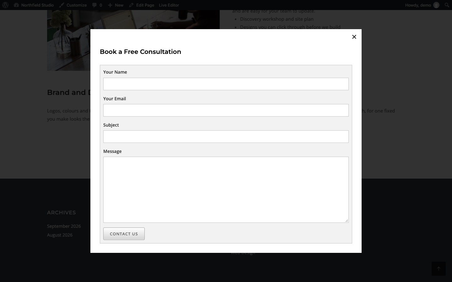
The Lightbox Builder addon adds the SiteOrigin Lightbox Builder widget. The widget shows a button. When a visitor clicks the button, a lightbox opens with a layout you build in Page Builder. Use it for a sign-up form, a video, a price list or any other widgets.
View the Lightbox Builder demo.
Requirements
- SiteOrigin Premium
- Page Builder by SiteOrigin
- SiteOrigin Widgets Bundle, with the Button widget active. The Button widget is active by default. The open button uses it.
Go to SiteOriginPremium Addons and activate Lightbox Builder. This also activates the Lightbox Builder widget at PluginsSiteOrigin Widgets.
Add a Lightbox
You can use the widget in three places:
Page Builder: Add the SiteOrigin Lightbox Builder widget to a Page Builder layout in the Classic Editor or in the SiteOrigin Layout block.
Block Editor: Add the SiteOrigin Lightbox Builder block. It is in the SiteOrigin category of the block inserter.
Widget areas: Add the widget to any theme or plugin widget area.
- Add the widget.
- Enter a Title.
- Under Content, click Open Builder.
- Add rows and widgets for the lightbox, then close the builder.
- In Open Button, enter the Button Text.
- Save the page.
The widget shows nothing until you add content. Not even the button shows.
How the Lightbox Opens and Closes
- The open button shows where you place the widget. The lightbox stays hidden until a visitor clicks the button.
- Only the widget’s own button opens its lightbox. The lightbox gets a new ID on each page load, so a menu link or another button can’t open it.
- To close the lightbox, click the close icon, click outside the lightbox, or press Escape.
- When the lightbox opens, the focus moves to the first link, button or common form control inside it (text field, text area, drop-down list, checkbox or radio button). The close icon is skipped. The Tab key then cycles through the lightbox.
- The page behind the lightbox doesn’t scroll while the lightbox is open. If the content is taller than the screen, the lightbox scrolls.
Settings
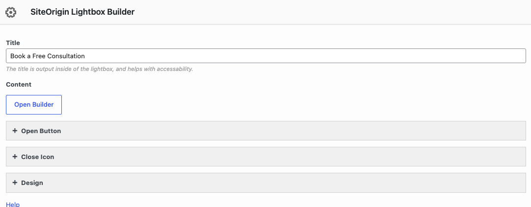
Title
Shows at the top of the lightbox. Screen readers use it as the name of the lightbox. Leave it empty to show no title.
Content
Click Open Builder to build the lightbox content with Page Builder rows, columns and widgets. A row with the Row Layout set to Full Width Stretched fills the lightbox box from edge to edge, over the padding.
Open Button
The open button has the settings of the Button widget, without Destination URL, Open in a new window and Download. These defaults are different for the open button:
Button Text
Default: Open Lightbox.
Button Color
In Design and Layout. Default: #239cff.
Hover Background Color
In Design and Layout, when Use hover effects is on. Default: rgba(35, 156, 255, 0.8).
The open button has three groups of settings:
- Icon: Icon, Icon Color, Image Icon and Icon Placement (Top, Right, Bottom or Left; default Left).
- Design and Layout: Width, Align, Mobile Align, Button Theme (Atom, Flat or Wire; default Flat), Button Color, Text Color, Use hover effects (default on), Hover Background Color and Hover Text Color (shown when Use hover effects is on), Font, Font Size (default 1em), Icon Size (default 1.3em), Padding (default 1em) and Rounding (default 0.25em on each corner). Align and Mobile Align offer Left, Right, Center or Full Width, and default to Center.
- Other Attributes and SEO: Button ID, Button Classes, Title Attribute, Onclick and Rel Attribute. Use Button ID or Button Classes to target the button with CSS or JavaScript. Use Onclick to run tracking code when a visitor opens the lightbox.
Close Icon
Icon
The icon for the close button. If you clear it, the default icon shows. Default: an X (Font Awesome xmark).
Color
Default: #2d2d2d.
Size
Default: 20px.
Position
Top Right or Top Left. Default: Top Right.
Design
The Design section has three groups: Title, Content and Lightbox.
Title: Tag
The HTML tag of the title: H1 to H6, or P. Default: H4.
Title: Color
Default: #000.
Title: Size
The font size of the title.
Title: Margin After Title
The space below the title.
Content: Background Color
The background of the lightbox box. Default: #ffffff.
Content: Padding
The space inside the lightbox box: top, right, bottom and left. Default: 30px on each side. At the moment, the first input is labelled Left. It sets the top padding.
Lightbox: Background Color
The overlay that covers the page behind the lightbox. Default: rgba(0,0,0,0.8), black at 80% opacity.
Lightbox: Maximum Width
The largest width of the lightbox box. The box is never narrower than 300px. Default: 60vw (60% of the screen width).
At the moment, Title: Font, Content: Border Width, Content: Border Color and Lightbox: Height have no effect. The lightbox height follows its content.
Advanced Customizations
Add PHP snippets with a plugin such as Code Snippets, or in a child theme’s functions.php file.
Compatibility mode
By default, the lightbox opens above all other page content. Some plugins add drop-down lists or pickers outside the lightbox, for example Forminator Forms. These can then show behind the lightbox. Compatibility mode opens the lightbox as a normal page layer, so these elements can show above it. It applies to all Lightbox Builder widgets on the site. Use it only if you see this problem.
add_filter( 'siteorigin_premium_lightbox_builder_compatibility_mode', '__return_true' );
Related
- Button widget
- Lightbox: opens images from Widgets Bundle widgets in a lightbox.
- Custom Layouts
- Building a Page