
 Page Builder
  Widgets Bundle
  SiteOrigin CSS
  Installer
 Tabs
4 min read Updated
The Tabs addon adds settings to the free Tabs widget. You can apply a ready-made design, add an icon or image to each tab, build tab content with Page Builder, move the tabs to the side or the bottom, and style the fonts, borders, padding and margins.
For the widget’s other settings, see the Tabs widget documentation.
Requirements
- SiteOrigin Premium
- SiteOrigin Widgets Bundle, with the Tabs widget
- Optional: Page Builder by SiteOrigin, for the Layout builder content type
Go to SiteOriginPremium Addons and activate Tabs. This also activates the Tabs widget.
Presets
The Presets setting is at the top of the widget form.
Presets
Applies a ready-made design: Flat, Wire, Rounded 01 or Rounded 02. A preset replaces some or all of the current Design values. It does not change the Tabs position.
Tab Settings
These settings are in each item of the Tabs list, between Title and Content.
Title icon
An icon that shows next to the tab title.
Title icon image
Your own image to show next to the tab title. Choose an image from the Media Library or enter an external URL. The image height matches the tab Font size. When you set an image, it shows in place of the Title icon.
Content type
Text uses the normal Content editor. Layout builder replaces the editor with a Content builder field. Click Open Builder to build the tab content with Page Builder rows, columns and widgets. Layout builder needs Page Builder by SiteOrigin. Default: Text.
Design Settings
The addon adds settings to the three groups of the Design section: Tabs container, Tabs and Panels. It also changes Border width in all three groups, and Border hover width in Tabs, to four inputs: top, right, bottom and left.
Tabs Container
These settings are below Border width.
Border radius
Rounds the top left, top right, bottom right and bottom left corners of the container.
Padding
The space inside the container: top, right, bottom and left. Default: 12px 10px 0px 10px.
Tabs alignment
Where the tabs sit in the container. When Tabs position is Top or Bottom, choose Left, Right or Center. Default: Left. When Tabs position is Right or Left, choose Top, Bottom or Middle. Default: Top.
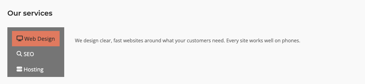
Tabs position
Top, Right, Bottom or Left of the content panel. Right and Left give you vertical tabs beside the panel. Default: Top.
Tabs mobile position
Shows when Tabs position is Right or Left. On small screens, Above moves the tabs above the panel and Below moves them under it. The tabs then fill the full width. Default keeps the tabs at the side. The Responsive Breakpoint global setting sets the screen width where this applies.
Tabs
Icon location
Shows the title icon or image to the Left or Right of the tab title. Default: Left.
Font
The font of the tab titles. You can choose a Google Font. Default: the theme font.
Font size
The size of the tab titles. Default: 16px.
Border radius
Rounds the top left, top right, bottom right and bottom left corners of each tab.
Padding
The space inside each tab: top, right, bottom and left. Default: 15px 15px 15px 15px.
Margin
The space around each tab: top, right, bottom and left. Default: 0px 5px 0px 5px.
Panels
Font
The font of the panel content. You can choose a Google Font. Default: the theme font.
Font size
The size of the panel content text. Leave it empty for 16px.
Border radius
Rounds the top left, top right, bottom right and bottom left corners of the panel area.
Padding
The space inside the panel: top, right, bottom and left. Default: 30px 30px 30px 35px.
Global Settings
Go to PluginsSiteOrigin Widgets and click Settings on the Tabs widget. The addon adds one setting to this form.
Responsive Breakpoint
The screen width at and below which Tabs mobile position applies. Default: 780px.
Link to a Tab
To open a tab from a link, activate the Anchor ID addon. It adds Add anchor ID in the URL and Anchor ID to the Tabs widget, above Design.
Related
- Tabs widget
- Widget Settings: global settings and responsive breakpoints.
- Anchor ID: link to a tab.
- Accordion: similar settings for the Accordion widget.
- Building a Page