
 Page Builder
  Widgets Bundle
  SiteOrigin CSS
  Installer
 Call To Action
2 min read Updated
The Call-To-Action addon adds an image and more layout control to the free Call To Action widget. Put the image behind the text as a background, or beside the text on the left or right. You can also set the padding of the box and the vertical alignment of the text next to a side image.
For the widget’s other settings, see the Call To Action widget documentation.
Requirements
- SiteOrigin Premium
- SiteOrigin Widgets Bundle, with the Call To Action widget
Go to SiteOriginPremium Addons and activate Call-To-Action. This also activates the Call To Action widget.
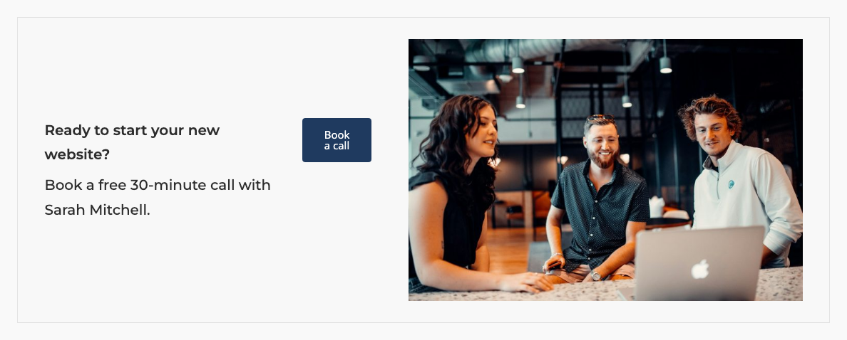
Image Settings
The addon adds an Image section to the Design section, below Layout.
Image
Choose an image from the Media Library, or enter an external URL. The other image settings have no effect until you set an image.
Image Display
Where the image shows. Default: Background Image.
- Background Image: the image fills the box behind the title, subtitle and button.
- Right of Text: the image shows to the right of the title, subtitle and button.
- Left of Text: the image shows to the left of the title, subtitle and button.
Background Style
Shows when Image Display is Background Image. Default: Cover.
- Cover: the image covers the whole box. Parts of the image can be cut off.
- Contain: the whole image shows, scaled to fit in the box. At the moment, copies of the image fill the rest of the box.
- Fixed: the image covers the box and stays in place while the page scrolls.
- Parallax: the image moves more slowly than the page when a visitor scrolls. It works without Page Builder. If Page Builder is active, Parallax works only when its Parallax Type is Modern, the default for new sites. Check it at SettingsPage Builder.
Gutter
The space between the image and the text. It also sets the space between the text and the button. Shows when Image Display is Right of Text or Left of Text. Default: 25px.
Image Size
The WordPress image size to use. Choose a smaller size to load a smaller file. Default: Full.
Layout Settings
The addon adds two settings to Design > Layout, below Mobile Button Align.
Content Vertical Alignment
Aligns the text and the button to the Top, Center or Bottom of the image. Shows when Image Display is Right of Text or Left of Text. It applies on screens at least as wide as the widget’s Responsive Breakpoint (a global setting of the Call To Action widget, default 780px). Default: Center.
Padding
The space inside the box: top, right, bottom and left, in px, % or em. It applies with or without an image. Default: 2em 2.5em 2em 2.5em.
Related
- Call To Action widget
- Button widget
- Page Builder settings: Parallax Type.
- Parallax Sliders: parallax backgrounds for the slider widgets.