 Page Builder
  Widgets Bundle
  SiteOrigin CSS
  Installer
 Image Overlay
Add beautiful, customizable hover text overlays with animations to your images. Hover overlays are great for galleries, portfolios, or any image that would benefit from displaying information on hover.
The Image Overlay Addon is available for the following SiteOrigin widgets:
- Image Widget
- Image Grid Widget
- Simple Masonry Widget
View the Image Overlay Addon demo.
Requirements
- SiteOrigin Premium Plugin
- SiteOrigin Widgets Bundle Plugin
- Optional: Page Builder by SiteOrigin Plugin
To make use of this addon, go to SiteOriginPremium Addons, locate Image Overlay, and click the Activate button. Next, go to PluginsSiteOrigin Widgets to activate the SiteOrigin Image, SiteOrigin Image Grid, and SiteOrigin Simple Masonry Widgets, assuming you’d like to use them all.
Usage
Global Settings
To edit the Image Overlay global settings, go to SiteOriginPremium Addons, locate the Image Overlay Addon, and click the Settings button. There you’ll find the following settings:
Enabled Widgets
Choose whether to automatically enable the image overlay for all instances of the following widgets:
- SiteOrigin Image Widget
- SiteOrigin Image Grid Widget
- SiteOrigin Simple Masonry Widget
If a widget is disabled, you can still manually enable the image overlay on a widget-by-widget basis.
Preset Themes
Optionally choose between two preset themes, Dark or Light. This will override some or all of the below global settings.
Delay Before Showing Overlay (In Milliseconds)
Set the delay after hovering before the overlay appears in milliseconds, 350 is the default.
Overlay Color
Select the overlay background color, defaults to black #000000.
Overlay Opacity
Select the overlay opacity, defaults to 0.8.
Overlay Position
Select the overlay position, defaults to Bottom. Choose from the following options: Top, Right, Bottom, or Left.
Overlay Size
Enter the size of the overlay as a fraction of the image’s size. Defaults to 0.2.
Desktop Device Trigger
When to display the overlay on desktop (non-mobile) devices. Choose between:
- Show on hover.
- Hide on hover.
- Always show.
Touch Device Show Trigger
When to display the overlay on touch devices. Choose between Shown on touch and Always show.
Touch Device Width
Device width in pixels. Controls when the touch show trigger takes effect. Defaults to 1024px.
Overlay Animation
Select the overlay animation—defaults to Fade. Choose from the following options: None, Fade, Slide, or Drop.
Animate Overlay When Image Enters Screen
Requires the applicable device trigger (either Desktop device trigger or Touch device trigger or both) to be set to Always show.
Font Family
Select the font family to be used for the overlay text. Defaults to the theme font. Choose from a list of over 900 beautiful Google Web Fonts.
Text Size
Enter the text size. Defaults to 15px.
Text Color
Select the text color. Defaults to white #ffffff.
Text Padding
Enter the text padding for the top, right, bottom, and left. Defaults to 22px.
Text Position
Select the text position—defaults to Middle. Choose between Top, Bottom, or Middle.
Text alignment
Select the text alignment—defaults to Left. Choose between Left, Right, or Center.
Text Animation
This is a secondary animation that will be triggered after the overlay animation finishes playing. Defaults to None. Choose from the following options: None, Left, Slide Left, Slide Right, Slide Up, Slide Down, or Drop.
Widget Settings
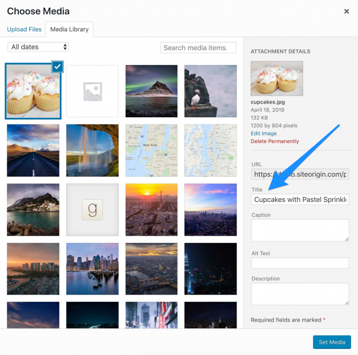
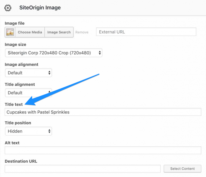
The image title is used for the overlay text and can be inserted in two locations:
- Media Library Image Title Field: Edit the image in the Media Libary and insert the text in the Title field provided.
- Widget Image Title Title Field: Edit the widget used and insert the text in the Title text field provided.
If both title fields are used, the widget image title will take precedence.
The SiteOrigin Image, Image Grid, and Simple Masonry Widgets can be inserted into the following areas:
- Theme Widget Areas
- Page Builder by SiteOrigin
- Other Supporting Page Builders: Beaver Builder, Elementor
- Block Editor: SiteOrigin Layout and SiteOrigin Widget Blocks
Once your widget has been inserted, scroll down to the bottom to locate the Image Overlay section. There you’ll find the following settings:
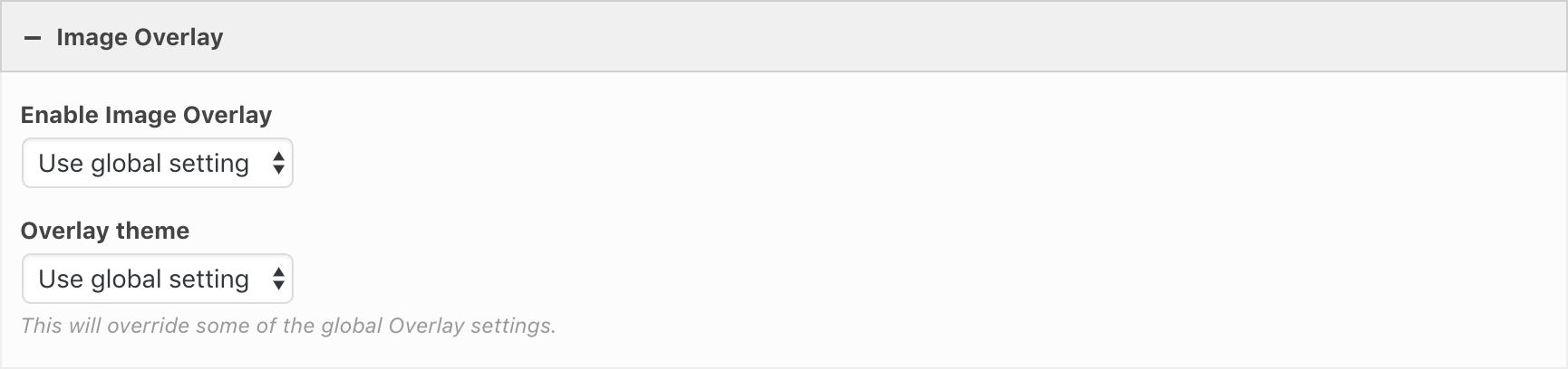
Enable Image Overlay
Choose between Use global setting, Enabled, or Disabled.
Overlay Theme
Choose between Use global setting, Light or Dark. Using this setting will override some of the global overlay settings.
Quick Tour Screencast
The following screencast is a quick tour showing the Image Overlay Addon used with the SiteOrigin Image widget. The process is very similar to the SiteOrigin Image Grid Widget and Simple Masonry widgets.
Advanced Customizations
The following functions can be applied using a child theme, custom plugin, or the Code Snippets plugin.
Use the Alt Tag for the Overlay Text
Use the image alt text for the overlay text instead of the title.
function so_image_overlay_use_alt( $data, $instance, $widget ) {
	if ( ! empty( $instance['alt'] ) ) {
		$overlay_settings = json_decode( $data['overlay-settings'], true );
		$overlay_settings['overlay_text'] =  $instance['alt'];
		$data['overlay-settings'] = json_encode( $overlay_settings );
	}
	return $data;
}
add_filter( 'siteorigin_premium_image_overlay_wrapper_data', 'so_image_overlay_use_alt', 10, 3 );