
 Page Builder
  Widgets Bundle
  SiteOrigin CSS
  Installer
 Tooltip
3 min read Updated
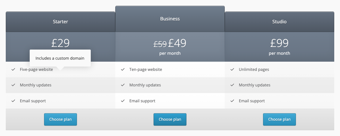
The Tooltip addon shows a short text in a styled box when a visitor points at or clicks an image, an icon, a button or a price table feature. It works with seven SiteOrigin widgets: Button, Features, Icon, Image, Image Grid, Price Table and Simple Masonry. For the widgets’ other settings, see their documentation.
Requirements
- SiteOrigin Premium
- SiteOrigin Widgets Bundle, with one or more of the seven widgets above
Go to SiteOriginPremium Addons and activate Tooltip. This also activates the Price Table widget. The Image and Button widgets are active by default. To use the tooltip with Features, Icon, Image Grid or Simple Masonry, activate those widgets at PluginsSiteOrigin Widgets.
Tooltip Text
Each widget takes the tooltip text from one of its fields. An item with no text gets no tooltip.
- Button: the Tooltip Text field in the Tooltip section. The addon adds this field.
- Features: the Icon title of each feature. The tooltip shows on the feature icon.
- Icon: the Title field.
- Price Table: the Hover text of each feature.
- Image, Image Grid and Simple Masonry: the image title. The widget takes it from the first of these that has text: the title field in the widget (Title text, Image title or Title), the image’s Caption in the Media Library, or the image’s Title in the Media Library. The widget doesn’t use a Media Library title that is the same as the file name.
Widget Settings
The addon turns the tooltip on for the Price Table widget by default. To change it for one widget, open the Tooltip section at the bottom of the widget form.
Enable Tooltip
Use global setting, Enabled or Disabled. Use global setting follows Enabled SiteOrigin Widgets in the global settings. Default: Use global setting.
Tooltip Theme
Use global setting, Light or Dark. Light is a light gray box with dark text. Dark is a dark gray box with white text. Hidden when Enable Tooltip is Disabled. Default: Use global setting.
Tooltip Text
Button widget only. The text in the tooltip. A Button widget with no tooltip text shows no tooltip. Hidden when Enable Tooltip is Disabled.
Global Settings
Go to SiteOriginPremium Addons and click Settings on the Tooltip card. These settings apply to every tooltip on the site.
Enabled SiteOrigin Widgets
The widgets that show tooltips by default: Button, Features, Icon, Image, Image Grid, Price Table and Simple Masonry. You can still turn the tooltip on or off in each widget. Default: Price Table.
Show tooltip on
Mouse over or Click. Default: Mouse over.
Delay before showing tooltip (in milliseconds)
The time between the pointer moving over the item and the tooltip showing. Shown only when Show tooltip on is Mouse over. Default: 500.
Hide tooltip on
Mouse out or Click. Mouse out hides the tooltip when the pointer leaves the item. Click hides it at the next click anywhere on the page. Default: Mouse out.
Tooltip position
Follow cursor, Center, Top or Bottom. Follow cursor places the tooltip above the pointer and moves it with the pointer. Center, Top and Bottom place it in the middle of the item, above the item or below the item. Default: Follow cursor.
Theme
Light or Dark. Each widget can change this in Tooltip Theme. Default: Light.
Related
- Button widget
- Features widget
- Icon widget
- Image widget
- Image Grid widget
- Price Table widget
- Simple Masonry widget
- Image Overlay: shows the image title in an overlay on the image.