
 Page Builder
  Widgets Bundle
  SiteOrigin CSS
  Installer
 Button
6 min read Updated
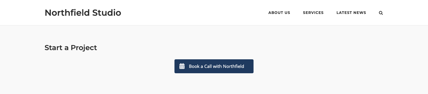
The Button Widget adds a single button that links to a page, a file or any URL. You can add an icon or image, choose from three button themes and set colors, fonts, size and rounding. It also has settings for IDs, classes and click tracking.
Requirements
The Button Widget is active by default. If you turned it off, go to PluginsSiteOrigin Widgets, find Button and click Activate.
You can use the Button Widget in these places:
Page Builder: Add the widget in Page Builder by SiteOrigin, in the Classic Editor or in the Page Builder Layout Block in the Block Editor.
Block Editor: Add the SiteOrigin Button block. You find it in the SiteOrigin block category.
Theme and Plugin Widget Areas: Add the widget to any theme or plugin widget area.
To show several buttons side by side, use the Button Grid Widget.
Setup Video
This video adds a Button Widget in Page Builder, sets the text, link and icon, and shows the button on the front end.
Settings
Button Text
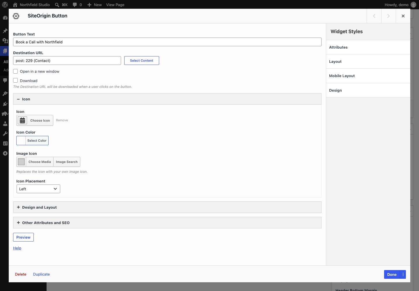
The text on the button. Leave it empty to make an icon-only button.
Destination URL
The link for the button. Click Select Content to find a page or post on your site, or enter any URL. This field also runs shortcodes.
Open in a new window
Opens the link in a new tab or window. Default: off.
Download
Adds the download attribute to the link. This asks the browser to download the file at the Destination URL instead of opening it. Browsers can ignore it for files on other sites. Default: off.
Icon
Icon
An icon from the icon picker.
Icon Color
The icon color. If you leave it empty, the icon uses the text color.
Image Icon
Your own image. It replaces the icon.
Icon Placement
Where the icon shows next to the text: Top, Right, Bottom or Left. Default: Left.
Design Settings
Open the Design and Layout section.
Width
The button width, with a unit such as px or %. Leave it empty to let the button fit its content.
Align
The button position: Left, Right, Center or Full Width. Default: Center. When Width is empty, Full Width makes the button fill its container.
Mobile Align
The button position on small screens: Left, Right, Center or Full Width. Default: Center. The widget uses it at and below the Responsive Breakpoint in the global settings.
Button Theme
The button style. Default: Flat.
- Atom: A soft top-to-bottom gradient in the button color.
- Flat: A solid button color.
- Wire: An outline button with a clear background. The border and text use the Button Color. With hover effects on, the button fills with the hover background color on hover.
Button Color
The main button color. Atom and Flat use it for the background. Wire uses it for the border and text. If you leave it empty, the widget uses blue (#41a9d5).
Text Color
The button text color. If you leave it empty, the text is white. The Wire theme uses the Button Color for its text.
Use hover effects
Turns on the hover style and shows the two hover color settings. Default: on.
Hover Background Color
The button color on hover. If you leave it empty, the widget uses the Button Color. Atom and Flat show it slightly lighter.
Hover Text Color
The text color on hover. If you leave it empty, the widget uses the Text Color.
Font
The font family. You can choose a web safe font or a Google Font. Default: Use theme font.
Font Size
The text size. Default: 1em.
Icon Size
The size of an icon from the icon picker. Default: 1.3em.
Padding
The space between the text and the edge of the button. Default: 1em. When the button has text, the left and right padding is twice this value.
Rounding
The corner rounding. The four fields, labelled Top, Right, Bottom and Left, set the top-left, top-right, bottom-right and bottom-left corners. Default: 0.25em for each corner.
Other Attributes and SEO
These settings are optional.
Button ID
An ID attribute for the button, so you can target it with CSS or JavaScript.
Button Classes
More CSS classes for the button link. Separate classes with a space.
Title Attribute
A title attribute for the button link. When a Premium tooltip is on and has text, the Tooltip Text replaces this value.
Onclick
A tracking call that runs when a visitor clicks the button, for example gtag('event', 'contact_click');. For security, the widget keeps only calls to functions on an allowlist, plus return false; and return;. The allowlist has common tracking functions, such as gtag, ga, fbq, dataLayer.push, plausible and fathom, and a few others, such as Calendly and Popup Maker calls. It removes other calls. If the value contains blocked code, such as alert or window, the widget removes the whole value. To allow another function, see Advanced Customizations.
Rel Attribute
A rel attribute for the button link, for example nofollow or sponsored. When Open in a new window is on, the widget adds noopener noreferrer as well.
Global Settings
Global settings apply to all Button Widgets on your site. Go to PluginsSiteOrigin Widgets, find Button and click Settings.
Responsive Breakpoint
The screen width at and below which the widget uses Mobile Align. Default: 780px.
SiteOrigin Premium
The SiteOrigin Premium Tooltip addon adds a Tooltip section to the Button Widget. It has three settings:
- Enable Tooltip: Use global setting (default), Enabled or Disabled.
- Tooltip Theme: Use global setting (default), Light or Dark.
- Tooltip Text: The text in the tooltip. The tooltip shows only when this field has text.
With the default addon settings, the tooltip is off for the Button Widget. To turn it on, set Enable Tooltip to Enabled, or add Button to Enabled SiteOrigin Widgets in the Tooltip addon settings.
For more information, see the Tooltip addon documentation.
Advanced Customizations
Style One Button With CSS
Enter a class in Button Classes, for example northfield-cta. Then add this CSS to your theme or to the Additional CSS section of the Customizer. Change the colors as you need.
.ow-button-base a.sowb-button.northfield-cta {
	background: #1f3a5f !important;
	border-color: #1f3a5f !important;
	color: #ffffff !important;
}

.ow-button-base a.sowb-button.northfield-cta.ow-button-hover:hover {
	background: #e07a5f !important;
	border-color: #e07a5f !important;
}
Change the Button Attributes
The siteorigin_widgets_button_attributes filter changes the HTML attributes of the button link. It passes two values: $button_attributes, an array of attributes, and $instance, the widget settings. Return the changed array.
This example adds an aria-label and a data attribute. Add it to your child theme’s functions.php file.
add_filter( 'siteorigin_widgets_button_attributes', function( $button_attributes, $instance ) {
	$button_attributes['aria-label'] = ! empty( $instance['text'] ) ? $instance['text'] : 'Button';
	$button_attributes['data-custom'] = 'my-custom-value';

	return $button_attributes;
}, 10, 2 );
The widget escapes each attribute value when it outputs the button.
Allow Another Onclick Function
The siteorigin_widgets_onclick_allowlist_functions filter changes the list of functions that the Onclick field keeps. Enter the function name in lowercase. This example allows mytracker().
add_filter( 'siteorigin_widgets_onclick_allowlist_functions', function( $functions ) {
	$functions[] = 'mytracker';

	return $functions;
} );