
 Page Builder
 Widgets Bundle
 SiteOrigin CSS
 Installer
Image Shape
3 min read Updated
The Image Shape addon adds more shapes to the Image Shape section of the SiteOrigin Image widget. It adds 43 shapes, a custom shape from your own image, and a drop shadow that can change when a visitor hovers over the image. For the widget’s other settings, including the free Image Shape settings, see the Image widget documentation.
Requirements
- SiteOrigin Premium
- SiteOrigin Widgets Bundle, with the Image widget
Go to SiteOriginPremium Addons and activate Image Shape. The Image widget is active by default. If you turned it off, activate it at PluginsSiteOrigin Widgets.
Usage
- Edit an Image widget and add an image.
- Open the Image Shape section and check Enable.
- Click Choose Shape and select a shape. To filter the list, type part of a shape name, such as blob or arrow, in Search Shapes.
- Set the shadow in the Shadow and Shadow Hover sections, if you want one.
Shapes
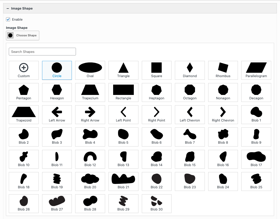
The Widgets Bundle has nine shapes: Circle, Oval, Triangle, Square, Diamond, Rhombus, Parallelogram, Pentagon and Hexagon. The addon adds these shapes to the list:
- Custom
- Trapezium, Rectangle, Heptagon, Octagon, Nonagon, Decagon and Trapezoid
- Left Arrow, Right Arrow, Left Point, Right Point, Left Chevron and Right Chevron
- Blob 1 to Blob 30: 30 irregular, rounded shapes
The free Repeat, Size and Alignment settings work with all shapes.
Custom Shape
Select Custom, the first shape in the list, to use your own image as the shape. The Custom Shape field then shows below the shape.
Custom Shape
Choose an image from the Media Library. Or leave it empty and enter the address of an image in the External URL field. Use an image with a transparent background, such as a PNG file. The photo shows only where the shape image is solid. If you don’t set an image, the widget uses the Circle shape.
Shadow
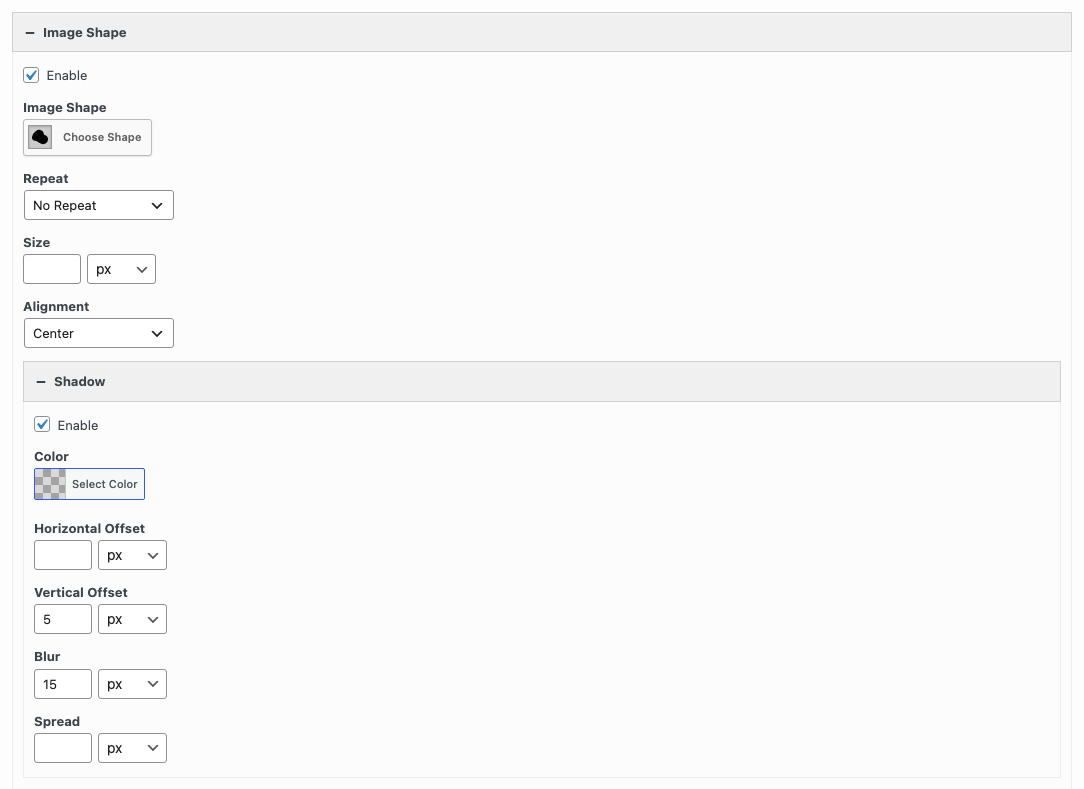
The Shadow section adds a drop shadow that follows the edge of the shape. It shows inside the Image Shape section when Enable is checked there. Check Enable in the Shadow section to show its settings.
Color
The shadow color. Use the slider in the color picker to set the opacity. Default: black at 15% opacity.
Horizontal Offset
A positive value moves the shadow to the right. A negative value moves it to the left. Default: 0.
Vertical Offset
A positive value moves the shadow down. A negative value moves it up. Default: 5px.
Blur
The higher the value, the softer the shadow. Default: 15px.
Don’t use the % unit in these three settings. A % value removes the shadow.
Spread
Leave this field empty. At the moment, any value in Spread, including 0, removes the shadow.
Shadow Hover
The Shadow Hover section sets the shadow that shows when a visitor hovers over the widget. The shadow changes over 0.3 seconds. It has the same settings as the Shadow section. The default Color is black at 30% opacity. The other defaults are the same.
You can enable Shadow Hover without Shadow. The image then has no shadow until a visitor hovers over it.
Related
- Image widget
- Image Overlay: shows the image title in an overlay on the image.
- Lightbox: opens the image in a lightbox.
- Tooltip: shows the image title in a tooltip.