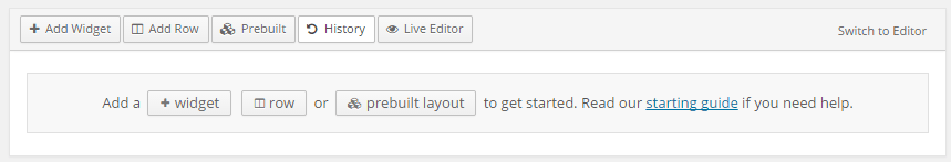
 Page Builder
  Widgets Bundle
  SiteOrigin CSS
  Installer
 Building a Page
I’m assuming you’ve already read the getting started guide. This guide will help you with the more advanced concepts of building a page using Page Builder.
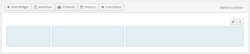
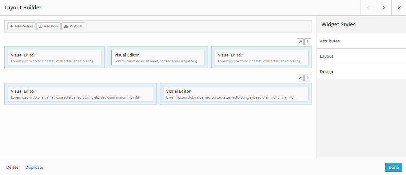
Adding a Row
Rows form the overall structure of your page layout. These are the first things you will add to your page. To add a row, click on “Add Row.”
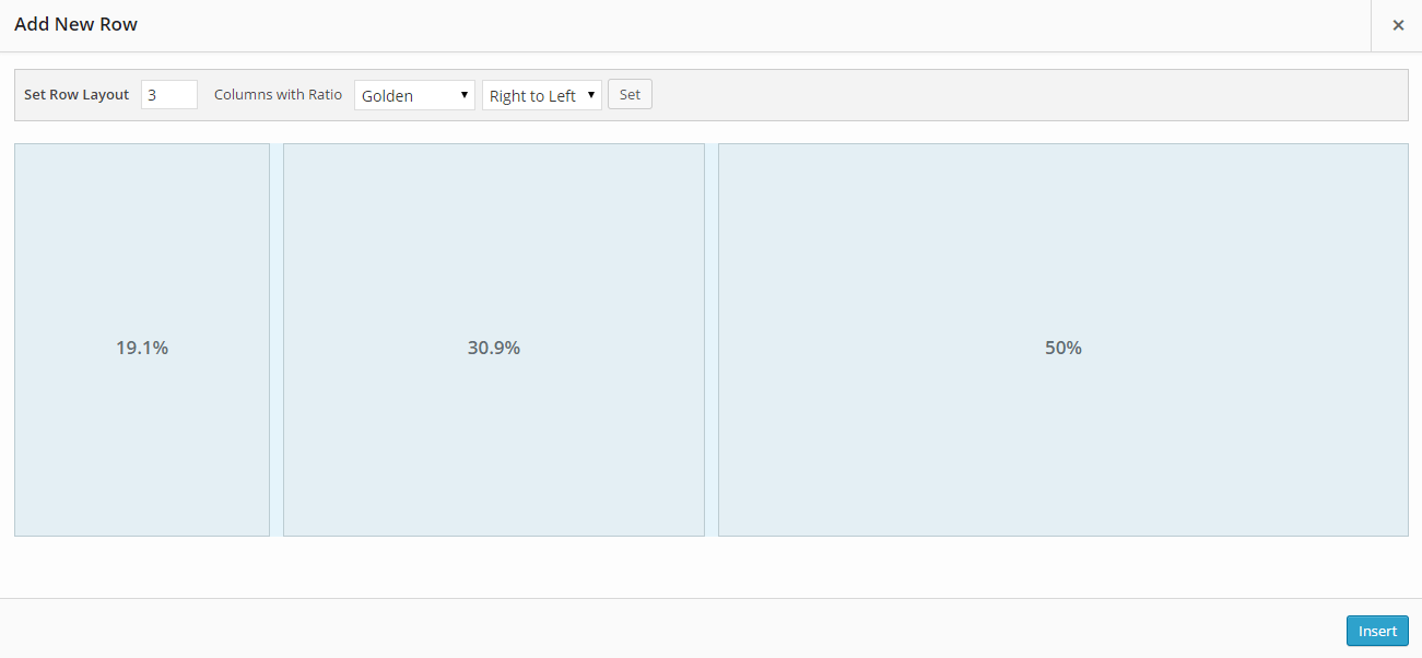
An “Add New Row” dialog will appear.
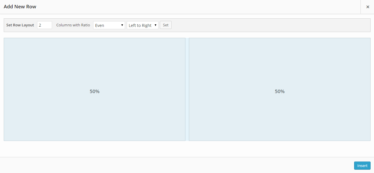
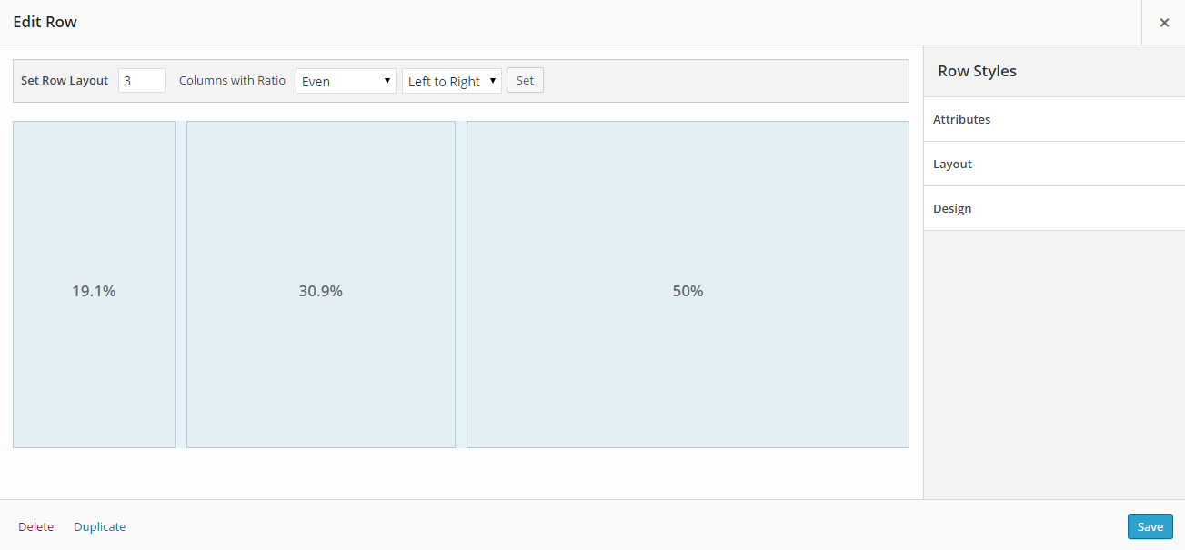
Set Row Layout
You can set the row layout by selecting the number of cells in the row, the cell ratio, and the direction to apply that ratio — left or right. Page Builder will update the layout as you change these values, or you can click “set” to set the layout.
The example below is a 3-cell layout with an even ratio from left to right.

This next example is a 3-cell layout using a golden ratio from right to left. Right to left means the cells with the largest width are on the right side, and subsequent cells are, according to the ratio, narrower.
Once you’re happy with the layout of your new row, click on “Insert” to add the row to your page.
Deleting a Row
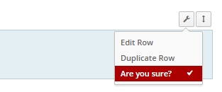
To delete a row, hover over the spanner icon in the top right corner above that row. A drop down menu will appear with options to Edit, Duplicate or Delete. Click on “Delete Row,” and then confirm this action by clicking on “Are you sure?”
Editing a Row
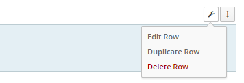
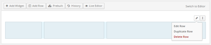
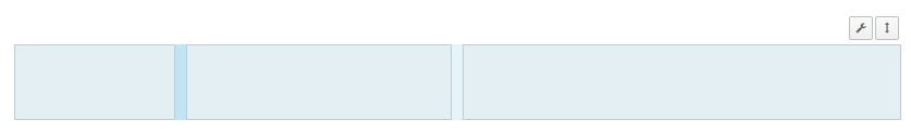
To edit an existing row, click on the spanner icon in the top right corner above that row.
This opens the “Edit Row” dialog.
Manually Editing Cell Widths
The cell widths can be manually adjusted in two ways.
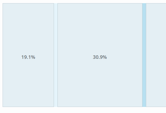
It can be done by dragging the dividing bar between two cells. Drag the bar left or right to increase and decrease the cell’s width. Click “Save” to apply your changes.
You can also adjust the cell widths outside the edit dialog, in the main builder view. However, Page Builder won’t display numerical values indicating cell widths.
Page Builder also lets you directly enter cell widths in the row edit dialog. Click on the percentage indicator in the first cell (moving left to right). Enter a width as a percent. Push enter or tab to move to the next cell. When you reach the last cell, pushing enter will tell Page Builder to set the widths.
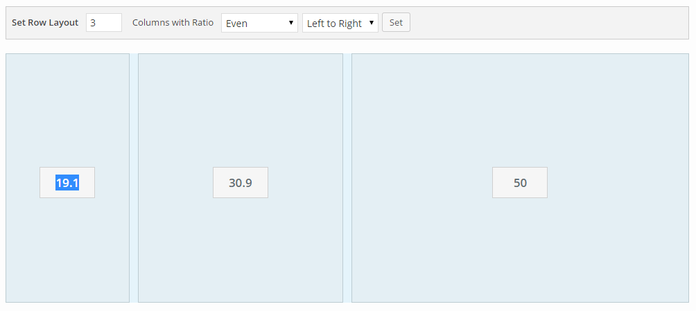
In the example above, I adjusted 19.1 to 25 and pushed enter, 30.9 to 35 and pushed enter, and, lastly, 50 to 40 and pushed enter to set the new widths.
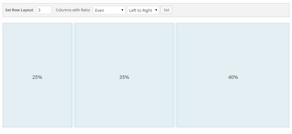
Clicking “set” in the “Set Row Layout” block will restore your layout to a ratio-based layout. Once you’re done editing your row, click “Save.”
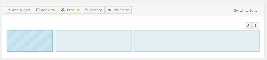
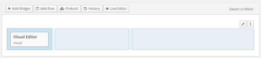
Adding a Widget
To add a widget, first activate the row cell to which you wish to add a widget. Once you have selected a row cell, click on “+ Add Widget.”
If you begin creating your post or page by adding a widget without having first created a row, this will automatically add a single cell row to your page containing the chosen widget.
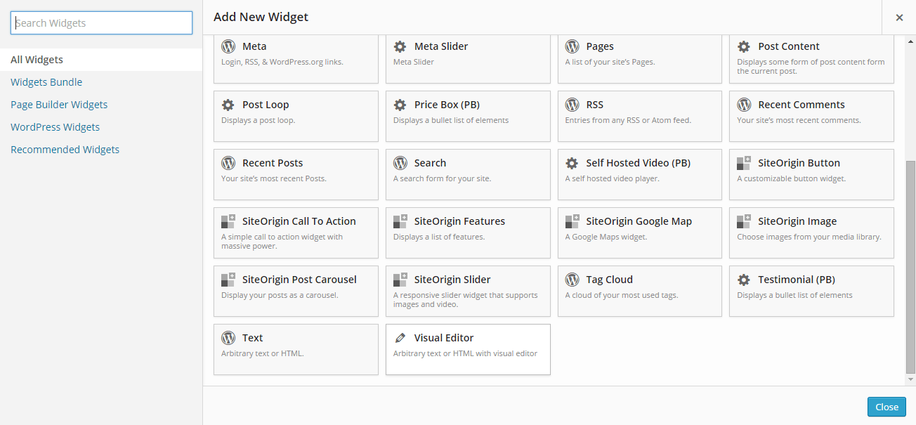
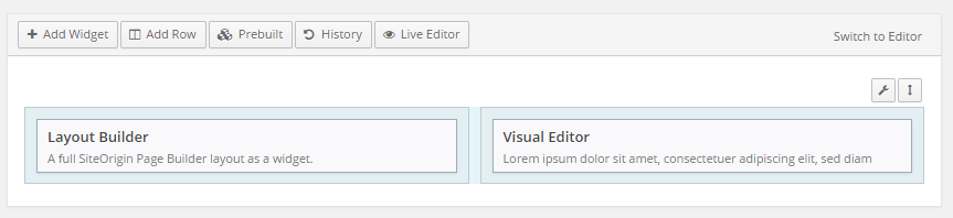
Clicking the “+ Add Widget” button will open an “Add New Widget” dialog with a table of all available widgets. You can filter the widgets according to their “origin, creator,” in this instance, Widgets Bundle Widgets, Page Builder Widgets, WordPress Widgets, and Recommended Widgets. Filter by clicking on each of the links respectively.
To select a widget, simply click on it. The widget will now appear in the selected row cell.
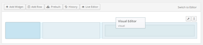
To move the widget, click, hold and drag it to a new cell. Letting go will position the widget in the chosen cell.
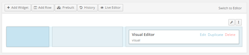
Hovering over the widget will display the widget options, namely Edit, Duplicate or Delete.
Using the Layout Widget
The Layout Widget gives you the full functionality of Page Builder in a simple widget. This allows you to create complex layouts, nested layouts and bring the power of Page Builder to your sidebars, footers and other widgetized areas.
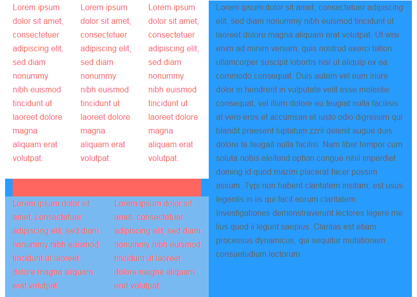
The example we give below illustrates the complex layout possibilities. We added a Layout Widget to the first column of a two-column row and filled it with placeholder text. To clarify what’s going on, we gave it a blue background (#289BFF).
In the Layout Widget, edit dialog shown below, the background color of the Layout Widget and the text color were adjusted to pink (#FF665F) under the Widget Styles > Design Tab.
We added 2 rows – one three-column row and a second two-column row. We filled this layout with placeholder visual editors.
The background colors of the three-column row and two-column row were set to white and light blue (#79B9F1), respectively. The resulting layout is displayed below: