
 Page Builder
  Widgets Bundle
  SiteOrigin CSS
  Installer
 Social Widgets
3 min read Updated
The Social Widgets addon adds a Custom Networks section to the SiteOrigin Social Media Buttons widget. Use it to add a button for a network that isn’t in the widget’s list, or to use your own icon or image for a network. For the widget’s other settings, see the Social Media Buttons documentation.
Requirements
- SiteOrigin Premium
- SiteOrigin Widgets Bundle, with the Social Media Buttons widget
Go to SiteOriginPremium Addons and activate Social Widgets. This also activates the Social Media Buttons widget.
Add a Custom Network
- Open the Social Media Buttons widget form.
- Find the Custom Networks section, below Networks and above Design and Layout.
- Click Add, then click the new New Network item to open it.
- Enter a Name and a URL.
- Choose an Icon, or choose an Icon image.
- Set the colors, then save the widget.
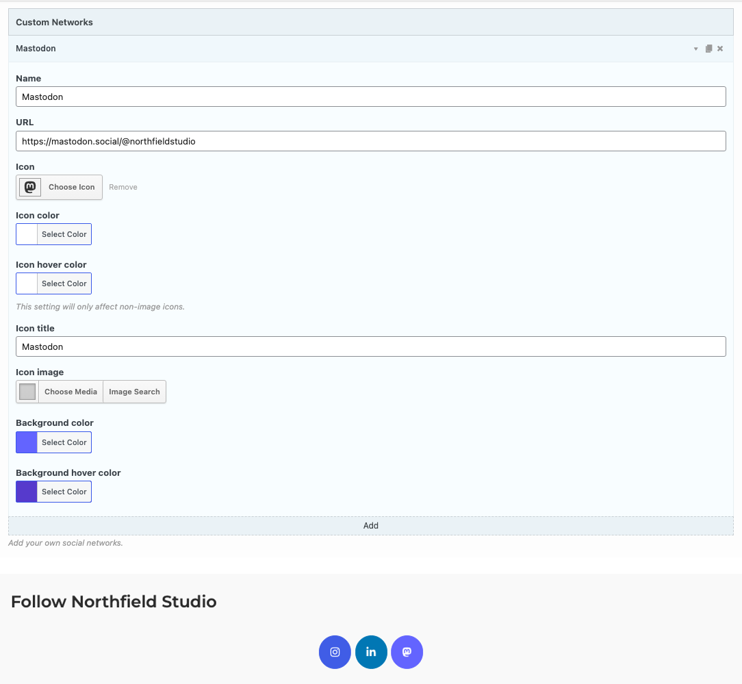
The custom buttons show after the buttons from Networks, in the order of the Custom Networks list. They use the Design and Layout settings of the widget, such as Button theme, Icon size and Open in a new window.
Always enter a Name. At the moment, a network with an Icon image and no Name shows two broken buttons. Also, an Icon image doesn’t show when the Name starts with “On”. For such a network, use a Name that doesn’t start with “On”, and enter the button title you want in Icon title.
Custom Network Settings
Name
The name of the network. The widget uses it in the default button title: “Site name on Name”, for example “Northfield Studio on Mastodon”. Spaces in the Name show as underscores in that title. To set your own title, use Icon title.
URL
The link for the button, for example your profile page on the network.
Icon
The icon for the button. Choose it from the icon families in the icon picker. Each network needs an Icon or an Icon image. Without one, the button shows empty.
Icon color
Default: #fff.
Icon hover color
The icon color when the pointer is over the button. It affects the Icon only, not the Icon image. Shows only when Use hover effects is on in Design and Layout. Leave it empty to keep the Icon color.
Icon title
The button’s title and its label for screen readers. Browsers show the title when the pointer rests on the button. Leave it empty to use the default title.
Icon image
An image from the Media Library to use in place of the Icon. The image shows as a square at the size of the icon, and it fills the square. Use a square image. The widget uses the image’s thumbnail size.
Background color
The button color. Default: #000000.
Background hover color
The button color when the pointer is over the button. Shows only when Use hover effects is on. Leave it empty to keep the Background color.
Border color
Shows only when Button theme is Wire.
Border hover color
The border color when the pointer is over the button. Shows only when Button theme is Wire. Leave it empty to keep the Border color.
Related
- Social Media Buttons widget
- Author Box: shows social media buttons in an author box.