
 Page Builder
  Widgets Bundle
  SiteOrigin CSS
  Installer
 Lightbox
5 min read Updated
The Lightbox Addon opens images in a lightbox when a visitor clicks them. The lightbox shows the full-size image over a dark overlay, with a caption and arrows to move between images. It works with four SiteOrigin widgets: Image, Image Grid, Simple Masonry and Image Slider. For the widgets’ other settings, see their documentation.
Requirements
- SiteOrigin Premium
- SiteOrigin Widgets Bundle, with the Image, Image Grid, Simple Masonry or Image Slider Widget
Go to SiteOriginPremium Addons and activate Lightbox. This also activates the four widgets.
Widget Settings
The lightbox is off by default. To turn it on for a widget, open the Lightbox section at the bottom of the widget form and check Enable Lightbox.
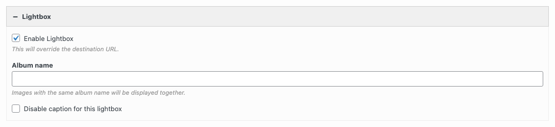
Enable Lightbox
Opens the images in a lightbox. The lightbox link replaces the destination URL of each image. Default: off.
Album name
Groups images from several widgets on the page into one album. Give each widget the same album name. The addon saves the name in lowercase with dashes and shows it with each word capitalized. The name shows with the image number in the lightbox, for example “Harrogate Bakery 2 of 6”.
Disable caption for this lightbox
Hides the caption in this widget’s lightbox. At the moment, the image number still shows. Default: off.
Albums
The images in one Image Grid, Simple Masonry or Image Slider Widget form one album. Visitors move between them with the arrows or the arrow keys. An Image Widget shows one image. To put several widgets in one album, give them the same Album name.
Which Image Shows
The lightbox shows the full-size image from the Media Library, or the image from the External URL field. In the Image Slider Widget, it shows the frame’s Foreground image. If the frame has no foreground image, it shows the Background image. A frame with a background video and no foreground image doesn’t open a lightbox.
Captions
The caption is the first of these that has text:
- The title field in the widget: Title text in the Image Widget, Image title in each Image Grid image, or Title in each Simple Masonry image.
- The image’s Caption in the Media Library.
- The image’s Title in the Media Library.
The Image Slider Widget has no title field, so it uses the Media Library caption, then the title. At the moment, when a frame has both images, the caption comes from the background image.
Global Settings
Go to SiteOriginPremium Addons and click Settings on the Lightbox card. These settings apply to every lightbox on the site. The form shows them in one list, in the order below. The headings on this page only group them.
Devices
Always show navigation controls on touch devices
The previous and next arrows show when the pointer is over the image. Touch screens have no pointer, so the arrows stay hidden, but a tap on the left or right side of the image still works. This setting shows the arrows at all times on touch screens, in albums with two or more images. Default: off.
Disable on tablet
Turns off all lightboxes on screens between the mobile width and the tablet width. On these screens, the images don’t respond to a click or tap. Default: off.
Disable on mobile
Turns off all lightboxes on screens at or below the mobile width. On these screens, the images don’t respond to a click or tap. Default: off.
With Page Builder active, the addon uses the Tablet Width and Mobile Width from SettingsPage Builder, on the Layout tab. Without Page Builder, it uses 1024px and 780px.
Disable page scrolling when the lightbox is open
Stops the page from scrolling behind the lightbox. Default: off.
Overlay
Overlay color
The color behind the lightbox. Default: #000.
Overlay opacity
From 0 (clear) to 1 (solid). Default: 0.8.
Fade duration
The time, in milliseconds, for the lightbox and overlay to fade in and out. Default: 600.
Image Size and Position
Fit images in viewport
Makes large images smaller so that they fit on the screen. Default: on.
Image fade duration
The time, in milliseconds, for an image to fade in after it loads. Default: 600.
Max image height (in pixels)
The largest height of a lightbox image. Leave it empty for no limit.
Max image width (in pixels)
The largest width of a lightbox image. Leave it empty for no limit.
Top offset
The distance, in pixels, from the top of the screen to the lightbox. Default: 50.
Resize duration
The time, in milliseconds, for the lightbox to change size when the next image has a different size. Default: 700.
Captions and Navigation
Show image number label
Shows the image number and the number of images in the album, for example “2 of 6”. It shows only in albums with two or more images. Default: on.
Disable captions for all lightboxes
Meant to hide the captions in every lightbox. At the moment, it hides the image number label, and the captions still show. To hide captions, check Disable caption for this lightbox in each widget. Default: off.
Wrap around
After the last image, the next arrow goes back to the first image. Default: on.
Related
- Image Widget
- Image Grid Widget
- Simple Masonry Widget
- Image Slider Widget
- Lightbox Builder: opens any content, not only images, in a lightbox.
- Image Overlay: shows the image title in an overlay on the image.