
 Page Builder
  Widgets Bundle
  SiteOrigin CSS
  Installer
 Social Media Buttons
6 min read Updated
The Social Media Buttons Widget adds a row of icon buttons that link to your social profiles, email address or phone number. Choose from 60 built-in networks, set the colors for each button and pick one of three button themes.
Requirements
To use this widget, go to PluginsSiteOrigin Widgets, find Social Media Buttons and click Activate.
You can use the Social Media Buttons Widget in these places:
Page Builder: Add the widget in Page Builder by SiteOrigin, in the Classic Editor or in the Page Builder Layout Block in the Block Editor.
Block Editor: Add the SiteOrigin Social Media Buttons block. You find it in the SiteOrigin block category.
Theme and Plugin Widget Areas: Add the widget to any theme or plugin widget area, for example a footer or sidebar.
Setup Video
This video adds a Social Media Buttons Widget in Page Builder, adds four networks and shows the buttons on the front end.
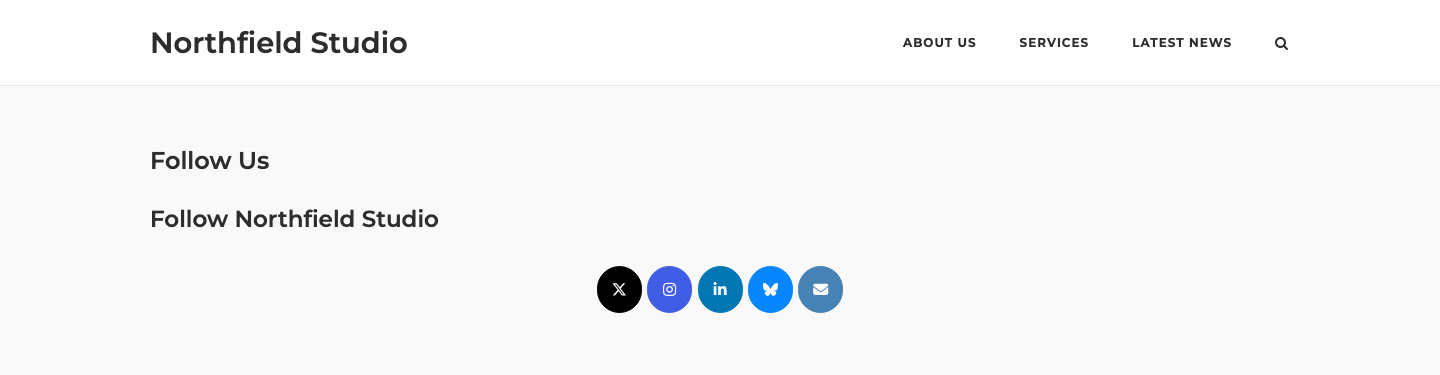
- Add the Social Media Buttons Widget to your page or widget area.
- Under Networks, click Add.
- Select a network, for example X (Twitter).
- In URL, enter the full address of your profile, for example
https://x.com/northfieldstudio. - Repeat for each network, then save.
Settings
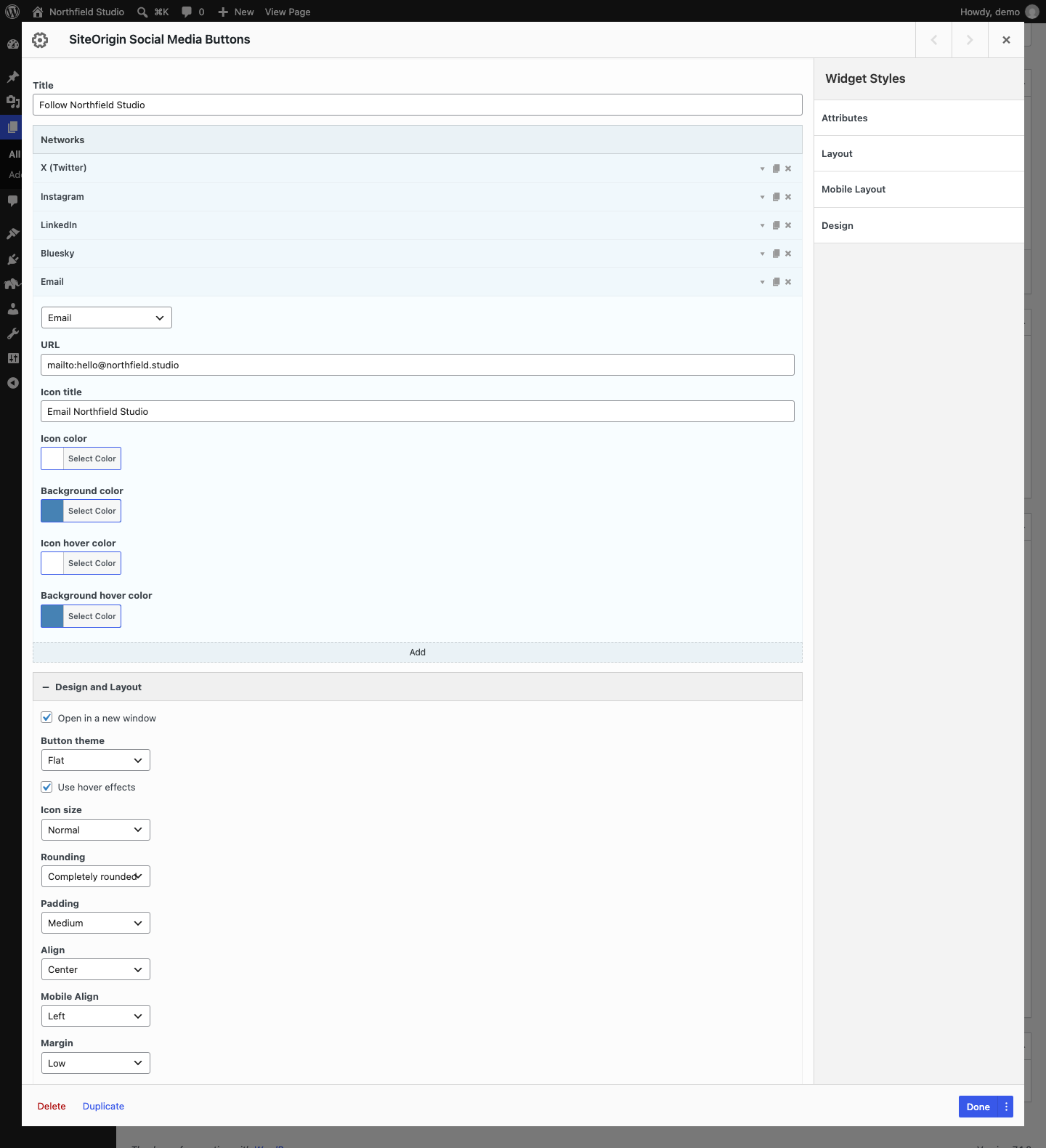
Title
An optional title that shows above the buttons.
Networks
Each item in this list is one button. Click Add to add a network. Each item has three icons on the right: the arrow opens the item settings, the page icon duplicates the item and the cross deletes it. Drag an item to change the button order.
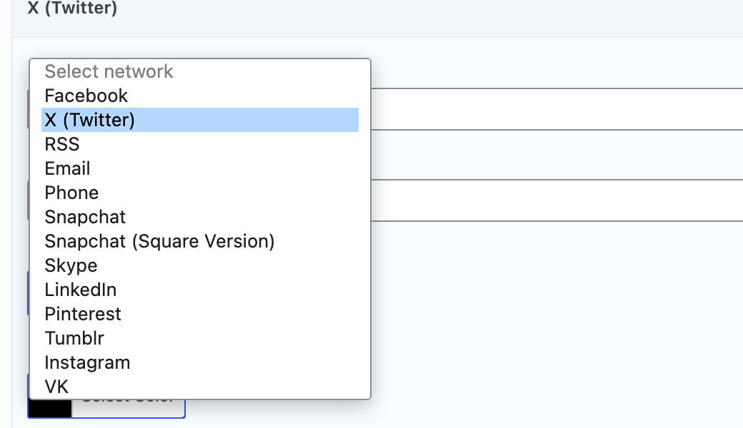
Select network
The drop-down list at the top of each item. When you select a network, the widget fills in the URL with the network’s base address and sets the network’s standard Icon color and Background color.
URL
The link for the button. Replace the base address with the full URL of your profile, for example https://www.linkedin.com/company/northfield-studio. For Email, the widget fills in mailto:; add your address after it, for example mailto:[email protected]. For Phone, it fills in tel:; add your number after it.
Icon title
The text for the link’s title and aria-label attributes. Screen readers read it, and some browsers show it when a visitor hovers over the button. If you leave it empty, the widget uses your site name and the network, for example “Northfield Studio on Instagram”. For an Email button, enter your own title, for example “Email Northfield Studio”.
Icon color
The icon color.
Background color
The button color. This setting works with or without hover effects.
Border color
The button border color. This setting shows only when Button theme is Wire.
Icon hover color
The icon color on hover. This setting shows only when Use hover effects is on.
Background hover color
The button color on hover. This setting shows only when Use hover effects is on.
Border hover color
The border color on hover. This setting shows only when Button theme is Wire.
Available Networks
The Select network list has 60 options:
- X (Twitter)
- RSS (links to your site’s RSS feed)
- Phone
- Snapchat
- Snapchat (Square Version)
- Skype (shows the Microsoft logo)
- Tumblr
- VK
- Flickr
- 500px
- AngelList
- Bandcamp
- Behance
- Bitbucket
- Blogger
- Bluesky
- Codepen
- Delicious
- deviantArt
- Discord
- Dribbble
- Dropbox
- Github
- GitLab
- Goodreads
- Hacker News
- IMDb
- JSFiddle
- Last.fm
- Patreon
- Slack
- Slideshare
- Soundcloud
- Spotify
- Stack Exchange
- Stack Overflow
- Steam
- Strava
- Telegram
- Threads
- TikTok
- Trello
- TripAdvisor
- Twitch
- Twitter (Classic Logo)
- Viber
- Vimeo
- WordPress
- Yahoo
- Yelp
- YouTube
Twitter (Classic Logo) currently shows an empty button with no icon. Use X (Twitter) instead. A button saved with the old Twitter network now shows as X (Twitter). Check its colors, because it can keep the old blue background.
To add a network that is not in the list, use the Premium Custom Networks section. See SiteOrigin Premium below.
Design Settings
Open the Design and Layout section to style all buttons in the widget.
Open in a new window
Opens the links in a new browser tab. Phone links always open in the same window. Default: on.
Button theme
The button style. Default: Atom.
- Atom: A soft gradient in the background color, with a darker border.
- Flat: A solid background color.
- Wire: An outline button with a clear background. The icon and the border take the Background color. Border color changes the border only. On hover, the button fills with the Background hover color, or with the Background color if you leave the hover color empty.
Use hover effects
Turns on the hover colors and shows the Icon hover color and Background hover color settings in each network. Default: on.
Icon size
Normal, Medium, Large or Extra large. Default: Normal.
Rounding
The corner rounding: None, Slightly rounded, Very rounded or Completely rounded. Default: Slightly rounded. Completely rounded makes circles only when Padding is Low or Medium. With High or Very high padding, the corners are rounded but the buttons are not circles.
Padding
The space around each icon inside its button: Low, Medium, High or Very high. Default: Medium.
Align
The position of the buttons: Left, Right, Center or Justify. Default: Left.
Mobile Align
The position of the buttons on small screens: Left, Right, Center or Justify. Default: Left. The widget uses this setting below the Responsive Breakpoint in the global settings.
Margin
The space between the buttons: Low, Medium, High or Very high. Default: Low.
Global Settings
Global settings apply to all Social Media Buttons Widgets on your site. Go to PluginsSiteOrigin Widgets, find Social Media Buttons and click Settings.
Responsive Breakpoint
The screen width at and below which the widget uses Mobile Align. Default: 780px.
SiteOrigin Premium
The SiteOrigin Premium Social Widgets addon adds a Custom Networks section below Networks. Use it to add a network that is not in the list, with your own icon or image. The custom buttons show after the standard buttons. Choose an Icon or an Icon image for each custom network, or the button shows empty. All settings in this section are Premium.
Name
The network name. The widget uses it to name the button’s CSS class.
URL
The link for the button.
Icon
An icon from the icon picker.
Icon color
The icon color. Default: #fff (white).
Icon hover color
The icon color on hover. It does not affect an icon image. It shows only when Use hover effects is on.
Icon title
The link’s title text.
Icon image
An image to use instead of an icon.
Background color
The button color. Default: #000000 (black).
Background hover color
The button color on hover. It shows only when Use hover effects is on.
Border color and Border hover color
The border colors. They show only when Button theme is Wire.
For more information, see the Social Widgets addon documentation.