
 Page Builder
  Widgets Bundle
  SiteOrigin CSS
  Installer
 Navigation
1 min read Updated
Navigation settings control the mobile menu, the sticky menu, search, the scroll to top button, post navigation and breadcrumbs. Go to AppearanceCustomizeTheme SettingsNavigation.
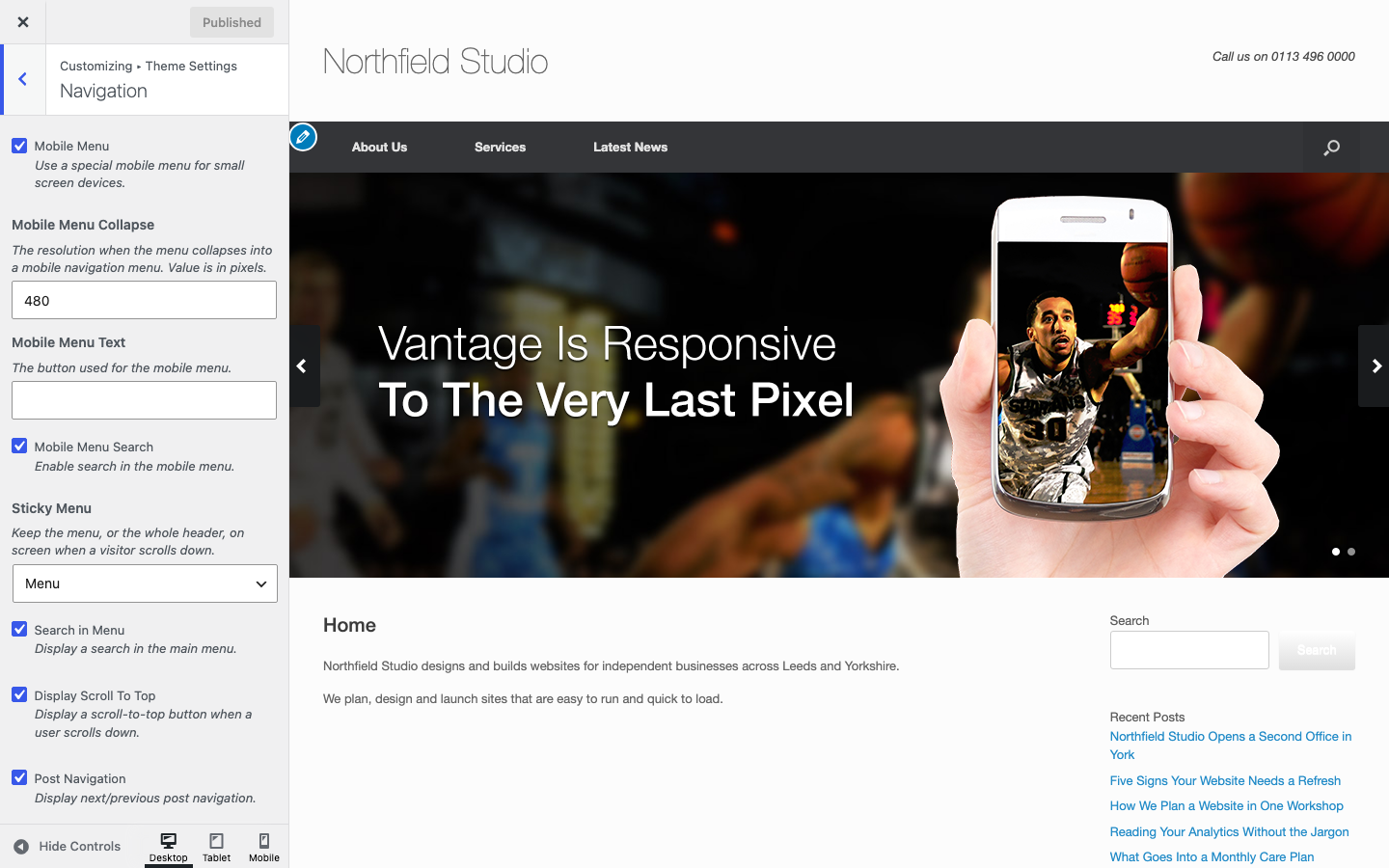
Mobile Menu
Mobile Menu
Uses a special menu on small screens. It needs Responsive Layout in the Layout section to be on. It is off when a mega menu plugin (Max Mega Menu or UberMenu) runs the primary menu. Default: on.
Mobile Menu Collapse
The screen width, in pixels, below which the menu becomes the mobile menu. Default: 480.
Mobile Menu Text
The text of the button that opens the mobile menu. Default: Menu.
Mobile Menu Search
Shows a search field in the mobile menu. Default: on.
Mobile Navigation
Turns on the Sticky Menu setting and the scroll to top button for mobile devices. Default: off.
Menu and Page
Sticky Menu
Keeps the menu, or the whole header, on screen when a visitor scrolls down. Choose None, Menu or Entire Header. Entire Header keeps the logo, header text and header widgets on screen too. Default: Menu.
Search in Menu
Shows a search icon at the right of the main menu. Default: on. To use your own icon, see Icons.
Display Scroll To Top
Shows a button that scrolls back to the top when a visitor scrolls down. Default: on.
Post Navigation
Shows links to the next and previous post below a single post. Default: on.
Home Page Icon
Shows a home icon on menu links that point to your home page. Default: off.
Breadcrumbs
Breadcrumbs
Shows breadcrumbs above the page content. They do not show on the front page. This setting shows only when one of these plugins is active: Yoast SEO, Breadcrumb NavXT or Rank Math. Vantage uses the breadcrumbs of that plugin. Default: on. See Breadcrumbs.