
 Page Builder
  Widgets Bundle
  SiteOrigin CSS
  Installer
 Simple Masonry
5 min read Updated
The Simple Masonry widget shows images in a masonry grid. Each image can span several columns and rows, and you can set a different layout for desktop, tablet and mobile.
Requirements
To use this widget, go to PluginsSiteOrigin Widgets and activate Simple Masonry Layout.
You can use the Simple Masonry widget in three places:
Page Builder: Add the SiteOrigin Simple Masonry widget to a Page Builder layout in the Classic Editor or in the SiteOrigin Layout block.
Block Editor: Add the SiteOrigin Simple Masonry Layout block. It is in the SiteOrigin category of the block inserter.
Widget areas: Add the widget to any theme or plugin widget area.
Make the Grid Look Like Masonry
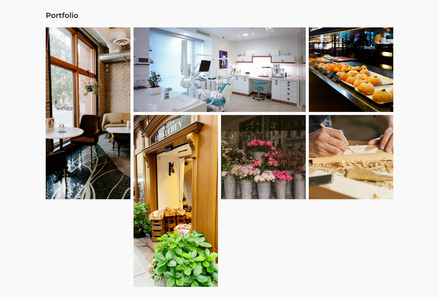
Each image has a Column span and a Row span. Both default to 1. If you leave every image at 1, the widget shows a plain grid of equal squares. Give some images a larger span to create the masonry effect. For example, in a four column layout:
- Image 1: Row span 2
- Image 2: Column span 2
- Image 3: Row span 1
- Image 4: Row span 2
Settings
Title
An optional title above the grid.
Images
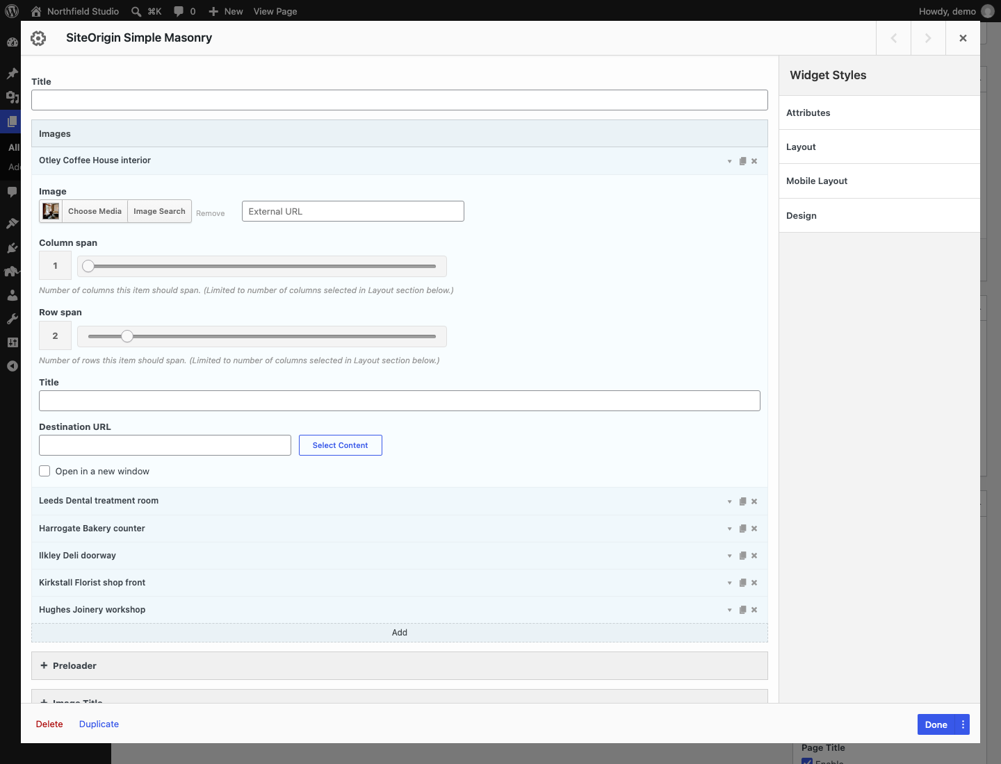
Click Add to add an image. Click an image to open it. Use the icons on the right of an image to duplicate or delete it.
Image
Choose an image from the Media Library, or enter an external image URL. The widget uses the full size image.
Column span
The number of columns the image covers, from 1 to 10. It can’t be more than the number of columns in the current layout. Default: 1.
Row span
The number of rows the image covers, from 1 to 10. It can’t be more than the number of columns in the current layout. Default: 1.
Title
The image title. If you leave it empty, the widget uses the image caption from the Media Library. If there is no caption, it uses the image title, unless that title is the file name.
Destination URL
Makes the image a link.
Open in a new window
Opens the Destination URL in a new tab. Default: off.
Preloader
A preloader shows a spinning icon until the images load and the grid is ready.
Enable preloader
Default: off.
Preloader icon color
Default: #232323.
Preloader height
The height of the space the preloader fills before the grid shows. Default: 250px.
Image Title
Display Image Title
Show each image’s title. The title settings below appear when this is on. Default: off.
Title Position
Above Image or Below Image. Default: Below Image.
Title Alignment
Left, Center or Right. Default: Center.
Title Font
Default: Use theme font.
Title Font Size
Default: 0.9rem.
Title Color
The title text color.
Title Padding
The space around the title: top, right, bottom and left. Default: 5px 0px 10px 0px.
Layout
Origin
The side the grid starts from: Left or Right. Default: Left.
Desktop
Number of columns
From 1 to 10. Default: 4.
Row height
The height of one row, in pixels. Leave it empty to make rows as tall as the columns are wide.
Gutter
The space between images, in pixels. Default: 0.
Tablet
The first field in this section is the tablet breakpoint. It shows without a label at the moment. It sets the screen width, in pixels, at and below which the Tablet layout applies. Default: 768. Don’t leave it empty. An empty breakpoint turns off the Tablet layout.
Number of columns
From 1 to 10. Default: 2.
Row height
Leave it empty to make rows as tall as the columns are wide.
Gutter
Leave it empty to use the Desktop gutter.
Mobile
The first field in this section is the mobile breakpoint. It shows without a label at the moment. It sets the screen width, in pixels, at and below which the Mobile layout applies. Default: 480. Don’t leave it empty. An empty breakpoint turns off the Mobile layout.
Number of columns
From 1 to 10. Default: 1.
Row height
Leave it empty to make rows as tall as the columns are wide.
Gutter
Leave it empty to use the Tablet gutter, or the Desktop gutter if Tablet is also empty.
SiteOrigin Premium
SiteOrigin Premium adds these features to the Simple Masonry widget:
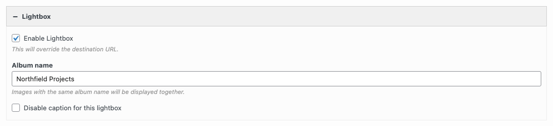
- Lightbox: adds a Lightbox section. Enable Lightbox opens images in a lightbox and overrides the Destination URLs. Album name groups images from several widgets into one lightbox. Disable caption for this lightbox hides the captions.
- Multiple Media: select several images at once to add them all to the grid.
- Image Overlay: shows each image title over the image. The addon turns the overlay on for this widget by default. Use Enable Image Overlay (Use global setting, Enabled or Disabled) and Overlay Theme in the Image Overlay section to change it.
- Tooltip: shows each image title in a tooltip. It is off for this widget by default. Set Enable Tooltip to Enabled in the Tooltip section, and choose a Tooltip Theme.
Lazy Loading
Some lazy loading plugins stop the grid from sizing its images. If the grid doesn’t display correctly, exclude this CSS class in your lazy loading plugin:
sow-masonry-grid-image
Advanced Customizations
Add PHP snippets with a plugin such as Code Snippets, or in a child theme’s functions.php file.
Don’t use Media Library captions and titles as image titles
By default, an image with an empty Title uses its Media Library caption or title. This snippet turns that off for the Simple Masonry widget. Titles you enter in the widget still show.
add_filter( 'siteorigin_widgets_auto_title', function( $status, $widget ) {
	if ( $widget === 'sow-simple-masonry' ) {
		$status = false;
	}
	return $status;
}, 10, 2 );