
 Page Builder
  Widgets Bundle
  SiteOrigin CSS
  Installer
 Widget Global Settings
6 min read Updated
Some widgets have global settings. Global settings are site-wide: you set them once, and they apply to the widget wherever you use it.
Requirements
Open the Global Settings
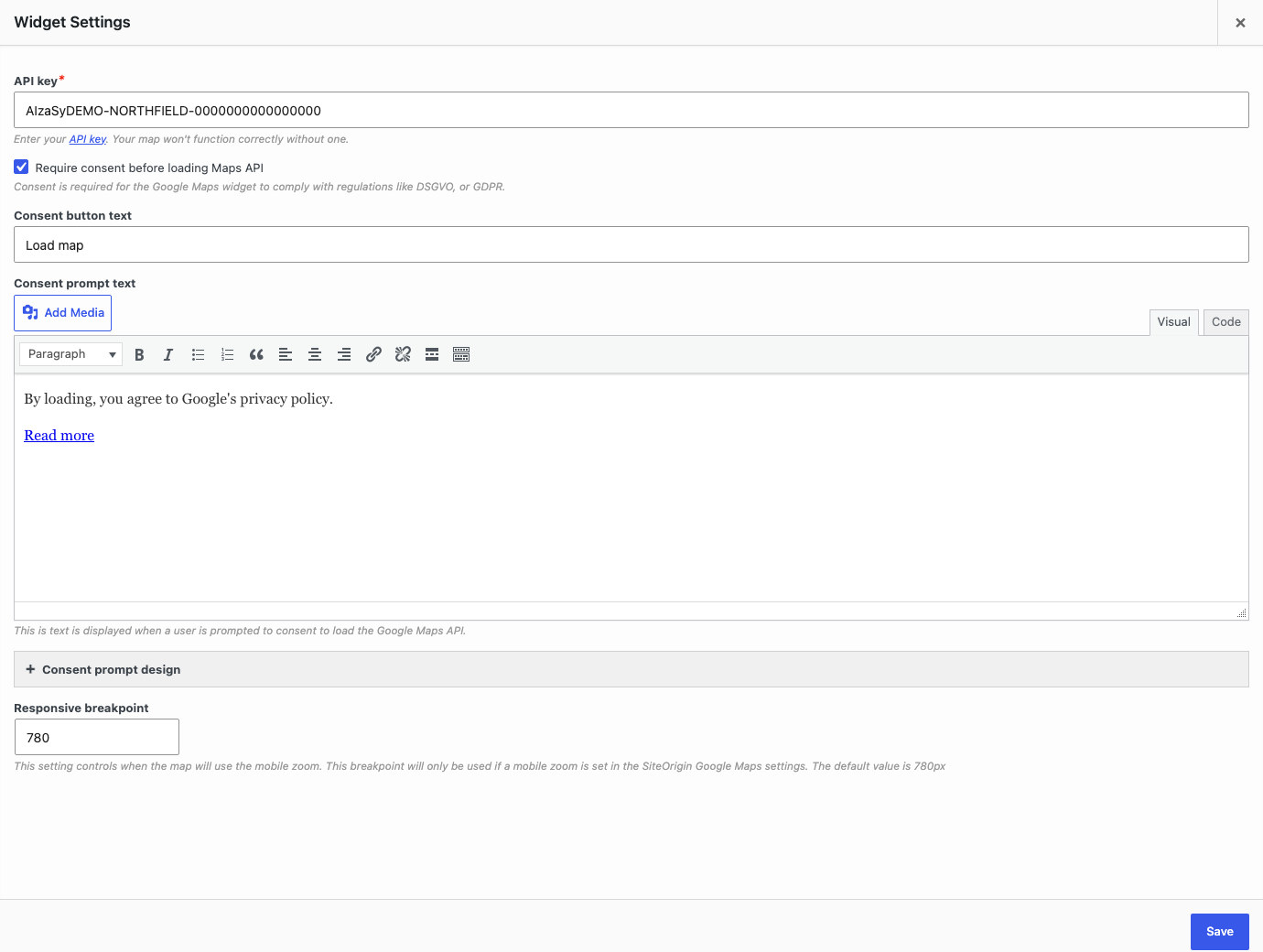
- Go to PluginsSiteOrigin Widgets.
- Find the widget. You can type its name in the Filter Widgets field.
- Click Settings on the widget card.
- Change the settings in the Widget Settings dialog.
- Click Save.
Only widgets with global settings show the Settings button. You can open the settings of a widget that is not enabled.
Responsive Breakpoint
The Responsive Breakpoint is a screen width. On screens this wide or smaller, the widget uses its mobile settings or its mobile layout. The default is 780px. Each widget has its own breakpoint, so you can set a different value for each one.
This breakpoint is not the same as the Mobile Width setting in Page Builder. The Page Builder setting controls when rows and columns collapse. The widget breakpoint controls the widget itself.
These widgets have a Responsive Breakpoint:
- Blog: collapses the Alternate, Grid, Masonry, Offset and Portfolio layouts into their mobile view. The Standard layout does not change.
- Button: sets when the button uses its Mobile Align setting.
- Button Grid: collapses the grid into its mobile view.
- Call To Action: sets when the widget uses its mobile alignment.
- Features: sets when the features collapse for mobile devices, if the widget’s Responsive layout setting is on.
- Google Maps: this setting is named Responsive breakpoint and takes a number in pixels, with a default of 780. Below it, an interactive map uses its mobile zoom, and a static map loads a larger image.
- Headline: sets when the mobile alignment settings apply.
- Hero Image: sets when the mobile height and padding apply.
- Image: below this width, an image with an enforced custom size scales down to fit the screen.
- Image Slider: sets when the Responsive Height applies.
- Layout Slider: sets when the mobile height and padding apply.
- Recent Posts: sets when the posts switch from the mobile layout to the desktop layout.
- Social Media Buttons: sets when the buttons use their Mobile Align setting.
In the three slider widgets, the Always show navigation on mobile setting always switches at 780px. It does not follow the Responsive Breakpoint at the moment.
The Author Box and Contact Form widgets also show a Responsive Breakpoint setting, but the setting has no effect at the moment. These widgets always use 780px.
Premium: the Tabs Addon adds a Responsive Breakpoint to the Tabs Widget, with a default of 780px. It sets when the mobile Tabs settings apply.
Carousel Responsive Settings
The Anything Carousel Widget has a Responsive section in its global settings. It has these groups: Desktop, Tablet (with Landscape and Portrait) and Mobile. Each group has these settings:
Breakpoint
A screen width in pixels. The breakpoints split screen widths into ranges. Defaults: Tablet Landscape 1366, Tablet Portrait 1025, Mobile 480. The Desktop group has no breakpoint.
- Desktop applies from the Tablet Landscape breakpoint up.
- Tablet Landscape applies between the Tablet Portrait and Tablet Landscape breakpoints. Its slide counts apply only when the screen is in landscape orientation. A portrait screen in this range uses the Desktop slide counts.
- Tablet Portrait applies between the Mobile and Tablet Portrait breakpoints.
- Mobile applies from the Mobile breakpoint down.
Slides to Scroll
The number of slides that move for each click or swipe. Defaults: Desktop 3, Tablet Landscape 3, Tablet Portrait 2, Mobile 1.
Slides to Show
The number of slides the carousel shows. Defaults: Desktop 3, Tablet Landscape 3, Tablet Portrait 2, Mobile 1.
Navigation Arrows
Shows the arrows. Default: on.
Navigation Dots
Shows the dots. Default: on.
Each Anything Carousel Widget also has a Responsive section in its own form. A value you set there overrides the global value for that widget only. An empty number field uses the global value. The Navigation Arrows and Navigation Dots checkboxes copy the global Navigation Arrows value when you add the widget. After you save the widget, it keeps its own values. At the moment, the arrows and dots still hide and show at the global tablet breakpoints, even if you set other tablet breakpoints in the widget form.
The Post Carousel Widget also shows a Responsive section in its global settings, but the saved values have no effect at the moment. Set the responsive values in the Responsive section of each Post Carousel Widget’s own form instead. An empty field there uses the Post Carousel defaults.
Scroll Top
These widgets can scroll the page so the visitor sees the result of an action. Each setting is on by default.
- Accordion: the setting is named Scroll top. When a visitor opens a panel, the page scrolls to the top of that panel.
- Tabs: the setting is named Scroll top. When a visitor changes tabs, the page scrolls to the top of the Tabs Widget.
- Blog: the setting is named Scroll Top. After a visitor clicks a pagination link, the page scrolls to the top of the Blog Widget.
- Contact Form: the setting is named Scroll Top. After a visitor submits the form, the page scrolls to the form.
If your site has a sticky header, you can change the scroll offset with a filter. Read Advanced Customizations.
Editor: Automatic Paragraphs
Enable the “Automatically add paragraphs” setting by default.
Sets the default for the Automatically add paragraphs checkbox in the Editor Widget form. Default: on. Editor widgets that you already saved keep their own setting.
Google Maps: API Key and Consent
The Google Maps Widget needs a Google Maps API key. It stores the key in its global settings, so you only enter it once.
API key
Your Google Maps API key. This field is required. The map does not work correctly without a key. Read the Google Maps Widget page to learn how to get a key.
Require consent before loading Maps API
Shows a consent prompt in place of each interactive map. The widget does not load the Google Maps API until the visitor clicks the consent button. Use it to help meet privacy laws such as the GDPR. Default: off. This setting does not affect static maps.
Consent button text
The text on the consent button. Default: Load map.
Consent prompt text
The text above the button. By default, it tells visitors that they agree to Google’s privacy policy and links to that policy.
Consent prompt design
Open the Button section to set the button colors:
- Consent prompt button text color. Default: #fff.
- Consent prompt button text hover color. Default: #eee.
- Consent prompt button background color. Default: #41a9d5.
- Consent prompt button background hover color. Default: #298fba.
When a visitor clicks the consent button, every map on the page loads. The widget does not remember the choice. The prompt shows again on the next page load.
Premium: the Map Styles Addon adds Background and Text sections to the consent prompt design. They set the prompt background color and image, and the text and link colors.