
 Page Builder
  Widgets Bundle
  SiteOrigin CSS
  Installer
 Button Grid
3 min read Updated
The Button Grid Widget shows several buttons in a grid. Each button has the full settings of the Button Widget. You set the number of buttons per row, the alignment and the gaps, with separate values for desktop and mobile.
Requirements
To use this widget, go to PluginsSiteOrigin Widgets, find Button Grid and click Activate. The Button Grid uses the Button Widget, so keep Button active too. Button is active by default.
You can use the Button Grid Widget in these places:
Page Builder: Add the widget in Page Builder by SiteOrigin, in the Classic Editor or in the Page Builder Layout Block in the Block Editor.
Block Editor: Add the SiteOrigin Button Grid block. You find it in the SiteOrigin block category.
Theme and Plugin Widget Areas: Add the widget to any theme or plugin widget area.
Setup Video
This video adds a Button Grid Widget in Page Builder, adds three buttons, sets the layout and shows the grid on the front end.

Settings
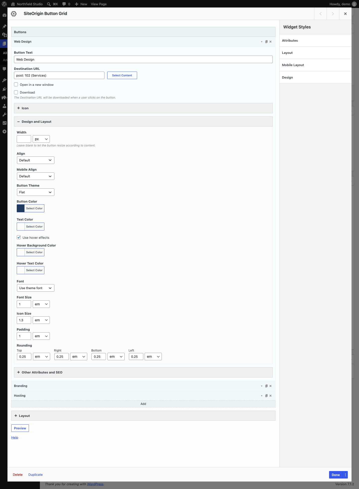
Buttons
Each item in this list is one button. Click Add to add a button. Each item has three icons on the right: the arrow opens the button settings, the page icon duplicates the button and the cross deletes it. Drag a button to change its position in the grid.
Each button has the same settings as the Button Widget: Button Text, Destination URL, Open in a new window, Download, the Icon section, the Design and Layout section and the Other Attributes and SEO section. For a description of each setting, see the Button Widget documentation.
In the Button Grid, Align and Mobile Align in each button have an extra option, Default, which is the default. Default means the button follows the grid’s Button Alignment. Keep Align set to Default. At the moment, the grid overrides a button’s own Align. If a button’s Align differs from the grid’s Button Alignment, its mobile alignment also stops working, so the button keeps the grid’s desktop alignment on all screens. When Align is Default, you can set a button’s Mobile Align to replace the grid’s Mobile Button Alignment for that button.
Layout
The Layout section has two groups: Desktop and Mobile. The Mobile values apply on small screens. See Global Settings for the breakpoints. Each group has these settings:
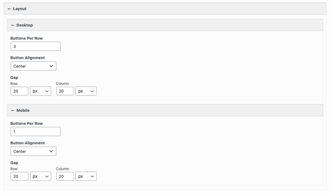
Buttons Per Row
The number of buttons in each row. Default: 3 for Desktop and 3 for Mobile.
Button Alignment
The position of each button inside its grid cell: Left, Center or Right. Default: Center. You see no change when a button fills its cell.
Gap
The space between buttons. Row sets the space between rows. Column sets the space between buttons in a row. Default: 20px for both.
Global Settings
Global settings apply to all Button Grid Widgets on your site. Go to PluginsSiteOrigin Widgets, find Button Grid and click Settings.
Responsive Breakpoint
The screen width at and below which the grid uses the Mobile Buttons Per Row and Gap values. Default: 780px. The Mobile Button Alignment uses the Button Widget’s Responsive Breakpoint, in the Button settings.