
 Page Builder
 Widgets Bundle
 SiteOrigin CSS
 Installer
Icon
2 min read Updated
The Icon Widget shows a single icon. You can set its color, size and alignment, link it to a page and add a hover title. Choose from seven icon libraries, including Font Awesome and Google Material Icons.
Requirements
To use this widget, go to PluginsSiteOrigin Widgets, find Icon and click Activate.
You can use the Icon Widget in these places:
Page Builder: Add the widget in Page Builder by SiteOrigin, in the Classic Editor or in the Page Builder Layout Block in the Block Editor.
Block Editor: Add the SiteOrigin Icon block. You find it in the SiteOrigin block category.
Theme and Plugin Widget Areas: Add the widget to any theme or plugin widget area.
Setup Video
This video adds an Icon Widget in Page Builder, chooses an icon, sets its color and size, and shows it on the front end.

Settings
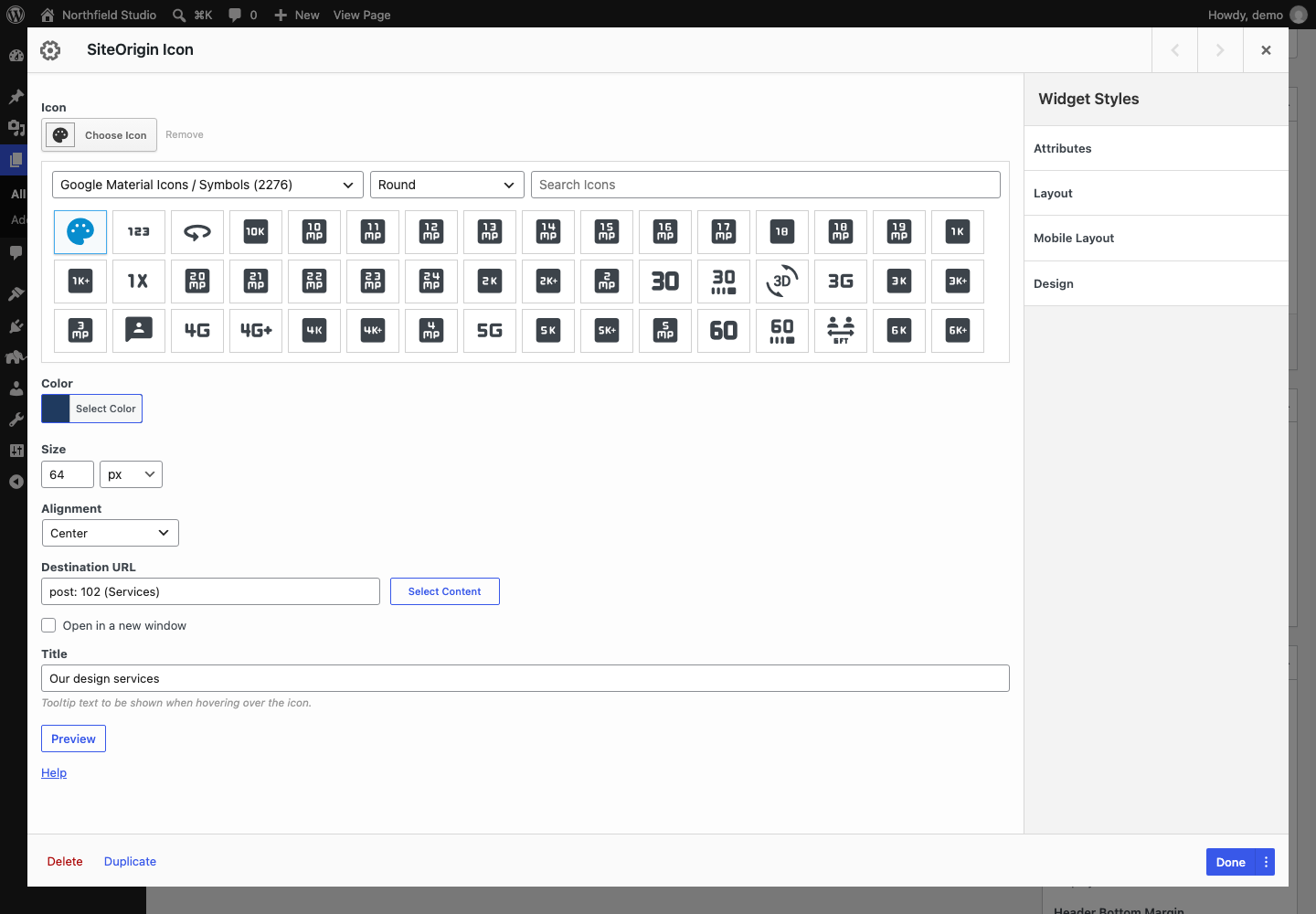
Icon
The icon to show. Click Choose Icon to open the icon picker. Select a library, and for some libraries a style, then click an icon. Use Search Icons to find an icon by name. Click Remove to clear the icon. The picker has these libraries:
- Font Awesome (styles: Regular, Solid and Brands)
- Elegant Themes Line Icons
- Google Material Icons / Symbols (styles: Regular, Round, Sharp and TwoTone)
- Genericons
- Icomoon Free
- Typicons
- Ionicons
Color
The icon color. If you leave it empty, the icon is black.
Size
The icon size, with a unit, for example 48px or 3em. If you leave it empty, the icon uses the text size of its container.
Alignment
The icon position: Center, Left or Right. Default: Center.
Destination URL
An optional link for the icon. Click Select Content to find a page or post on your site, or enter any URL.
Open in a new window
Opens the link in a new tab or window. Default: off.
Title
Text that shows when a visitor hovers over the icon. The widget adds it as the icon’s title attribute, so most browsers show it as a small tooltip. With SiteOrigin Premium, it can show as a styled tooltip.
SiteOrigin Premium
The SiteOrigin Premium Tooltip addon shows the Title as a styled tooltip. Turn on the Icon Widget in the Tooltip addon settings, or open the Tooltip section in the widget and set Enable Tooltip to Enabled. The section also has a Tooltip Theme setting. For more information, see the Tooltip addon documentation.
Advanced Customizations
Change the Icon Color on Hover
The Icon Widget has no hover color setting. Add this CSS to your theme or to the Additional CSS section of the Customizer to change the color of linked icons on hover.
.so-widget-sow-icon .sow-icon a:hover span {
	color: #e07a5f !important;
}