
 Page Builder
  Widgets Bundle
  SiteOrigin CSS
  Installer
 Features
5 min read Updated
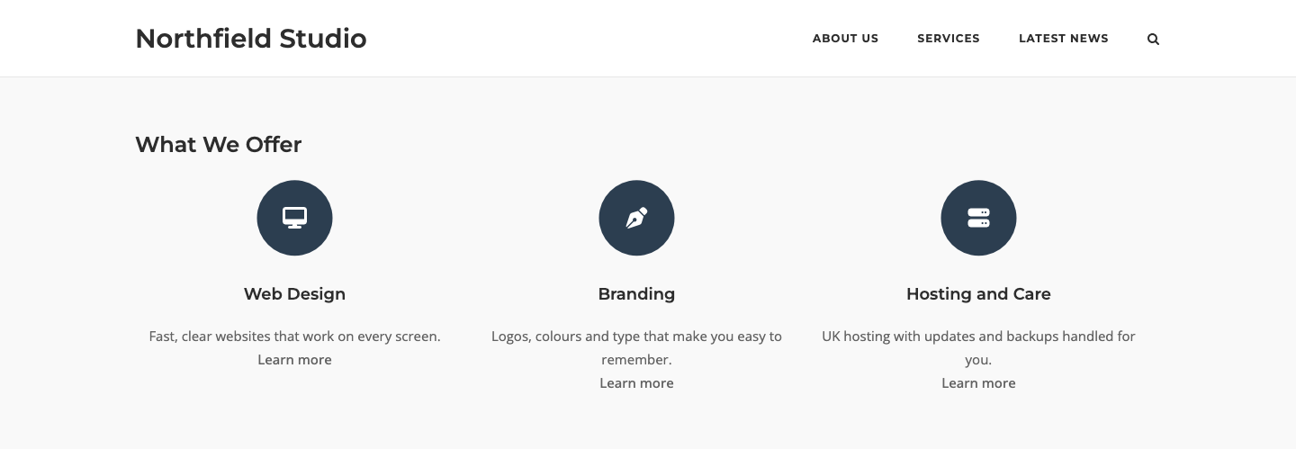
The Features Widget shows a grid of features. Each feature can have an icon or image, a title, some text and a link. Use it to present services, product benefits or the steps of a process.
Requirements
To use this widget, go to PluginsSiteOrigin Widgets, find Features and click Activate.
You can use the Features Widget in these places:
Page Builder: Add the widget in Page Builder by SiteOrigin, in the Classic Editor or in the Page Builder Layout Block in the Block Editor.
Block Editor: Add the SiteOrigin Features block. You find it in the SiteOrigin block category.
Theme and Plugin Widget Areas: Add the widget to any theme or plugin widget area.
Setup Video
This video adds a Features Widget in Page Builder, adds three services with icons and shows the grid on the front end.
Settings
Features
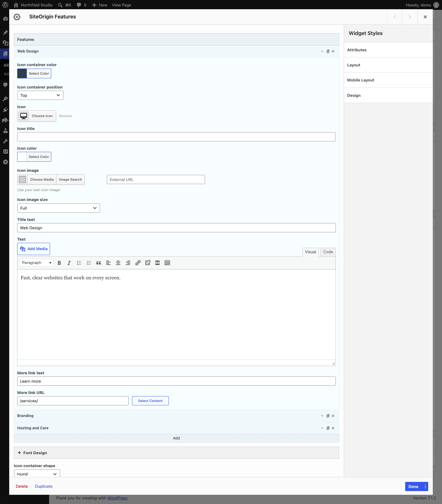
Each item in this list is one feature. Click Add to add a feature. Each feature has three icons on the right: the arrow opens the feature settings, the page icon duplicates the feature and the cross deletes it. Drag a feature to change its position.
Icon container color
The color of the shape behind the icon. Default: #404040.
Icon container position
Where the icon shows next to the text: Top, Right, Bottom or Left. Default: Top.
Icon
An icon from the icon picker.
Icon title
Text for the icon’s title attribute. Most browsers show it when a visitor hovers over the icon. With SiteOrigin Premium, it can show as a styled tooltip.
Icon color
The icon color. Default: #fff (white).
Icon image
Your own image to use instead of an icon. When you add an image, the widget shows it in place of the icon.
Icon image size
The image size that WordPress loads for the icon image.
Title text
The feature title.
Text
The feature description. It uses the WordPress editor and runs shortcodes.
More link text
The text for a link below the feature, for example “View our web design service”.
More link URL
The link target. Use the Select Content button to find a page on your site, or enter any URL.
Font Design
This section has three groups: Title, Text and More Link. The Title group starts with this setting:
HTML tag
The heading tag for each feature title, from H1 to H6. Default: H5.
All three groups have these settings:
Font
The font family. You can choose a web safe font or a Google Font. Default: Use theme font.
Size
The font size and unit.
Color
The text color.
Layout and Links
These settings are below the Font Design section. They apply to all features in the widget.
Icon container shape
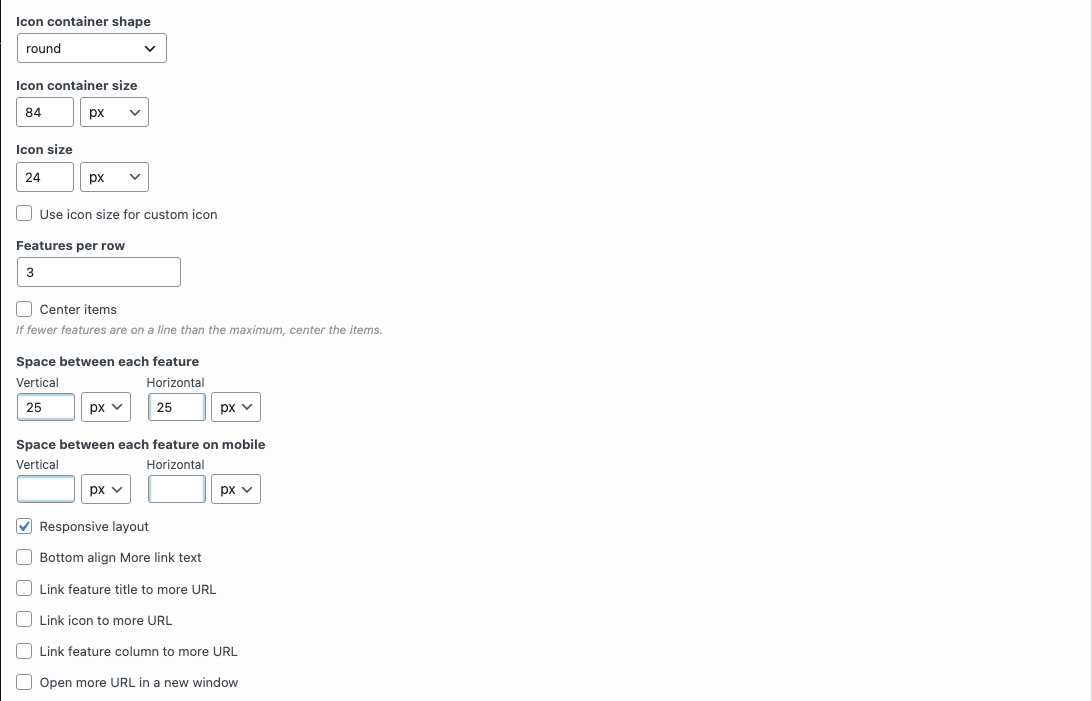
The shape behind each icon or image: none, round, sticker, rounded-sticker, square, rounded-square, rounded-hex, octagon, hex, frame or explode. Default: round. Choose none to show the icon without a shape.
Icon container size
The width and height of the shape. Default: 84px.
Icon size
The size of the font icons. Default: 24px.
Use icon size for custom icon
Uses Icon size for icon images too. When it is off, the widget scales an icon image to fit inside the icon container. Default: off.
Features per row
The number of features in each row. Default: 3.
Center items
Centers the features in a row that has fewer features than Features per row, for example the last row. Default: off.
Space between each feature
The space between features. Vertical sets the space between rows. Horizontal sets the space between the features in a row. Default: 25px for both.
Space between each feature on mobile
The space between features on small screens, with Vertical and Horizontal values. The widget uses it at and below the Responsive Breakpoint. This setting shows only when Responsive layout is on. If it is empty or hidden, the space on small screens is 25px, not the value in Space between each feature.
Responsive layout
At and below the Responsive Breakpoint, shows each feature at full width, with the icon above or below the text. Default: on.
Bottom align More link text
Aligns the More link text to the bottom of each feature, so the links in a row line up. Default: off.
Link feature title to more URL
Links the feature title to the More link URL. Default: off. This setting is hidden when Link feature column to more URL is on, because that setting also links the title.
Link icon to more URL
Links the icon or image to the More link URL. Default: off.
Link feature column to more URL
Makes the whole feature a link to the More link URL. Screen readers use the More link text as the link text, so add it to each feature. Default: off.
Open more URL in a new window
Opens all feature links in a new tab or window. Default: off.
Global Settings
Global settings apply to all Features Widgets on your site. Go to PluginsSiteOrigin Widgets, find Features and click Settings.
Responsive Breakpoint
The screen width at and below which the widget uses its mobile spacing and, when Responsive layout is on, its mobile layout. Default: 780px.
SiteOrigin Premium
The SiteOrigin Premium Tooltip addon shows the Icon title as a styled tooltip. Turn on the Features Widget in the Tooltip addon settings, or open the Tooltip section in the widget and set Enable Tooltip to Enabled. The section also has a Tooltip Theme setting. For more information, see the Tooltip addon documentation.
Advanced Customizations
Change the Title Margin
The widget adds a 1em margin above and below each feature title. Add this CSS to your theme or to the Additional CSS section of the Customizer to change it.
.sow-features-list .sow-features-feature .sow-features-feature-title {
	margin: 0.5em 0 !important;
}