
 Page Builder
  Widgets Bundle
  SiteOrigin CSS
  Installer
 Blog
The Blog Widget shows your posts as a blog with pagination. Pick one of six templates: Standard, Grid, Offset, Alternate, Masonry or Portfolio. Then choose which post details to show, style them, and use the Posts Query to choose the posts.
Requirements
To use this widget, go to PluginsSiteOrigin Widgets and activate the SiteOrigin Blog Widget.
You can use the Blog Widget anywhere:
Page Builder: Add the widget to a Page Builder layout in the Classic Editor, or in the Page Builder Layout Block in the Block Editor.
Block Editor: Add the SiteOrigin Blog block. You will find it in the SiteOrigin block category.
Theme and Plugin Widget Areas: Add the widget to any theme or plugin widget area.
Settings
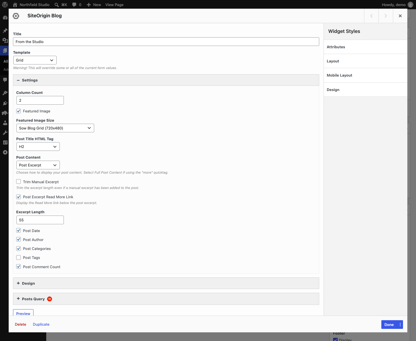
Title: An optional title above the posts.
Template: Choose Standard, Grid, Offset, Alternate, Masonry or Portfolio. Default: Standard.
When you change the template, the widget loads that template’s default settings and design values. This replaces the values you set before. To get them back, click Undo next to the Template field.
Settings
Some settings show only for some templates. The Templates section lists each template’s defaults.
Column Count: The number of columns. Grid, Masonry and Portfolio only.
Featured Image: Show the post featured image. Default: on. All templates except Portfolio.
Skip Post if No Featured Image: Leave out posts that have no featured image. Default: on. Portfolio only.
Featured Image Size: The image size to use. Choose a registered size, or Custom Size to enter a width and height. Shows when Featured Image is on.
Post Title HTML Tag: The HTML tag for the post title. Choose H1 to H6 or Paragraph. Default: H2.
Post Content: Choose Post Excerpt or Full Post Content. Select Full Post Content if your posts use the “more” tag. All templates except Portfolio.
Trim Manual Excerpt: Trim manual excerpts to the Excerpt Length too. Default: off. Shows when Post Content is Post Excerpt.
Post Excerpt Read More Link: Add a “Continue reading” link below the excerpt. Shows when Post Content is Post Excerpt.
Excerpt Length: The number of words in the excerpt. Default: 55. Shows when Post Content is Post Excerpt.
Post Date: Show the post date. Default: on.
Post Author: Show the post author. Default: on.
Filter Categories: Show category filter buttons above the posts. Default: on. Portfolio only.
Post Categories: Show the post categories. Default: on.
Post Tags: Show the post tags. Default: off.
Post Comment Count: Show the number of comments. The count shows only on posts that are open for comments. Default: on.
Post Date, Post Author, Post Tags and Post Comment Count do not show for the Portfolio template. In the Standard, Grid, Alternate and Masonry templates, sticky posts get a “Sticky” label in the post meta.
Posts Query
Open the Posts Query section to choose which posts the widget shows. The widget normally leaves out the post or page it is on.
Post Type: Choose one or more post types, or All. Default: Posts.
Post In: Show only the posts you pick. Type to search.
Taxonomies: Show only posts in these categories, tags or other terms. Type to search.
Taxonomies Relationship: OR shows posts that have at least one of the terms. AND shows posts that have all of them. Default: OR.
Date Selection Type: Choose Specific for fixed dates, or Relative for dates relative to today. Default: Specific.
Dates: The date range. With Specific, pick a From and a to date. With Relative, enter a number and choose days, weeks, months or years ago for each end of the range.
Order By: How to sort the posts. Default: Published date.
Order Direction: Choose Ascending or Descending. Default: Descending.
Posts Per Page: The number of posts on each page. If you leave it empty, the widget shows 10 posts per page.
Sticky Posts: Choose Default, Ignore sticky, Exclude sticky or Only sticky. Default: Default.
Additional: Extra query arguments in URL query format, for example offset=1. See WP_Query for the arguments you can use.
The Order By options are: No order, Post ID, Author, Title, Published date, Modified date, By parent, Random order, Comment count, Menu order, By meta value, By numeric meta value and By include order.
The Sticky Posts options work like this:
- Default: WordPress moves sticky posts to the top of the first page, unless you filter by Taxonomies. They can show in addition to the Posts Per Page count.
- Ignore sticky: Sticky posts are not moved to the top. They show in their normal position.
- Exclude sticky: Sticky posts are removed.
- Only sticky: Only sticky posts show. If your site has no sticky posts, the widget shows all posts.
If you use offset in Additional, the widget keeps the offset on later pages too. With the Default sticky setting, sticky posts can still show at the top of the first page. Set Sticky Posts to Ignore sticky or Exclude sticky if you use offset.
Templates
Each template has its own layout and default values. The table shows the main differences.
| Template | Layout | Column Count | Post Content | Featured Image Size | Extra design section |
|---|---|---|---|---|---|
| Standard | One post per row. Image above the text. | Not used | Full Post Content | Full | None |
| Grid | Posts in equal columns. | 2 | Post Excerpt | Sow Blog Grid (720×480) | None |
| Offset | Author and post details in a narrow left column. Post on the right. | Not used | Full Post Content | Full | Offset Post Meta |
| Alternate | Image beside the text. The image side changes on every other post. | Not used | Post Excerpt | Sow Blog Alternate (950×630) | None |
| Masonry | Columns of posts with different heights. | 2 | Post Excerpt | Full | Overlay Post Category (no effect) |
| Portfolio | A grid of images. The title and categories show on hover. | 3 | Not used | Sow Blog Portfolio (375×375) | Filter Categories, Featured Image |
The Sow Blog image sizes are cropped. WordPress creates them when you upload an image while the widget is active. For older images, use a plugin that regenerates thumbnails.
Below the Responsive Breakpoint, every template shows one post per row.
Standard Template
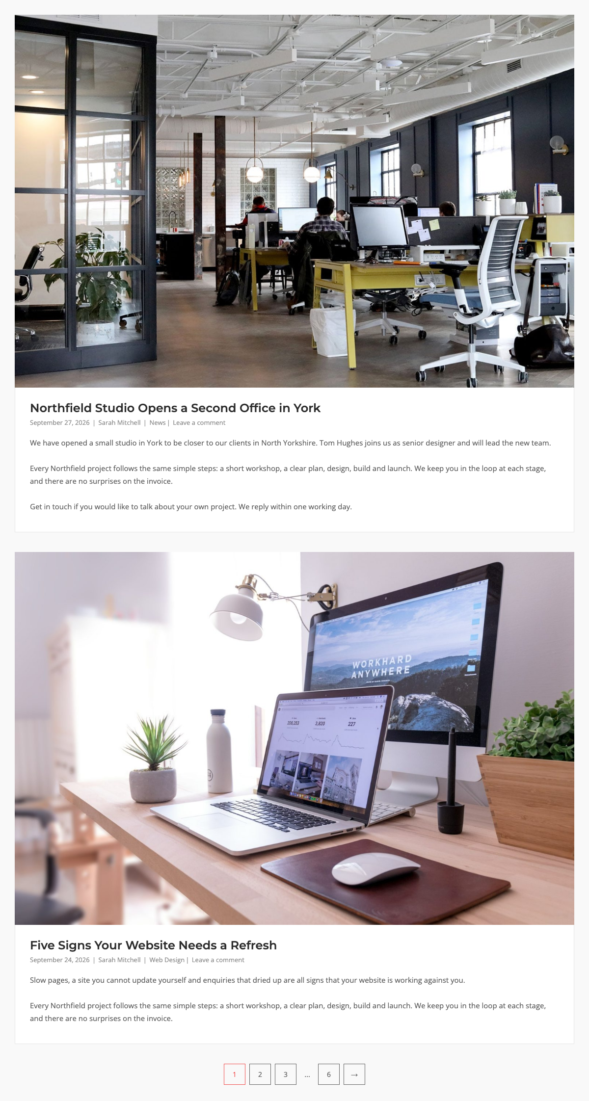
The Standard template shows one post per row. Each post has the featured image, then the title, the post meta and the content. It shows the full post content by default. The post title font size is 24px.
Grid Template
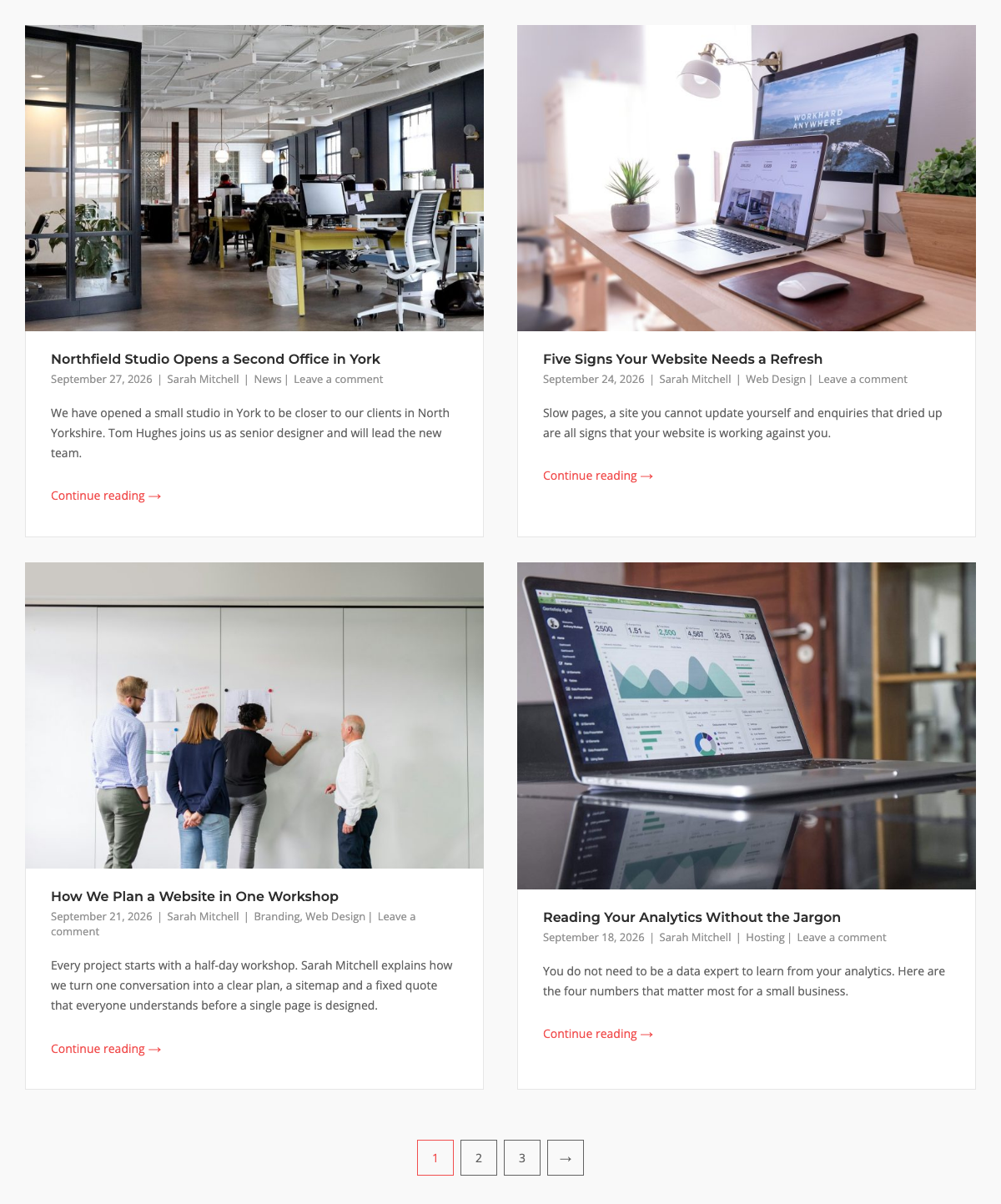
The Grid template shows posts in equal columns. Set the number of columns with Column Count. Default: 2. It shows the post excerpt by default. The post title font size is 16px and the post content font size is 14px.
Offset Template
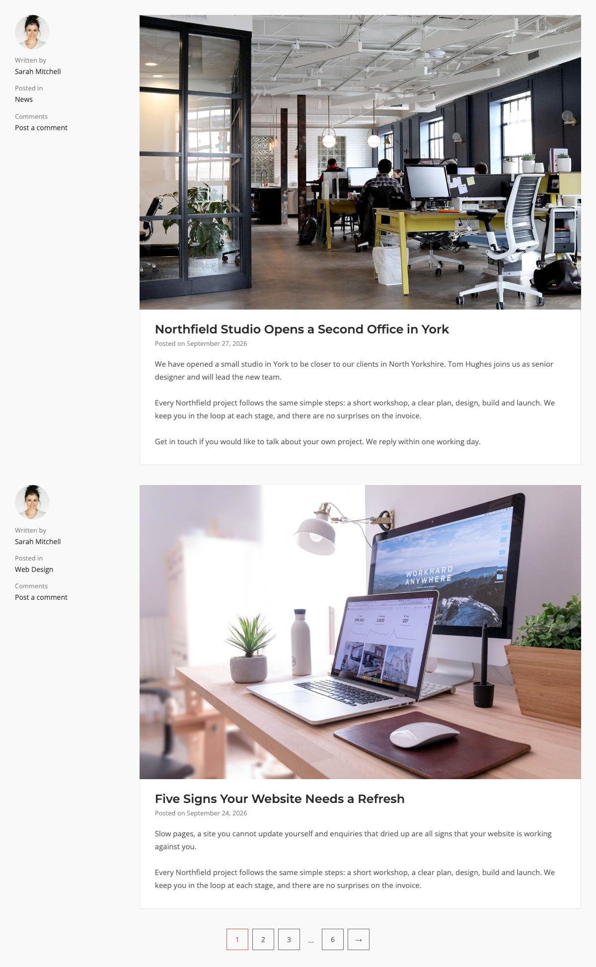
The Offset template puts the author avatar and name (“Written by”), the categories (“Posted in”), the tags and the comment count in a narrow column on the left. The featured image, title, date (“Posted on”) and content are on the right. It shows the full post content by default.
Style the left column with the Offset Post Meta design section.
Alternate Template
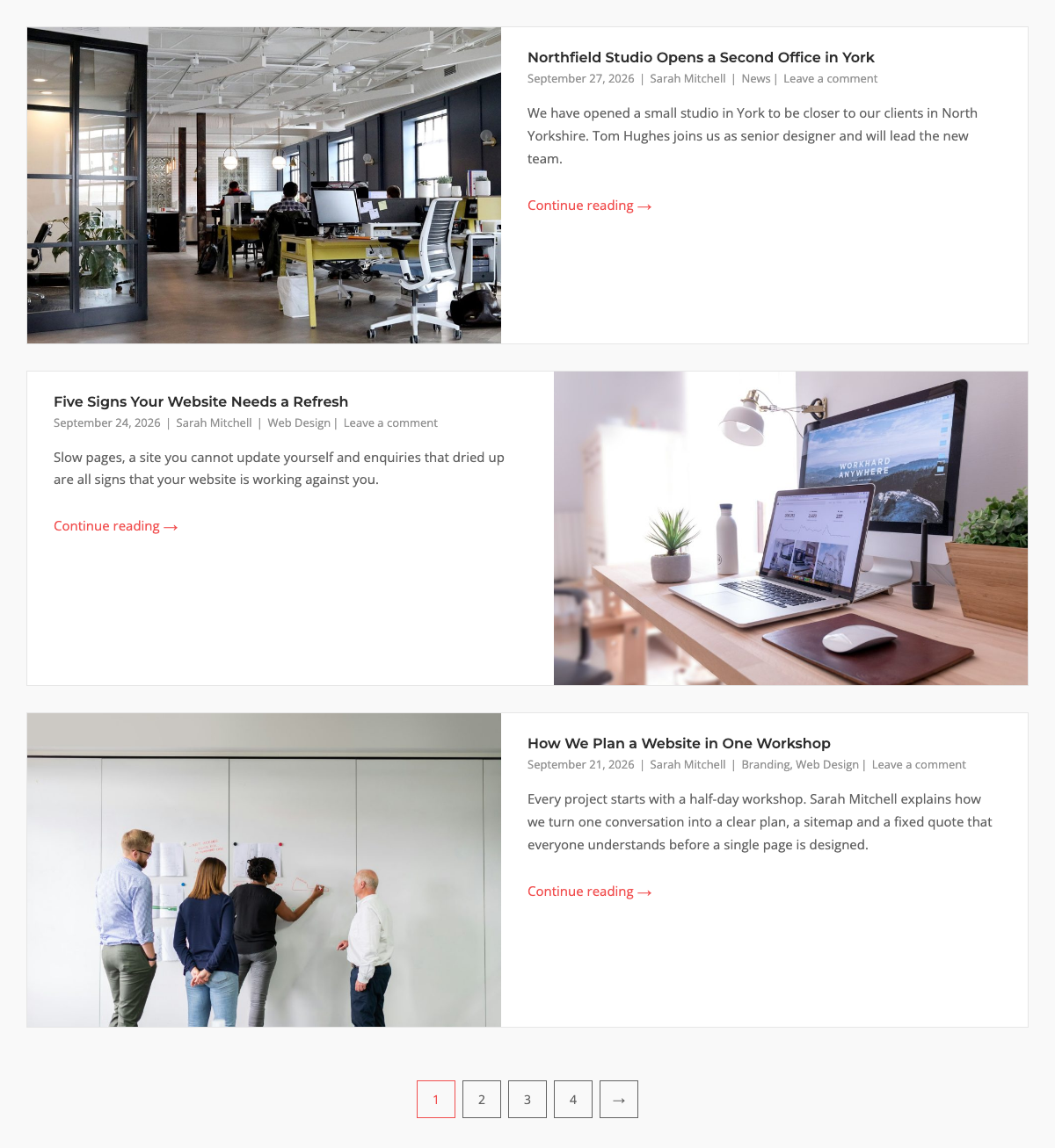
The Alternate template puts the featured image beside the text. The image is on the left for the first post, on the right for the second, and so on. It shows the post excerpt by default. The post title font size is 16px.
Masonry Template
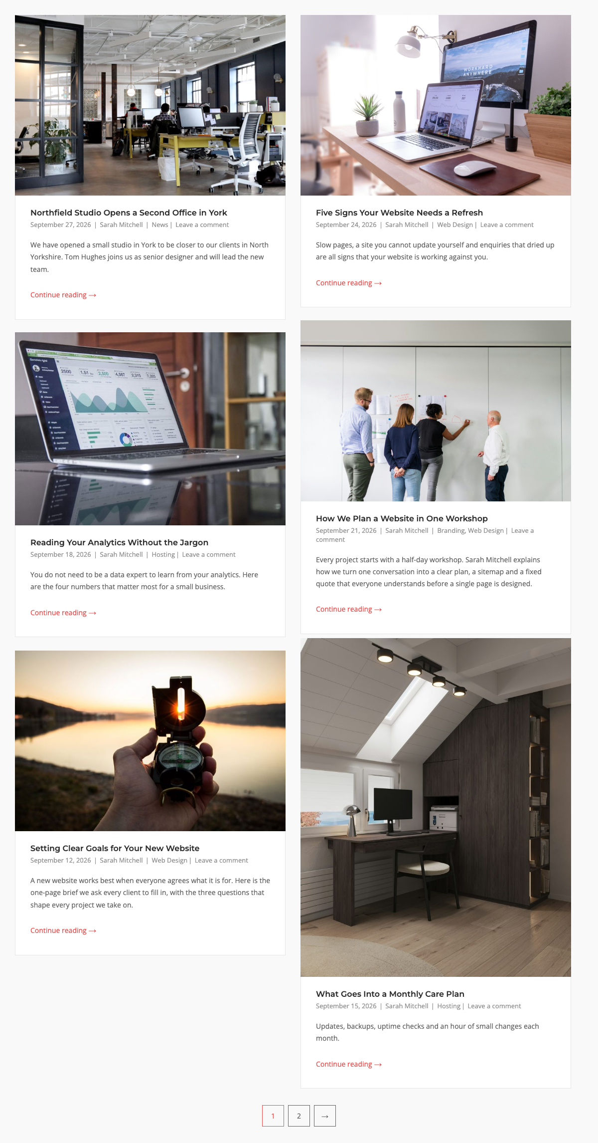
The Masonry template shows posts in columns. Each post keeps its own height, so the columns fit together like bricks. Set the number of columns with Column Count. Default: 2. It shows the post excerpt by default. The post title font size is 16px and the post content font size is 14px.
The Masonry template shows the post categories in the post meta, below the title. The form also has an Overlay Post Category design section, but the Masonry template does not show a category overlay on the image, so these settings have no effect.
Portfolio Template
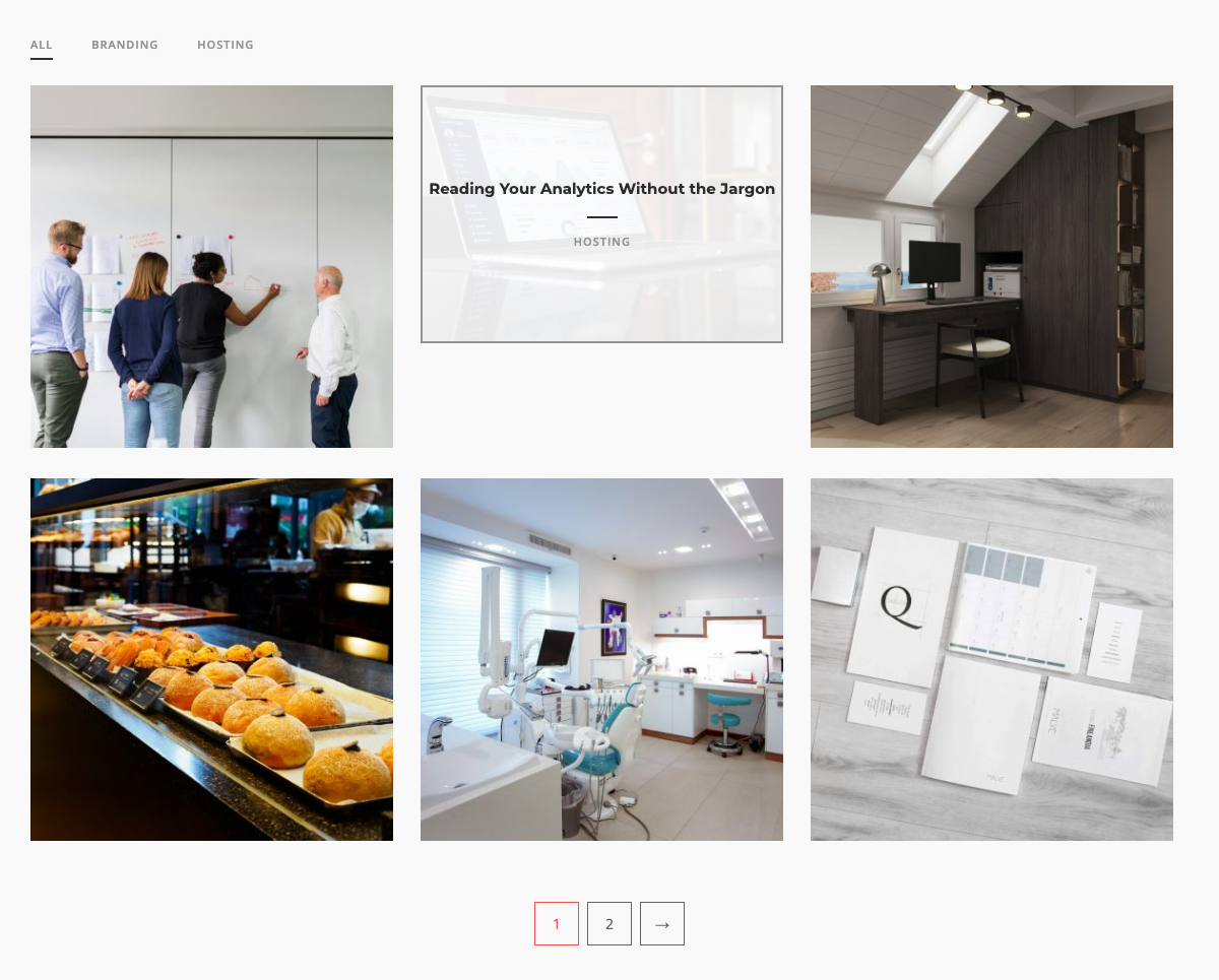
The Portfolio template shows a grid of featured images. When a visitor hovers over an image, the post title and categories show on top of it. Set the number of columns with Column Count. Default: 3. By default, the template leaves out posts that have no featured image (Skip Post if No Featured Image).
With Filter Categories on, buttons show above the grid: All, then one button for each category. Click a button to show only the posts on the current page that have that category. The buttons and the category line under each title show the category slug, for example “web-design”, not the category name.
The widget chooses the filter categories in this order:
- If you set Taxonomies in the Posts Query, it uses those terms. This needs two or more terms. With one term, only the All button shows.
- If the post type is Jetpack Portfolio, it uses the Jetpack Project Types.
- Otherwise it uses the first taxonomy of the post type that has terms. For posts, this is Categories.
- If nothing is found, it uses Categories.
The widget shows only the terms that the posts on the current page use.
Design
Open the Design section to style the posts. The sections that show depend on the template. The defaults below are the values for a new widget. When you choose a template, it sets its own values, as noted below.
Post
All templates except Portfolio.
Border Color: Default: #e6e6e6.
Background Color: Default: #fff.
Post Title
All templates except Portfolio.
Font: Default: the theme font.
Font Size: Default: 24px. Grid, Alternate and Masonry: 16px.
Color: Default: #2d2d2d.
Hover Color: Default: #626262.
Post Meta
All templates except Portfolio.
Font: Default: the theme font.
Font Size: Default: 13px.
Color: Default: #929292.
Hover Color: Default: #f14e4e.
Offset Post Meta
Offset only. Styles the left column.
Font: Default: the theme font.
Font Size: Default: 13px.
Color: Default: #929292.
Link Color: Default: #2d2d2d.
Link Color Hover: Default: #f14e4e.
Link Font Size: Default: 14px.
Post Content
All templates except Portfolio.
Font: Default: the theme font.
Font Size: Default: 15px. Grid and Masonry: 14px.
Color: Default: #626262.
Link Color: Default: #f14e4e.
Link Hover Color: Default: #626262.
Filter Categories
Portfolio only. Shows when Filter Categories is on.
Font: Default: the theme font.
Font Size: Default: 11px.
Capitalize Categories: Show the button text in capital letters. Default: on.
Color: Default: #929292.
Hover Color: Default: #2d2d2d.
Selected Border Color: The underline color of the selected button. Default: #2d2d2d.
Selected Border Thickness: Default: 2px.
Featured Image
Portfolio only. Styles the hover overlay.
Border Color: The overlay border color. Default: #929292.
Hover Overlay Color: Default: rgba(255,255,255,0.9).
Post Title Font: Default: the theme font.
Post Title Font Size: Default: 15px.
Post Title Color: Default: #2d2d2d.
Divider Border Color: The line between the title and the categories. Default: #2d2d2d.
Divider Border Thickness: Default: 1px.
Divider Border Margin: The space above and below the line. Default: 13px.
Post Meta Font: Default: the theme font.
Post Meta Font Size: Default: 11px.
Post Meta Color: Default: #929292.
Pagination
All templates. Pagination shows when there is more than one page of posts.
Top Margin: Default: 30px.
Link Margin: The space between page links. Default: 8px.
Border Color: Default: #626262.
Border Hover Color: Default: #f14e4e.
Background: No default.
Hover Background: No default.
Border Radius: From 0 to 50. Default: 0.
Font: Default: the theme font.
Font Size: Default: 14px.
Link Color: Default: #626262.
Link Hover Color: Default: #f14e4e.
Dots Color: Default: #626262. Not shown for Masonry.
Width: Default: 40px. 44px after you choose a template.
Height: Default: 43px.
Global Settings
Go to PluginsSiteOrigin Widgets, find the Blog Widget and click Settings.
Responsive Breakpoint: Below this screen width, posts show in one column. Default: 780px.
Scroll Top: After a visitor clicks a pagination link, scroll to the top of the Blog Widget. Default: on.
SiteOrigin Premium
Load more posts without a page reload, and show related posts below each post. SiteOrigin Premium adds these features:
- Blog addon: Pagination styles (Previous – Next, Load More and Infinite Scrolling), Ajax page loading, a Post Date Format setting, custom Read More link text and excerpt trim text, a first-image fallback for posts without a featured image, a None option for Post Content, Filter Categories for the Masonry template, and entrance animations. See Blog.
- Related Posts addon: Show related posts at the end of your posts, using the Blog Widget’s Grid or Masonry template. See Related Posts.
Advanced Customizations
Add these snippets to your child theme’s functions.php file, or use a code snippets plugin.
Change the Template Image Sizes
The widget registers three cropped image sizes: portfolio (375×375), grid (720×480) and alternate (950×630). This snippet changes the grid size. Regenerate your thumbnails afterwards.
add_filter( 'siteorigin_widgets_blog_image_sizes', function( $sizes ) {
	$sizes['grid'] = array( 800, 600 );
	return $sizes;
} );
Change the Scroll Top Offset
With Scroll Top on, the widget stops 90 pixels above the widget. Increase the value if a sticky header covers the widget.
add_filter( 'siteorigin_widgets_blog_scrollto_offset', function() {
	return 150;
} );
Center the Featured Image in the Alternate Template
Add this CSS at AppearanceCustomizeAdditional CSS or in SiteOrigin CSS.
.sow-blog-layout-alternate .sow-blog-posts article .sow-entry-thumbnail a {
	justify-content: center !important;
}
Related Links
- Recent Posts Widget: a compact list of recent posts.
- SiteOrigin Premium: Blog
- SiteOrigin Premium: Related Posts
- WordPress: WP_Query arguments