
 Page Builder
  Widgets Bundle
  SiteOrigin CSS
  Installer
 Responsive
3 min read Updated
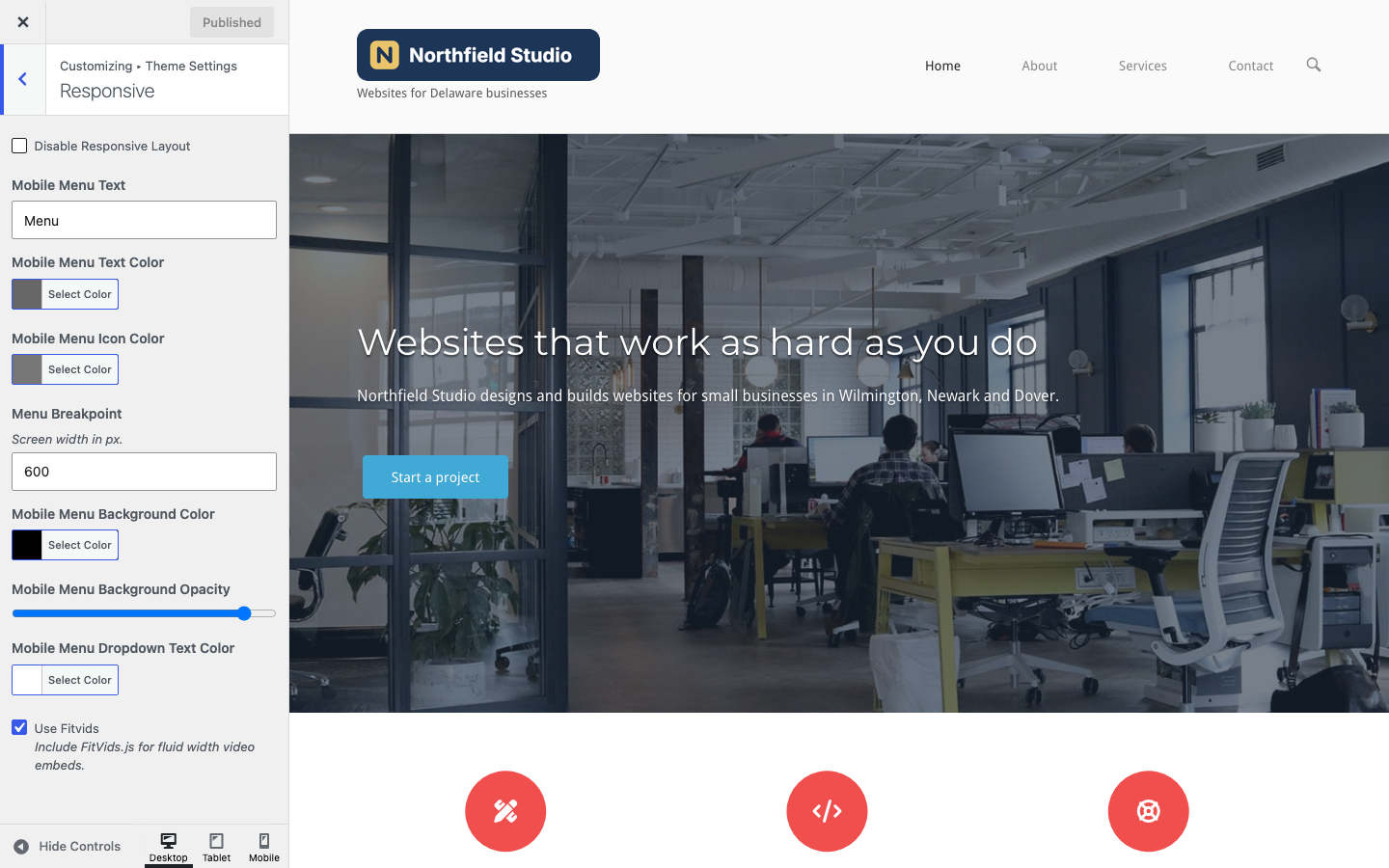
The Responsive section controls how North adapts to small screens: the mobile menu, its colors, the width where it takes over from the header menu, and responsive video embeds. Go to AppearanceCustomizeTheme SettingsResponsive.
Responsive Layout
Disable Responsive Layout
Show the desktop layout on all screens. North removes the viewport meta tag, so phones show a zoomed-out copy of the desktop site, and the mobile menu no longer replaces the header menu. It also removes the WooCommerce small screen styles. Default: off.
Page Builder uses this setting as the default for its own Responsive Layout setting at SettingsPage Builder. If you have saved the Page Builder settings, check that field too.
Mobile Menu
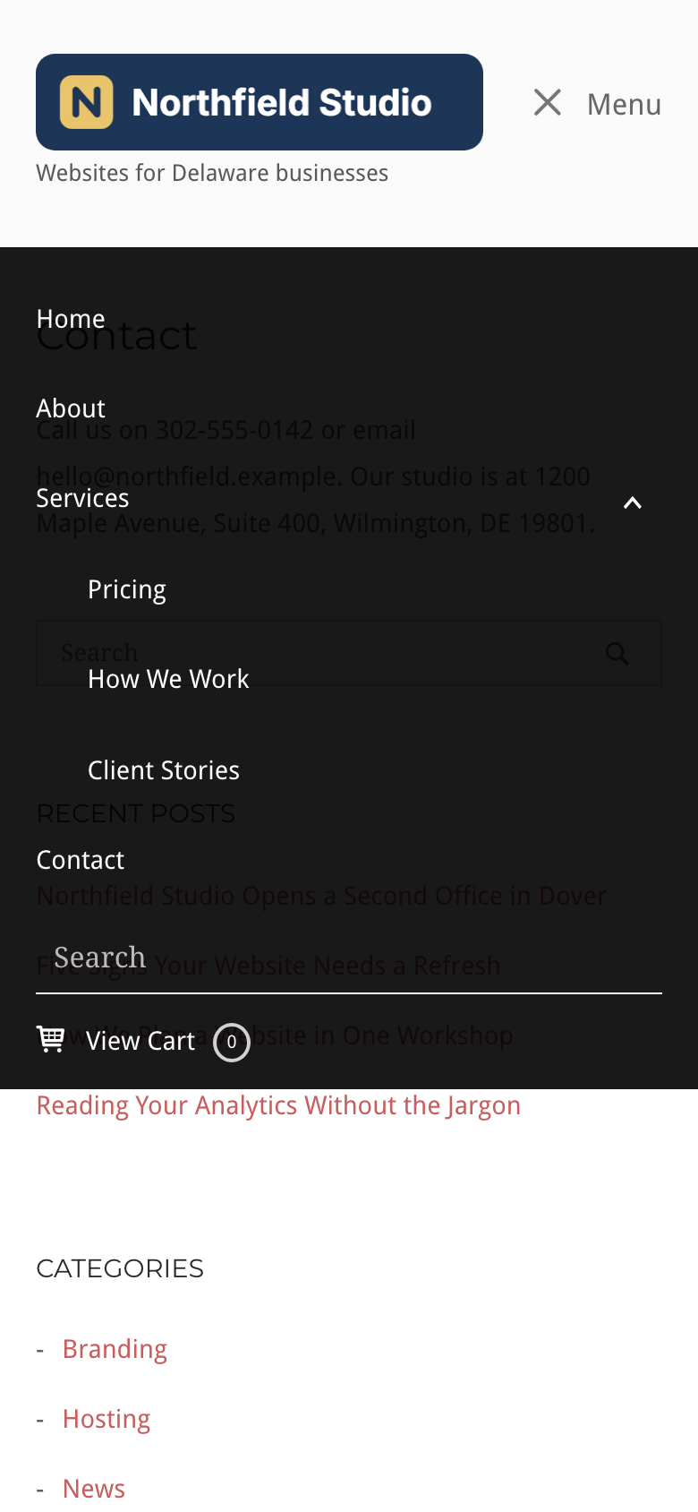
On screens at or below the Menu Breakpoint, the header menu changes into a mobile menu button. A click on the button opens the mobile menu, which holds the header menu items, a search field when Menu search is on in Navigation, and a cart link when the WooCommerce cart shows. Sub menus open with the arrow next to their parent item. When UberMenu or Max Mega Menu outputs the header menu, the plugin handles small screens instead.
Mobile Menu Text
The text next to the mobile menu icon. Leave it empty to show the icon only. Default: Menu.
Mobile Menu Text Color
The color of the text next to the mobile menu icon. Default: #666666.
Mobile Menu Icon Color
The color of the three lines of the mobile menu icon. It does not apply to a custom icon from Icons. Default: #777777.
Menu Breakpoint
The screen width in pixels at which the header menu changes into the mobile menu. Type a number only, such as 768. Default: 600.
Mobile Menu Background Color
The background color of the open mobile menu. Default: #000000.
Mobile Menu Background Opacity
The opacity of the mobile menu background. 0 is fully transparent and 1 is solid. Default: 0.9.
Mobile Menu Dropdown Text Color
The color of the links, the search field and the cart link in the open mobile menu. Default: #ffffff.
The mobile menu button shows only when the header menu has items, Menu search is on, or the WooCommerce cart shows. To add a menu, see Menu Locations.
Video Embeds
Use Fitvids
Load FitVids.js, which makes embedded videos scale to the width of the content area and keep their shape. It applies to videos in post and page content, Page Builder layouts and WooCommerce pages. Default: on.
Other Breakpoints
These widths are fixed in the theme styles, and no setting changes them:
- The Footer Widgets columns stack on screens 640 pixels wide or less, while the responsive layout is on.
- Top bar widgets stack on screens 768 pixels wide or less.
- The scroll to top button hides on screens 600 pixels wide or less while the responsive layout is on, unless Scroll to top on mobile is on in Navigation.
Related
- Icons to replace the mobile menu icon.
- Navigation for the sticky menu and menu search.
- Advanced Customizations to turn off the sticky header on small screens.