
 Page Builder
  Widgets Bundle
  SiteOrigin CSS
  Installer
 Responsive Layouts
3 min read Updated
Page Builder layouts change to fit the screen. You can control how rows change on tablets and phones.
How Columns Stack
By default, when the screen is as narrow as the Mobile Width or narrower, each row shows its columns one above the other at full width. The left column is on top, or the right column on right-to-left sites. Empty columns are hidden on mobile. You can change this for the whole site or for one row.
If Use Tablet Layout is on, rows that stack on mobile and have three or more columns show two columns per line on tablets. This happens between the Tablet Width and the Mobile Width, so the Tablet Width must be the larger value. Rows with one or two columns keep their desktop layout on tablets.
Set the Breakpoints
Go to SettingsPage BuilderLayout.
- Responsive Layout: Collapses rows, columns and widgets on mobile. It is on by default. If you turn it off, columns never stack and empty columns stay visible.
- Use Tablet Layout: Turns on the tablet layout. Off by default.
- Tablet Width: The screen width for the tablet layout. The default is 1024px.
- Mobile Width: The screen width for the mobile layout. The default is 780px, and the lowest value is 320px.
The same tab sets Row Gutter, the space between columns, and the default mobile bottom margins for rows, stacked columns and widgets.
Change How a Row Collapses
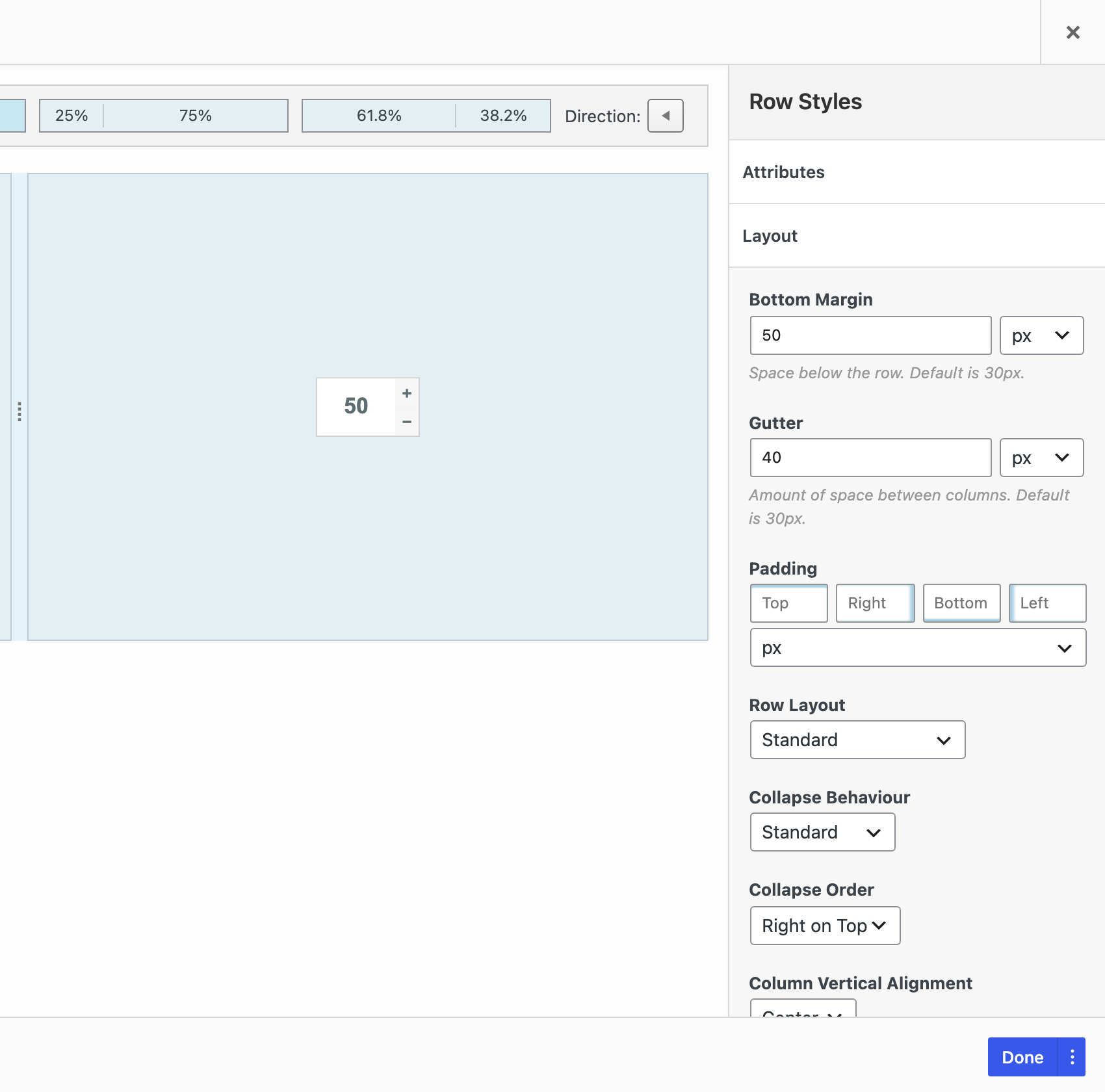
Edit a row and open the Layout section in the Row Styles sidebar.
- Collapse Behaviour: Standard follows the site settings above. No Collapse keeps the columns side by side on all screens. Empty columns are still hidden on mobile.
- Collapse Order: Left on Top puts the first column on top. Right on Top reverses the order, so the last column is on top. Default uses Left on Top, or Right on Top on right-to-left sites.
Use Right on Top when a row has an image on the left and text on the right, and the text should come first.
Tablet and Mobile Spacing
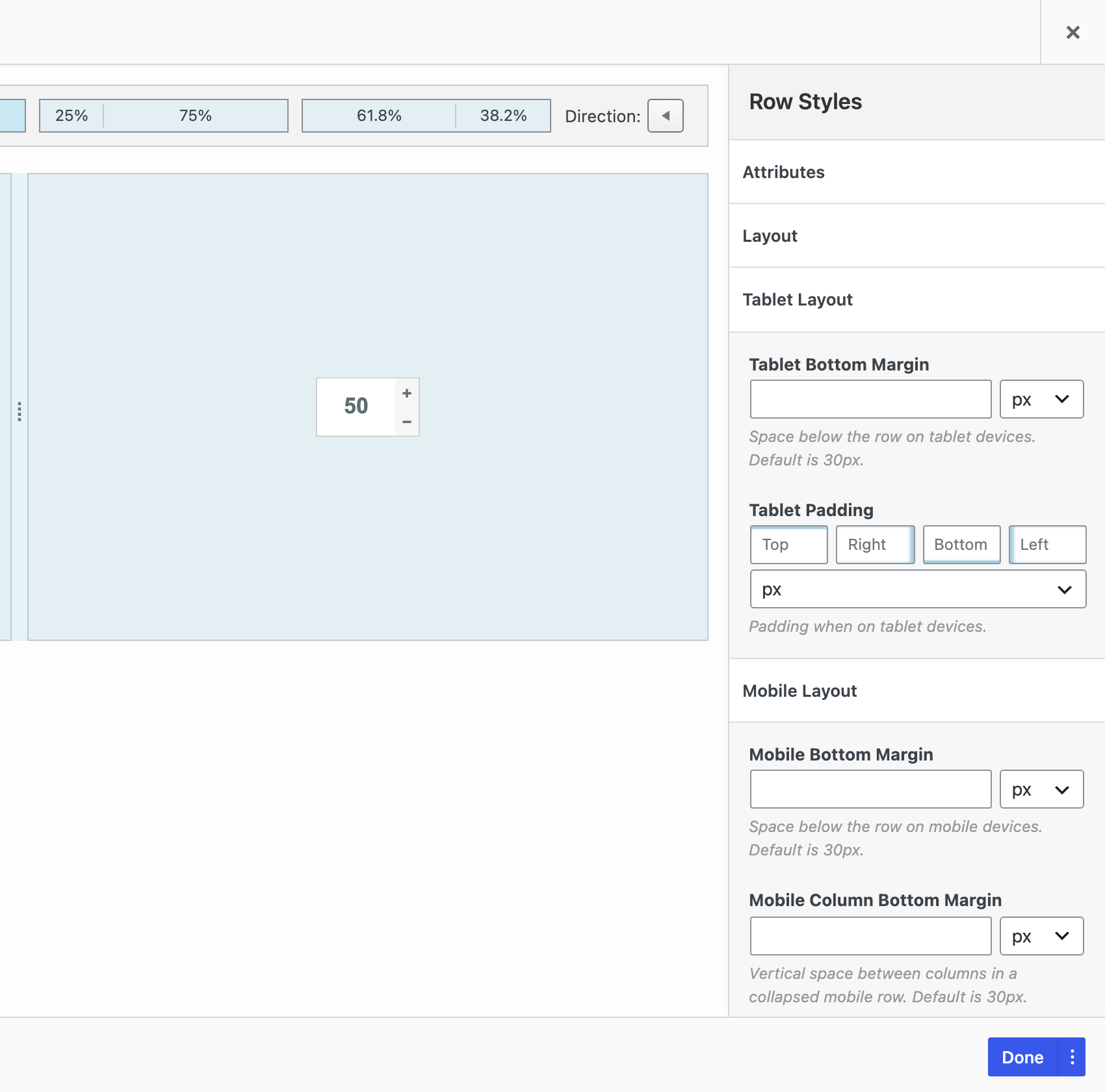
Rows, columns and widgets each have a Mobile Layout section in their styles. When Use Tablet Layout is on, they also have a Tablet Layout section. Tablet values apply between the Mobile Width and the Tablet Width. Mobile values apply at the Mobile Width and below. Row bottom margins for tablet and mobile need Collapse Behaviour set to Standard. If you leave a field empty, the element keeps its desktop style or uses the default from the Layout settings tab.
- Rows: Tablet Bottom Margin, Tablet Padding, Mobile Bottom Margin, Mobile Column Bottom Margin and Mobile Padding.
- Columns: Tablet Padding and Mobile Padding.
- Widgets: Tablet Margin, Tablet Padding, Mobile Margin and Mobile Padding.
Mobile CSS Declarations
For other mobile changes, use Mobile CSS Declarations in the Attributes section of a row, column or widget. Add one CSS declaration per line, for example text-align: center;. They apply only at the Mobile Width and below.
To hide a row or widget on desktop, tablet or mobile, SiteOrigin Premium adds Toggle Visibility. It uses the Tablet Width and Mobile Width above, and it needs the SiteOrigin Widgets Bundle.
Show Empty Columns on Mobile
If you use an empty column to show a background color or image, go to SettingsPage BuilderLayout and turn on Display Empty Columns With Background. Page Builder then shows all empty columns on mobile.
Preview Your Layout
Open the Live Editor and use the desktop, tablet and mobile buttons. The tablet preview is 720px wide and the mobile preview is 320px wide. With the default Mobile Width of 780px, the tablet preview shows the mobile layout. To check the tablet layout, view the page in a browser window between your Mobile Width and Tablet Width.