 Page Builder
  Widgets Bundle
  SiteOrigin CSS
  Installer
 Styling a Page
I’m assuming you’ve already read the getting started guide and begun building pages with Page Builder. This guide will help you with the more advanced concepts of styling a Page Builder page.
Styling a Row
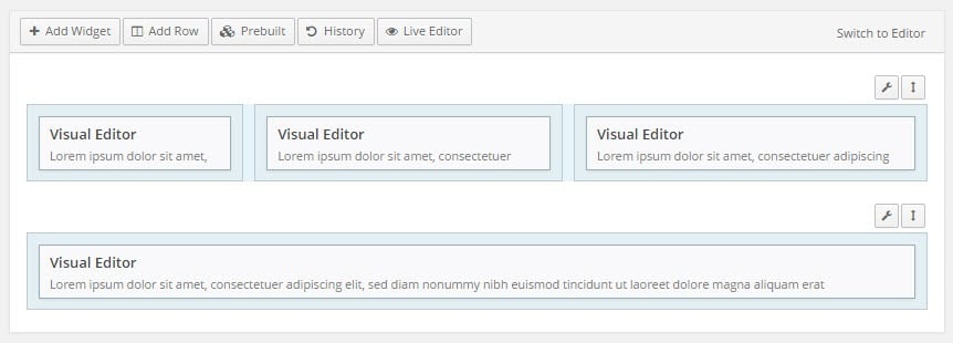
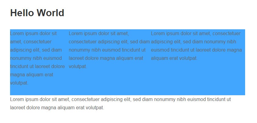
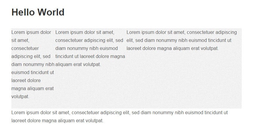
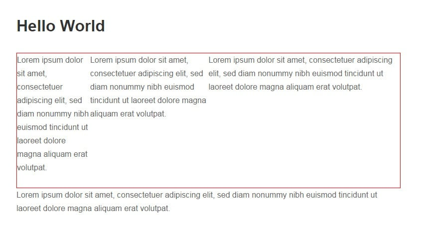
The example below displays the default row and cell styling for the example page:
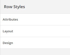
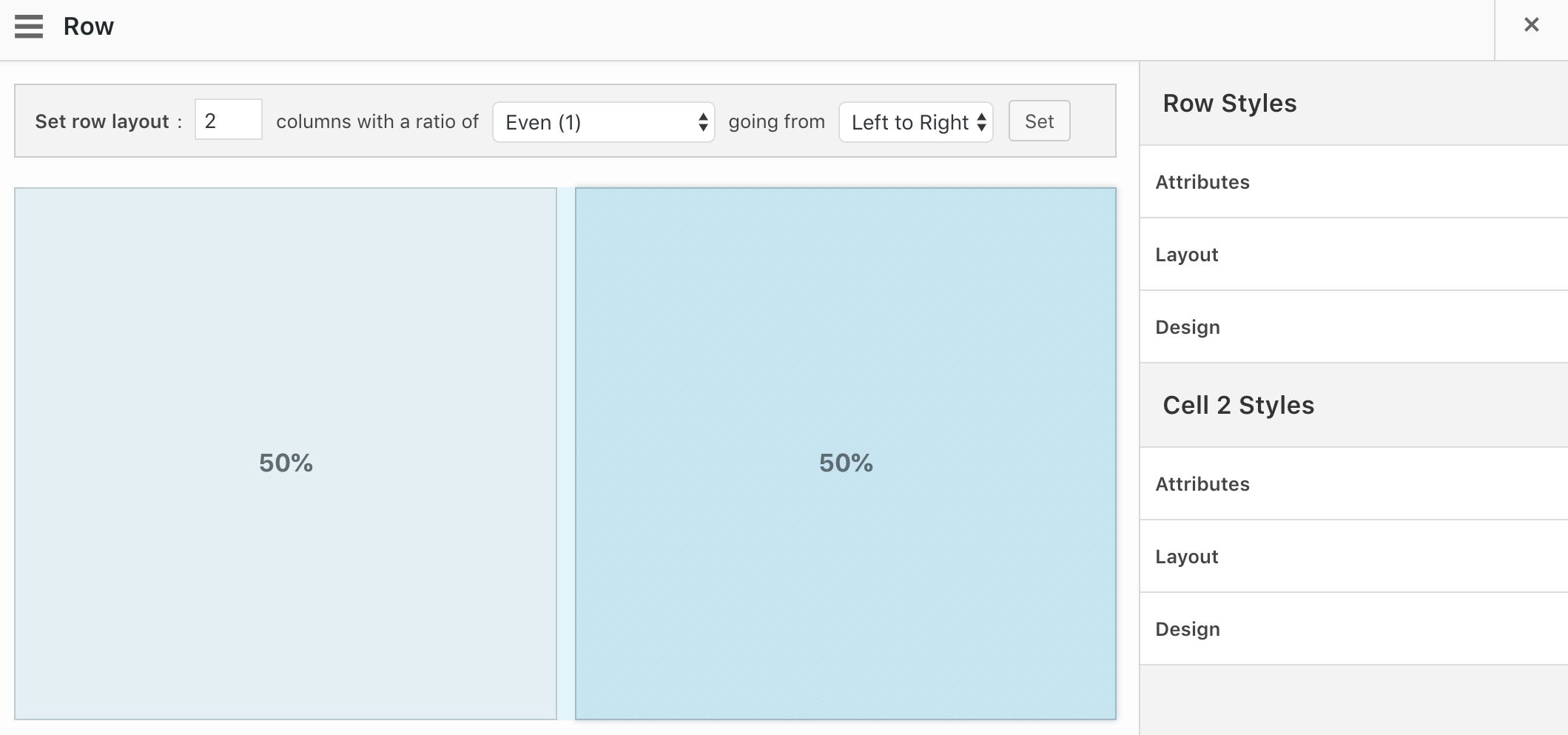
In the “Edit Row” dialog, you’ll find the row styling tabs in the Row Styles Sidebar. By default, there are three groups: Attributes, Layout and Design. Click on each tab to display the settings in that group.
Attributes
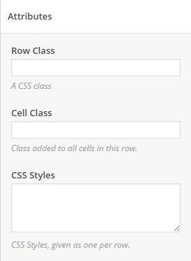
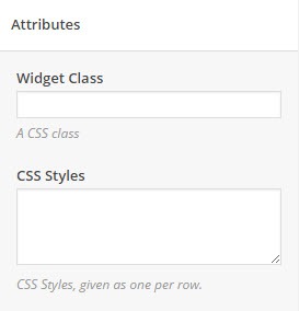
Under the attributes tab, you can specify the Row Class and Cell Class. Use the CSS Styles editor to add custom styling to the row and the cells using your chosen classes.
Layout
Under the layout tab, you’ll find settings for Bottom Margin, Gutter, Padding, and Row Layout.
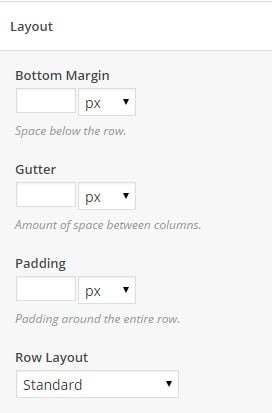
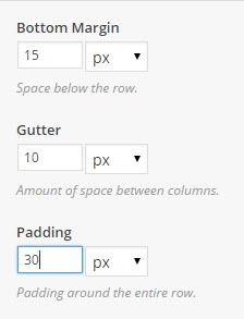
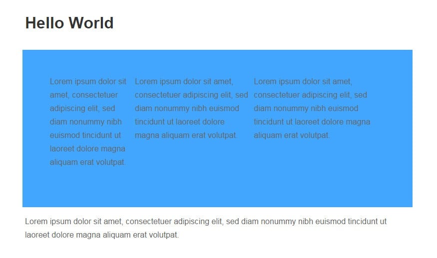
Bottom Margin, Gutter and Padding
You can specify your layouts using just about any unit. Click on the drop-down menu to change the unit you’re using.
This is what each of the settings means in the Page Builder context:
- The bottom margin adjusts the space below the row
- The gutter adjusts the space below each cell
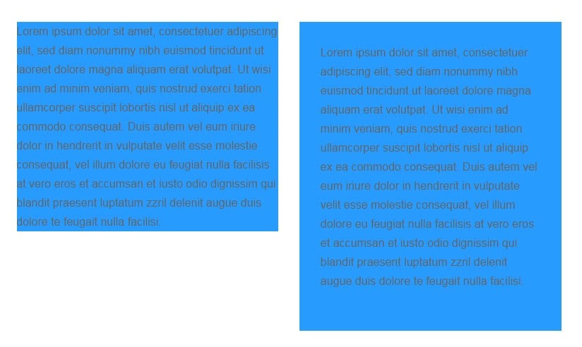
- The padding adjusts the space around the entire row
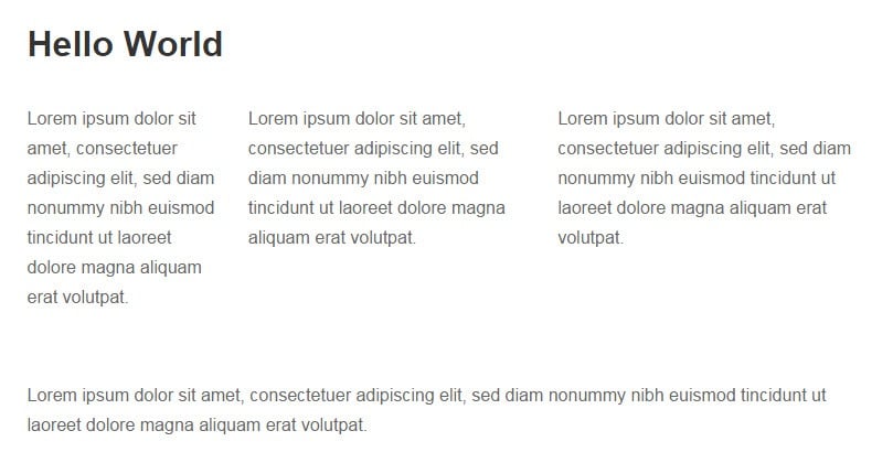
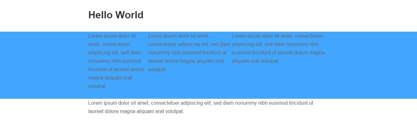
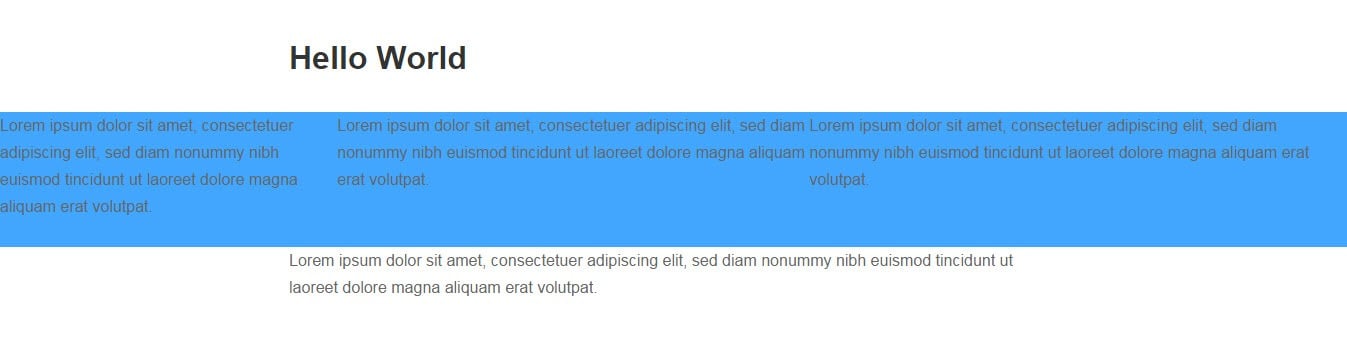
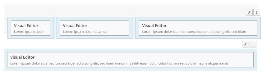
A comparison of the default row and cell styling and the following example settings are shown below for the first row:
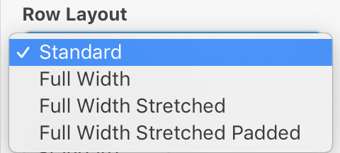
Row Layout
The Row Layout setting has three options; Standard, Full Width, Full Width Stretched and Full Width Stretched Padded. There are examples for each layout:
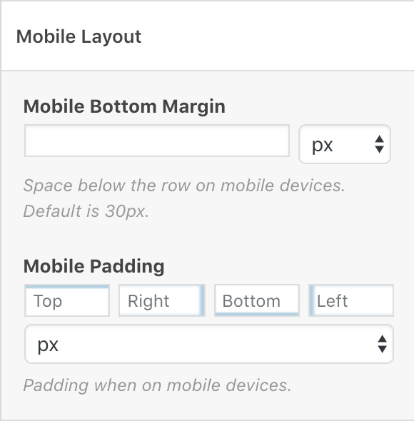
Mobile Layout
Mobile Bottom Margin
Space below the row on mobile devices. Default is 30px.
Mobile Padding
Padding when on mobile devices. Enter values for the top, right, bottom and left mobile padding as required.
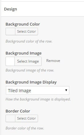
Design
Under the design tab, you will find settings for Background Color, Background Image, Background Image Display and Border Color.
Background Color
To select a row’s background color, click on the “Select Color” button under the Background Color heading.
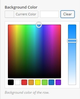
Select the desired color using the color pallet, or type in the color Hex (#) Value. Adjust the color intensity using the slider.
Background Image
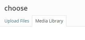
To select a row background image, click on the “Select Image” button.
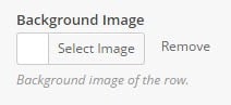
The media library dialog will appear. Select the desired image and click “Done.”
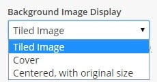
Select how you wish the image to display from the “Background Image Display” drop-down menu.
Choose between the following options:
- Tiled Image
- Cover
- Centered, with original size
- Contain
- Fixed
- Parallax
- Parallax (Original Size)
Parallax Image Requirements
To work correctly, parallax scrolling requires that image height be greater than the image width. When this condition is no longer true, parallax scrolling will switch to a regular background image using background-size: cover; and a centered position. It’s possible for an image to meet the requirements on desktop but not for mobile as the content in the widget stacks and the height increases. If your widget parallax scrolling is functioning correctly on desktop but not on mobile, check to see if the image height is less than the width when parallax scrolling stops.
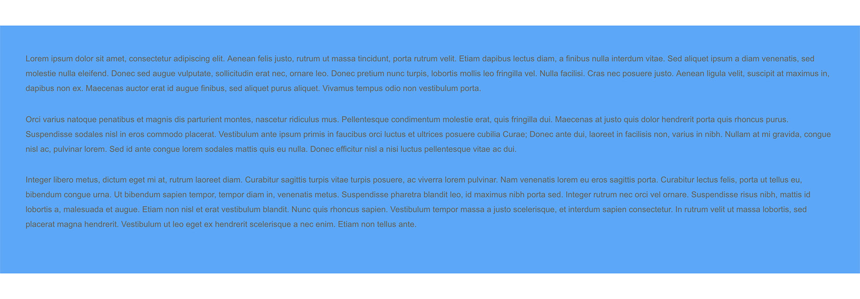
Below is an example of a tile-able background image, generated using SiteOrigin’s very own background image generator, used as a row background. The Background Image Display is set to “Tiled Image.”
Border Color
To select a border color, click on the “Select Color” button under the Border Color heading.
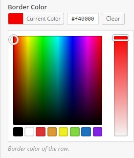
Select the desired color using the color pallet or type in the color Hex (#) Value. Adjust the color intensity using the slider.
Changing Row Orders
To change the order of a row, click and hold the arrow icon in the upper corner above that row.
Once you have positioned the row, release the icon to implement the change.
Styling a Cell
To style a row cell, edit the row and click the cell you’d like to style. Once selected, the background color of the cell will be a slightly darker blue and a Cell Styles panel will appear in the right column under the Row Styles panel.
The Cell Styles panel offers the following sections:
Attributes
Cell ID
A custom ID used for this cell.
Cell Class
A custom CSS class used for this cell.
CSS Styles
One style attribute per line. For example font-size: 16px. The closing ; at the end of each line isn’t neccessary.
Mobile CSS Styles
CSS applied when in mobile view. For example font-size: 14px. The closing ; at the end of each line isn’t neccessary. The resolution used for the mobile view is at SettingsPage BuilderLayoutMobile View.
Layout
Padding
Set the top, right, bottom and left padding around the entire cell.
Mobile Padding
Set the top, right, bottom and left padding around the entire cell on mobile devices.
Vertical Alignment
Choose between defaulting to the row alignment (use row setting) or top, center, bottom or stretch.
Design
Background Color
Background color of the cell.
Background Image
Background image of the cell.
Background Image Display
How the background image is displayed.
Border Color
Border color of the cell.
Font Color
Color of text inside the cell.
Links Color
Color of links inside the cell.
Styling a Widget
Click on any widget to open its edit dialogue. The widget styling features may vary from widget to widget, depending on the author of that particular widget. There are, however, some basic default styling options.
Attributes
Under the attributes tab, you can specify the Widget Class and use the CSS Styles editor to add custom styling to that widget using your chosen class.
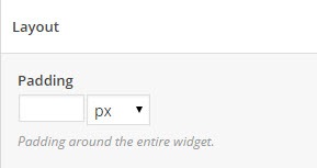
Layout
Under the layout tab you will find a padding text field. This value specifies the padding around the entire widget within its cell. You can specify this value using just about any unit. Click on the drop-down menu to change the unit you’re using.
Design
Under the Design tab, you will find similar settings to those found in the Row Styling Design tab, namely Background Color, Background Image, Background Image Display, and Border Color. All these setting are covered under section Row Styling > Design.
In addition to these, you will find Font Color.
Font Color
To select a font color, click on the “Select Color” button under the Font Color heading.
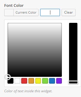
Select the desired color using the color pallet, or type in the color Hex (#) Value. Adjust the color intensity using the slider.