
 Page Builder
  Widgets Bundle
  SiteOrigin CSS
  Installer
 Theme Design
3 min read Updated
The Theme Design panel sets the Origami fonts and the colors of the page container, the menu and the footer. You open it at AppearanceCustomizeTheme Design, and it has four sections: Fonts, Page Container, Menu and Footer. The other Origami settings are in the Theme Settings panel.
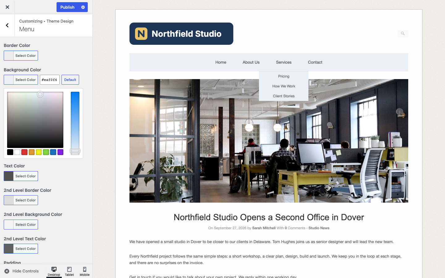
Color fields and the menu Padding field update the preview as you change them; font fields reload it. Nothing is saved until you click Publish.
Fonts
Each font list starts with six web safe fonts, such as Helvetica Neue and Georgia, followed by Google fonts. A Google font has one entry for each weight, for example Dosis (200). When you choose a Google font, Origami loads it from Google Fonts.
Body Font
Used for body text. Default: Helvetica Neue.
Title Font
The font of the site title in the header. The site title shows only when your site has no logo or header image. Default: Dosis (200).
Heading Font
The font of headings, post and page titles, archive titles and footer widget titles. Default: Dosis. At the default, Origami does not load Dosis, so these titles show in Arial on most computers (issue #30). To show Dosis, choose Dosis (200), the weight that Origami uses for post titles.
Page Container
The page container is the box that holds the header, menu, content and footer widgets. The copyright line sits below it, on the page background.
Background Color
The background color of the page container. Default: #fdfdfd.
Border Color
The color of the thin border around the page container. Default: #cbc9c7.
Menu
Border Color
Sets the lines above and below the menu bar. Default: #EEEEEE.
Background Color
The background color of the menu bar. Default: #F9F9F9.
Text Color
Sets the top level menu links. Default: #505050.
2nd Level Border Color
The border color of the drop-down menus. Default: #DDDDDD.
2nd Level Background Color
The background color of the drop-down menus. Default: #F4F4F4.
2nd Level Text Color
Sets the links in the drop-down menus. Default: #606060.
Padding
The space above and below each top level menu link, in pixels. Default: 25. The menu uses 22 pixels until you enter a value other than 25, because a value of 25 adds no CSS (issue #31).
Footer
The first five colors apply to the footer widget area, which shows only when the Footer widget area has widgets. The last two apply to the copyright line and the “Theme By SiteOrigin” link below the page container.
Background Color
The background color of the footer widget area. Default: #F9F9F9.
Border Color
Sets the line above the footer widget area. Default: #EEEEEE.
Text Color
The color of the footer widget text. Default: #777777.
Link Color
The color of links in the footer widgets. Default: #505050.
Title Color
Sets the footer widget titles. Default: #333333.
Copyright Text Color
The color of the copyright line. Default: #999999.
Copyright Link Color
Sets the links in the copyright line, including the “Theme By SiteOrigin” link. Default: #777777.
Other Design Settings
These settings come from WordPress, in their own Customizer sections:
- Colors has Background Color, the color around the page container (default #f0eeeb), and Origami’s General Link Color, the color of links in post and page content (default #36659f). The preview reloads when you change the link color.
- Background Image holds the light texture that Origami shows behind the page container; you can remove it or choose your own image there.
- Site Identity and Header Image hold your logo, as Add Your Logo shows.
For changes that these settings do not cover, such as font sizes and the site width, see CSS Snippets.