
 Page Builder
  Widgets Bundle
  SiteOrigin CSS
  Installer
 Menus
3 min read Updated
Origami has one menu location, Primary Menu, which shows your menu in a bar below the logo. Nested menu items open as drop-down menus, and on small screens a Menu button opens the menu in a panel.
Create and Assign a Menu
- Go to AppearanceMenus.
- Click create a new menu, type a name such as Main Menu and click Create Menu.
- On the left, open Pages, tick the pages you want and click Add to Menu. Drag an item to the right, under another item, to make it a sub item.
- Under Menu Settings, tick Primary Menu for Menu location.
- Click Save Menu.
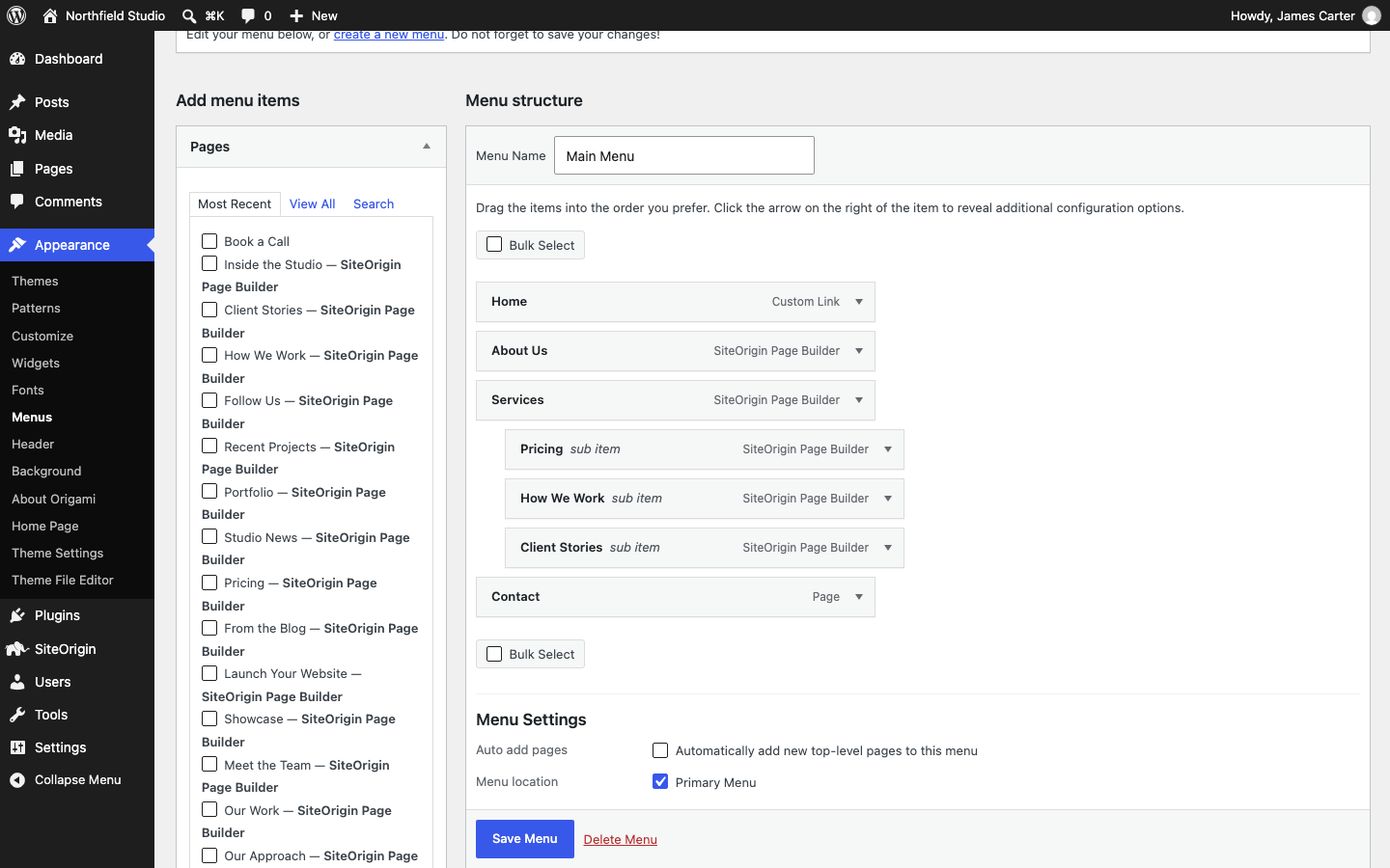
You can also assign a menu at AppearanceMenusManage Locations, or in the Customizer at AppearanceCustomizeMenus, where you see the changes in the preview before you publish.
The Default Page List
Until you assign a menu to Primary Menu, Origami lists all your published pages in the menu bar. WordPress sorts them by the Order field of each page, then by title, and shows child pages as drop-down menus. The list has no link to the home page, so add a menu when you want to choose the links or their order.
Drop-Down Menus
The menu bar is centered below the logo. When the mouse pointer is over an item with sub items, its drop-down menu opens below it. A third level opens to the right of the drop-down menu, and you can nest items as deep as you like. Drop-down menus do not open with the keyboard (issue #36), so keep important pages at the top level.
To change the colors of the menu bar and the drop-down menus, and the space above and below each item, use the Menu section of Theme Design. For the menu font size, see CSS Snippets.
Mobile Menu
On screens 480 pixels wide or narrower, a Menu button replaces the menu bar. The button opens a panel over the page with a search field and your menu items. An arrow beside an item opens its sub items, the back arrow at the top returns to the level above, and X closes the panel. An item with # as its link opens its sub items too.
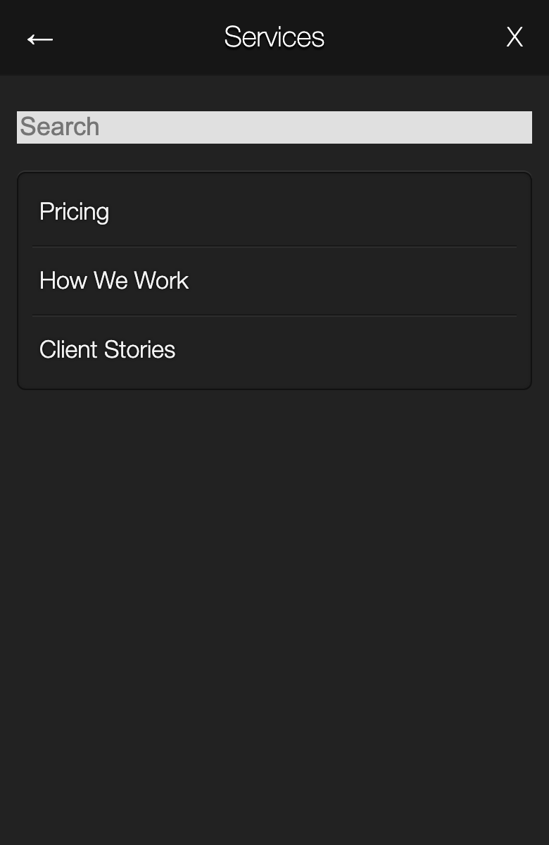
Two settings in the Responsive section of Theme Settings control the mobile menu:
- Responsive Navigation turns the mobile menu on or off. When it is off, phones show the menu bar. Default: on.
- Responsive Navigation Collapse sets the screen width in pixels at and below which the Menu button shows. Enter 0 to show the button on all screens. Default: 480.
When Responsive in the same section is off, phones show the desktop layout at a width of 1100 pixels, so the Menu button does not show.
To change the button text or remove the search field from the panel, see Advanced Customizations.
Header Search
The search field at the right of the header belongs to the logo area. Turn it off with Header Search in the Display section of Theme Settings.