 Page Builder
  Widgets Bundle
  SiteOrigin CSS
  Installer
 How to fix box in mobile view – or hide
I have a Row with 3 widgets
The Row has a background image with a colour wash over the top
Background Image display = Tiled image
Background Image Style = Full
Column 1 style has background colour #fffff
Padding 5,10,5,10 %
Vertical Alignment Center
Editor Design
Background Colour #c1ebff
Padding 30, 30, 30, 30 px
But looks really bad on mobile
Image 1
Image 2
Image 3
Is there any way to fix the formatting using mobile design or if it can’t be fixed that way, is there a way to hide these rows on mobile only but still show on desktop?
This is our free support forum. Replies can take several days.
Need fast email support? Get SiteOrigin Premium
Replies
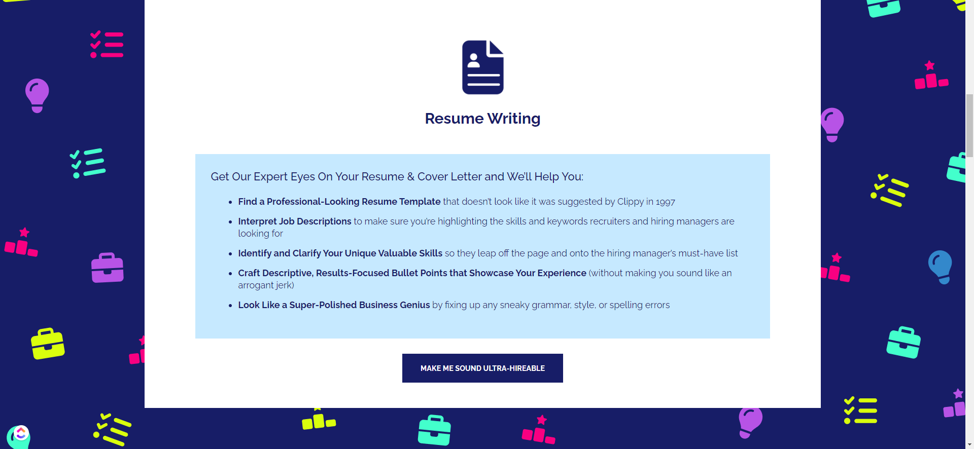
4Desktop image link
https://wimdi.com/wp-content/uploads/2024/04/Screenshot-79.png
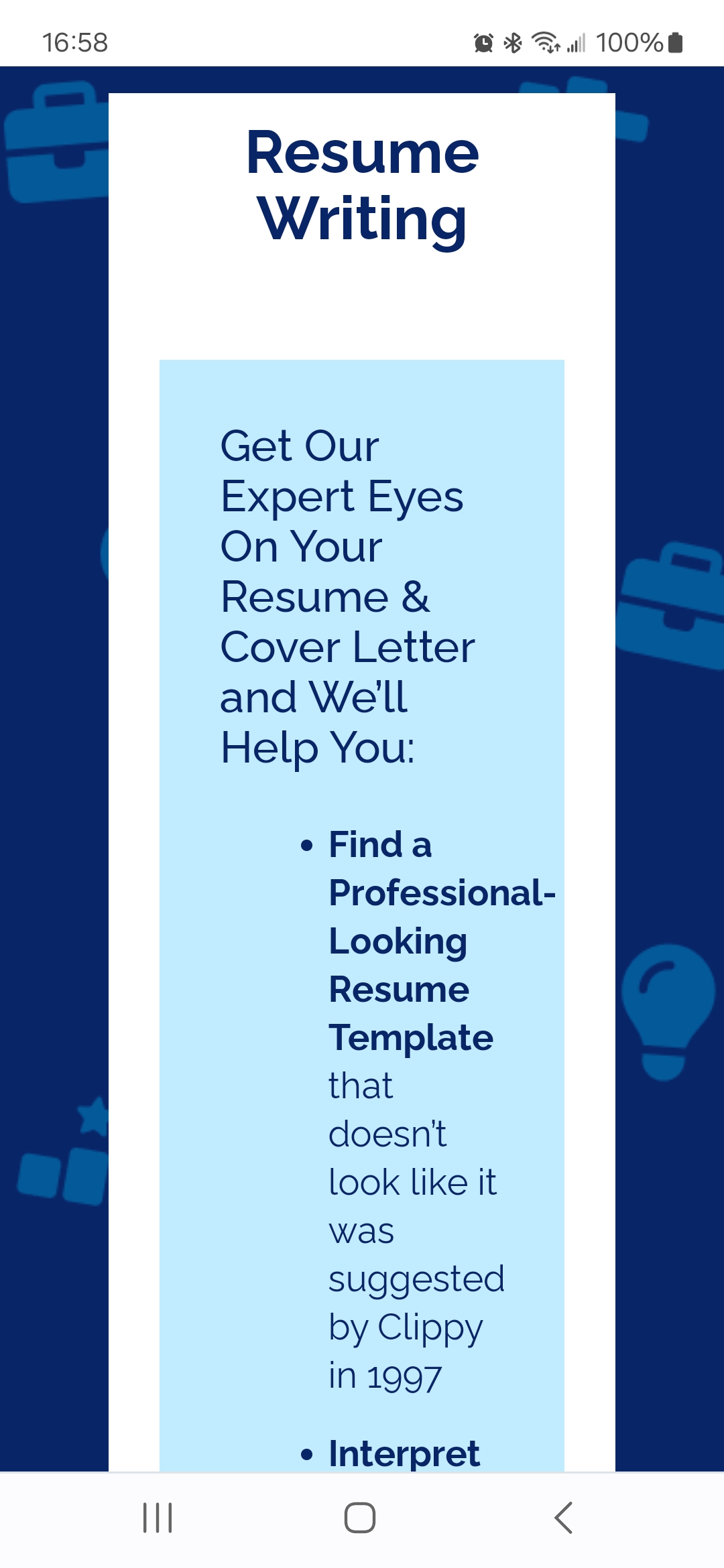
Mobile screenshot image 1
https://wimdi.com/wp-content/uploads/2024/04/Screenshot_20240423_165852_Ecosia.jpg
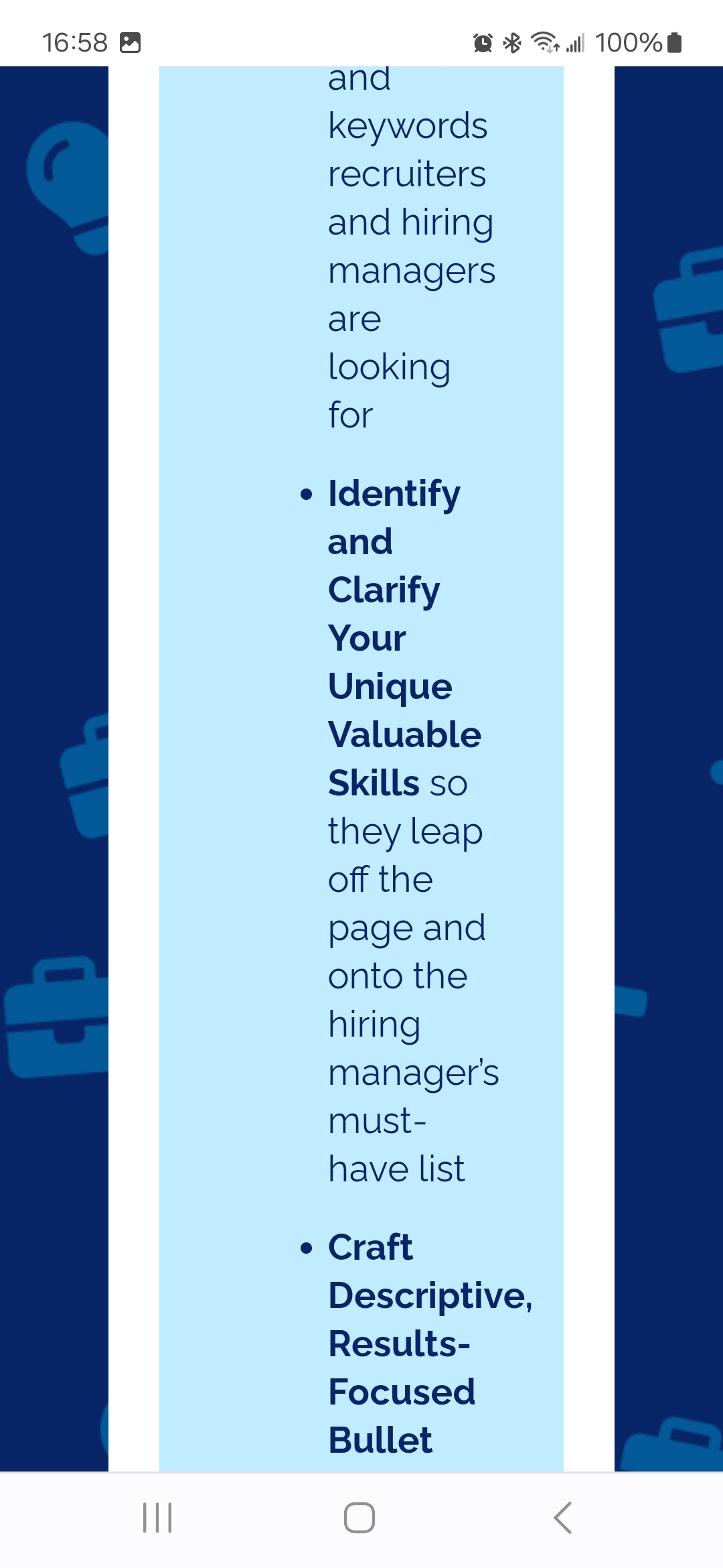
Image 2
https://wimdi.com/wp-content/uploads/2024/04/Screenshot_20240423_165859_Ecosia.jpg
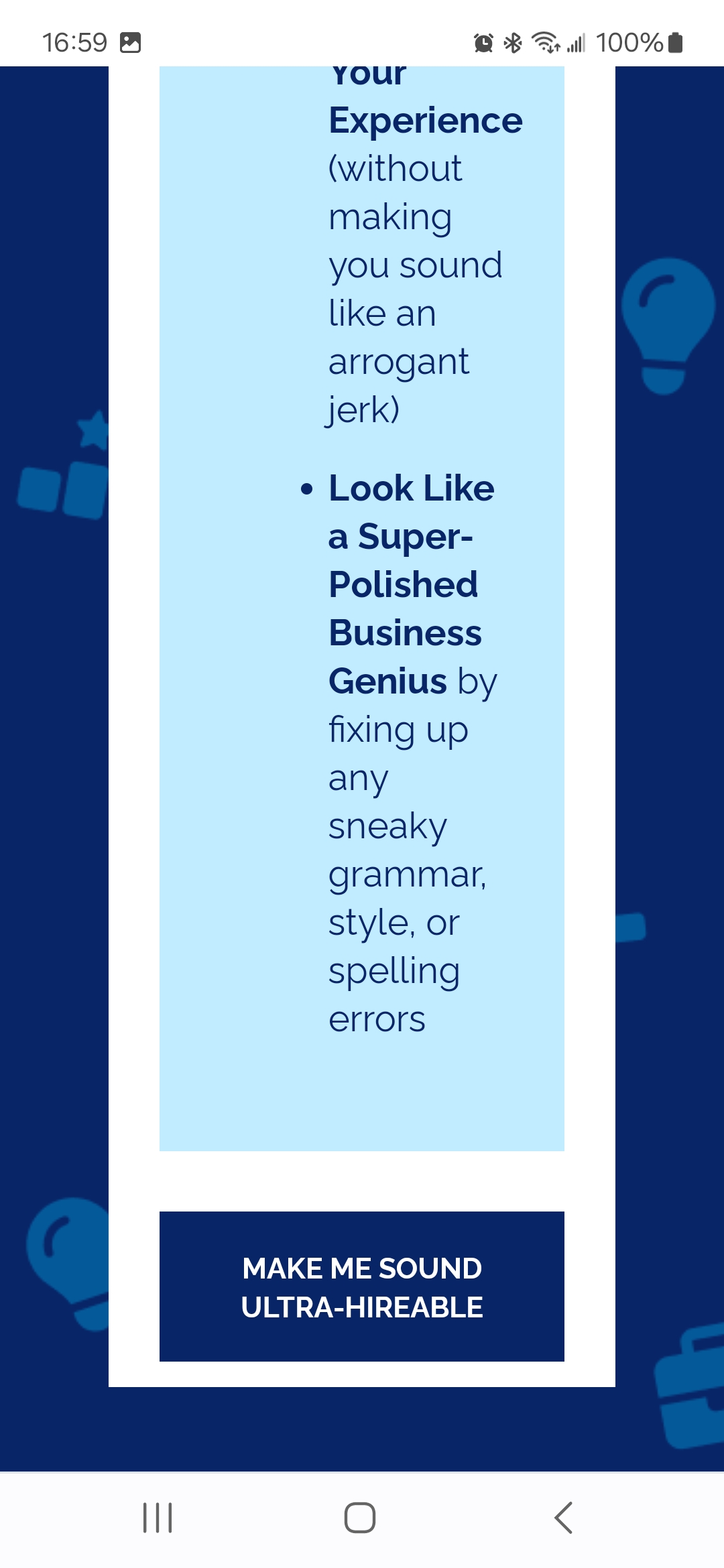
Image 3
https://wimdi.com/wp-content/uploads/2024/04/Screenshot_20240423_165905_Ecosia.jpg
Hi Holly
At the row, column, and widget level you’ll find mobile-specific sections within the Layout section. In each case try reducing whatever padding has been set to allow for more space on mobile.
Hi Andrew,
Padding hasn’t worked for this. How can we hide rows on mobile only but still show on desktop?
Hi Holly
We offer widget, column, and row display for various resolutions via the Toggle Visibility Addon: Page: Toggle Visibility. We don’t currently have a built-in solution without SiteOrigin Premium.
Replies on this thread are closed.
Please create a new thread if you have a question, or purchase a SiteOrigin Premium license if you need one-on-one email support.