 Page Builder
  Widgets Bundle
  SiteOrigin CSS
  Installer
 Question about button widget in North theme
Hello,
I’ve build a site with the North theme, absolutely happy with it! I do have a few questions though, I’m stuck. It regards the SiteOrigin button widget. Let me show you with pictures what I mean.
The buttons are not the same hight (because of the larger text within).
In the responsive mode, the buttons are too wide.
Here the buttons are larger than the pictures.
I’ve used page builder and I made rows, like so:
I have SiteOrigin CSS, bus I am not able to adjust this.
Kind regards,
Simone
This is our free support forum. Replies can take several days.
Need fast email support? Get SiteOrigin Premium
Replies
46Hi Simone
Thanks for your support.
Do you have a public URL where we can take a look at what’s going on? If you need to keep this URL private from other users, just select “Private Reply” on the bottom right of the comment box.
Hi Andrew,
I don’t have a public URL, I work local.
A lot of mentioned above I could fix (using Sublime Text adjusting width etc.).
What is still left:
When the page is full width, all is perfect (first screenshot).
When I make the screen smaller (responsive), the pictures become smaller, but the buttons don’t (second screenshot). How can I scale the buttons as well?
When I make the screen even more small (responsive), the pictures are below each other (third screenshot). I would like it more when the pictures would stand beside each other as long as possible.
I would really appreciate if you could tell me where I can find this in the code, so I can alter it with Sublime Text.
Oh, and I just want to tell you that I looooooooove the CSS editor from SiteOrigin!!!! Works like a charm.
Thanks for the wait.
I’m really glad to hear you’ve been enjoying SiteOrigin CSS.
Please, keep in mind that all WordPress themes completely overwrite their own folder during theme updates so it’s best to not edit any theme files directly, a child theme should be used if you want to make code level changes.
Ideally, we’d wait until your site was live to assist with this challenge. I don’t have a settings based solution. The solution would probably rely on a little custom CSS to set the button widths. With questions like this it’s a lot quicker if we can inspect the page and the code to send recommendations.
With regards to the collapse point setting, sure, this can be changed. Please, go to SettingsPage BuilderLayoutMobile Width and Tablet Width if you have that enabled.
Hi Andrew,
Thanks for the reply!
I think I’ll have the site live within a day or two. I’ll give a shout when it’s live, I hope you will have a look then.
I don’t know what a child theme is, but I’ll look into it.
I’ll be back shortly!
Regards,
Simone
Awesome, let me know when it’s live and I’ll take a look.
To read a quick overview on child themes, please, see my post here: Page: Child Themes.
We don’t have a starter child theme available for North yet, let me know if you need one.
Hi Andrew,
I understand now what you mean with Child Themes. It would be best not to use it al all, I think. A few questions though:
– Is it possible to have a menu-stripy-thingy (three stripes) in stead of the menu how it is now?
– Is it possible to change the footer so that SiteOrigin does not appear in the footer?
– Is it possible to mess with the responsive settings? Now for instance in te “over” page, there are 4 pictures next to each other, on a tablet only one, but there is room for 2.
– The buttons below the pictures (for instance on the “over” page) are not all the same with (the same as the pictures), what to do with those?
Love to hear from you!
Regards,
Simone
pfff, forgot the link to the test-site: galerie.dekleinevesting.nl
Hi Simone :)
Is it possible to have a menu-stripy-thingy (three stripes) in stead of the menu how it is now?
Go to Appearance > Customize > Theme Settings > Responsive and change the value to say 3000. This will make the mobile menu display on all displays up to 3000px width resolution.
Is it possible to change the footer so that SiteOrigin does not appear in the footer?
Hopefully, we’ll have some kind of premium offer in the future that would remove this attribution link. You could edit footer.php from within a siteorigin-north child theme to remove it now.
Is it possible to mess with the responsive settings? Now for instance in te “over” page, there are 4 pictures next to each other, on a tablet only one, but there is room for 2.
If you’re using Page Builder you can control the responsive collapse points from SettingsPage BuilderLayout.
The buttons below the pictures (for instance on the “over” page) are not all the same with (the same as the pictures), what to do with those?
Is your site live yet? It would be easiest to check this question out by looking at the pages. Thanks.
yes it’s live, the link is above your reply. ;-)
The stripy-menu is there when I change the value to 3000. BUT, when I click on it, no menu appears. So I changed ik back for now.
I also adjusted the responsive settings for page-builder, but that doesn’t look good either. It would be much more convenient to use image grid (siteorigin), but I can’t put names there…
So is it best to change the theme to Influence? Or another theme?
I’ve tried to make a sub-menu instead of de different pictures with buttons. So this one can be closed.
Thanks for highlighting the issue with the responsive menu. The bug has been fixed, we hope to release an update within the next week that will resolve the problem.
Andrew, will you please take a look at my site? galerie.dekleinevesting.nl
The submenu is cut off. And in the responsive mode I hardly see any menu. What can I do about that?
And is it possible that you send me a child-theme? Because I really want to change the footer text. ;-)
And what about the responsive settings? When adjusted to 3000 (for instance), the menu doesn’t appear. I can see the 3 stripes, but no menutext.
Love your help, thanks!!!!!
p.s. I have also asked a question about a one-page website 2 days ago (technical – theme north) but no answer yet. Can you help there as well?
And I don’t mind paying if that helps at all. Love to contribute for all that fine work of SiteOrigin!
Thanks for your feedback.
Apologies for the menu hassles. They should all be resolved with the upcoming update. I’m sure we’ll see that released in the next few days.
Please, find a starter child theme for SiteOrigin North here: https://siteorigin.com/wp-content/uploads/2016/04/siteorigin-north-child-starter.zip. To make use of the child theme, download the ZIP file and install via AppearanceThemesAdd NewUpload Theme. Activating a child theme for the first time will cause AppearanceCustomize and AppearanceMenusMenu Locations to reset.
For an overview of how a child theme works, please, see our page here: Page: Child Themes. The WordPress.org overview can be found here: https://codex.wordpress.org/Child_Themes.
I’ll reply to your other thread ASAP. Apologies for the delay.
Thanks Andrew!!!!
I can’t see the complete list. No way to scroll down. What to do? galerie.dekleinevesting.nl
Or is that also fixed in the next update?
Now in the responsive mode, the screen is black, with white letters. Is it possible to change that to the look of the site? In my case something like this: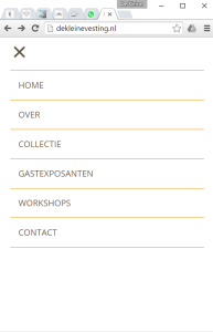
It seems to me that a lot of people would want this a bit more similar to their site.
In the responsive mode, the menu stays in plays, even if you click on a menu-item. Then it is supposed to disappear in my opinion.
strange, it stays on here but not here
(the menu in the responsive mode)
All of the above challenges should be resolved in the update which we’ll release ASAP. Changing responsive menu colors is a good idea, I’ll log that as a feature request.
Super, thanks! Responsive menu’s are very important I think. And again, I don’t mind paying. I will use your stuff a lot in the future.
When in the responsive mode, the slider disappers under the header. Any thoughts? example
Can you please, check your Custom CSS for the following rule:
#masthead.site-header.layout-centered {
  margin-bottom: -1px;
  background-color: #ffffff;
}
Try removing the following declaration:
That should hopefully, resolve the slider challenge. Thanks for your offer of support. We’re working on an all in one premium offering that would offer extra options for your theme as well as the Widgets Bundle. We’re hoping to release that in the next couple of months.
Yep, that did the trick!
Another question, is it possible to make the active page visible in the menu? By putting a line under the menu-name for instance?
You could try the following at Appearance > Custom CSS, see if that suits you:
.main-navigation .current_page_item > a, .main-navigation .current-menu-item > a, .main-navigation .current_page_ancestor > a { color: #f27a03; }You are the best!
And what if I want a line under it? Not text-decoration: underline, but a line 2px below the menu? for the hover-part for instance. When I tried, the line was wider than the text.
Any news on the update? (for the menu troubles)
Sure, you can try adding something like this to the previous rule:
No news on the update just yet.
The same problem occurs, the line is wider. Have a look
You can try adding this:
.main-navigation ul > li a { padding-left: 0; padding-right: 0; } .main-navigation ul > li { margin-left: 25px; margin-right: 25px; }Yep, that did it!
Another question: I’m trying to implement more languages, using polylang (as suggested in someone elses thread). Very nice, but I run into 2 problems at the moment:
1. the flags don’t appear on all pages, when clicking on the Dutch flag, the flags disappers. How to fix this.
2. trying to implement it on a one-pager, the menu can only be in one language (in this case English). Is there a way that the menu can also be in Dutch?
the test-site
this link does work: click
sorry for the inconvenience!
Hi Simone
Would it be possible for you to create a temporary admin account for us so we can log in and take a look? You can create the account with the following email address:
[email protected]
Just navigate to UsersAdd New in your WordPress admin. Enter siteorigin for the username and [email protected] for the email address. Make sure you’ve selected Administrator for the role and enabled the Send Password field so we receive the details.
Once we’re finished taking a look, you can delete this account. We’ll let you know when to do that.
done!
This is a private message.
This is a private message.
Thanks :)
This page: http://monika.dekleinevesting.site/wp-admin/post.php?post=16&action=edit. In the right column meta box you have Page Layout set to No Sidebar.
For the menus: http://monika.dekleinevesting.site/wp-admin/nav-menus.php. You have your English menu activated for both languages. You can create a separate menu for Dutch.
Should I make a new menu for Nederlands?
And why won’t the red stripe apear under the menu-item “about” when selected?
That’s correct. You mentioned the problem was that the menu was in English for both languages. To resolve this problem you’d need to create a separate Dutch menu and assign that menu to the Primary Menu Netherlands location.
I can only see a Home menu item at the moment. Let me know when you’ve added About to the menu and I’ll take a look at the selected style problem.
I have added about to the menu, but it is a one-pager, so no different page. When you click on about, you see the page scroll a little bit.
I also see that the flags are there (yes!!!!), but in the responsive mode, it is all the way at the bottom. Could it be above the text then?
Ahh right, yes, the CSS I provided for the selected menu item won’t work for a one pager. I’d need to chat to the guys about a possible solution, I’d imagine it would require a little JavaScript to work. I’ll come back to you on that.
Are you still see a problem with the flags? Looking good on my side.
I,ve put it in the menu now. Today I’ll make it a normal site, no one-pager. That would help as well.
Funny thing now is that when I click on home in the Nederland version, no red stripe appears.
When in the responsive mode, the flags are in the menu. How can I leave them in the header?
And most important question: when will the North update arrive? I have 2 sites that need to be live. But not with a not-functioning responsive menu, hahaha. Any news on that front?
At the moment,there isn’t any easy way to leave the flags in the header for mobile. The flags are part of the menu and the menu becomes responsive. What you need is a header widget area, unfortunately, the theme doesn’t have this at the moment.
I’ll follow-up with the team regarding the update. Thanks for the wait.
During the wait I have time to look at the different site I’ve made. I hope you don’t mind looking in to the last problems I have with them (other than the responsive menu stuff).
first site
– when clicking on a menu-item, the page “flickers”
– in the mobile mode, the items start to high
second site
– the navigating buttons from the slider are hardly visible when the pictures are more narrow (click “over” –> simone goudzwaard)
third site
– in the mobile mode, the last image on the page (on every page an image with AVVT on it) is cut of. I’ve put more space below, but still a little part is missing
fourth site
– in the mobile mode the page “sieraden” goes from 3 pictures in a row to 1 picture. Why not 2 pictures when there is space?
You are a true source of knowledge, Andrew. I’m thankful for all your help. It’s been a steep learning-curve thanks to you!
What has happened here ?
The pictures are all the same size, but I don’t no why they don’t line up? The first row is good, but you can see in the second row that the 14 karaat gouden collier – facet geslepen rookkwarts is lower. The rest of the rows are even worse…
Andrew, help! :-)
This thread can be marked “solved”
Thanks.
Replies on this thread are closed.
Please create a new thread if you have a question, or purchase a SiteOrigin Premium license if you need one-on-one email support.