Vantage Premium – iOS browser issue – Fonts and Layout
Hi,
When viewing my site (www.townaides.com) using iOS (Chrome and Safari) the screen layout and fonts differ considerably than when I use a windows browser (chrome. IE, Firefox) which is correct.
The most noticeable is when viewing the site using an iPad and changing from portrait (which is correct) to landscape (which is incorrect), the fonts and layout are completely inconsistent with any other screen views. This also happens using an Apple MacBook (iOS/Windows browser issue).
Please can you shed some light on this matter and let me know what to do to overcome this issue.
Thx Trevor
This is our free support forum. Replies can take several days.
Need fast email support? Get SiteOrigin Premium

Replies
10Hi Trevorr
Thanks for your question.
All looks normal on our side. Could you, perhaps, share a few screenshots to illustrate the problem?
Hi,
I’m not sure which devices you used to verify the above (your reply) because I have been to the local Apple shop and tried every iOS device in the shop and they all appeared as I have stated in my initial comment and as per below.
As requested I have screenshots (iPad) to show you what is happening:
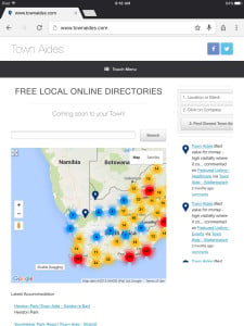
This is the correct screenshot with the right font and layout and it was taken as a portrait layout (iPad) –

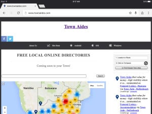
This is the incorrect screenshot with the incorrect font and changed layout and it was taken as a landscape layout (iPad) –

As can be seen the second screenshot (landscape) is quite different from the first (portrait). I must mention again that this does not happen on a windows browser.
Thanks for your feedback.
My iPhone 6s in Chrome or Safari isn’t suffering from the same issue. What you’re seeing in the second screenshot is a loss of some of the styles (CSS) or perhaps a web font failure for an unknown reason. I’ll ask Greg if he can test on his iPad.
Thanks for the wait. We’ve been unable to replicate testing across multiple iOS devices.
We think this is most likely a device or network caching issue. Please, try clearing your iPad’s browser cache. If that doesn’t work, try testing with another connection. If you’ve been working on wifi, try testing on a mobile connection instead.
As per my previous comment I mention that I have tested this at the local Apple shop on 6 or 7 devices and had the same problem. These devices were not connected to my network or using my browser!!
And the problem still persists. The setup is a multisite one and I noticed that it only does it on the main site and not on the subsites.
Thanks for the update.
We’ve been able to recreate in Safari. For some reason Safari isn’t inheriting theme styles. You can try set these manually by adding the following to Appearance > Custom CSS:
.live-stream-item * { font-family: "Helvetica Neue",Helvetica,Arial,"Lucida Grande",sans-serif !important; font-size: 13px !important; line-height: 20px !important; } .live-stream-item a { color: #248cc8 !important; } .live-stream-item a:hover { color: #f47e3c !important; } a.live-stream-item-author { color: #248cc8 !important; } a.live-stream-item-author:hover { color: #f47e3c !important; } .live-stream-text-footer * { font-size: 11px !important; }Ive done this and flushed all caches etc but still not getting the correct layout and fonts. Same as it was.
Ok, I see we’ve only fixed the sidebar. It looks like the problem might be coming from a performance/compression plugin. That plugin is using something called booster_css. Please, try clearing your performance plugin’s cache and then disabling it.
Ok we seem to be getting somewhere, so this works but not 100%.
I have excluded the style.css file from booster.css (combine file) and the layout and fonts seem much better, however when screen is in normal mode (large) it now shows both the normal menu as well the responsive menu (only on Apple). Is there possibly another file that could/should be excluded as opposed to style.css
I really not am in favor of this as it effects all sub-sites as well which is quite a considerable load and seeing that it effects only Apple browsers there definitely seems to be a problem with the Apple/iOS related css.
Would this be a fair assumption?
Nicely done.
To resolve the menu issue try excluding /vantage/premium/extras/mobilenav/mobilenav.min.js.
I’m not quite sure what the issue is. At a guess it looks like Chrome is ok with minification that’s happening but, for some reason, Safari isn’t recognising the same CSS/JSS that Chrome is able to see.
Replies on this thread are closed.
Please create a new thread if you have a question, or purchase a SiteOrigin Premium license if you need one-on-one email support.