 Page Builder
  Widgets Bundle
  SiteOrigin CSS
  Installer
 Form Fields
This is where you'll find a lot of the convenience of using the SiteOrigin Widgets Bundle as a framework for creating your own widgets. The widget form fields are a way for you to define the configuration fields you'd like to allow for your widget users. The more form fields you provide, the more customizable your widget becomes.
Form Field Descriptors
The form fields options are passed into the SiteOrigin_Widget class constructor as an array and stored in the $form_options instance variable. Each value in the array is a form field descriptor, which is an associative array describing the form field to be rendered by the SiteOrigin_Widget base class, in order to capture configuration values for a widget instance. Each form field descriptor must at least have a type, however a few of the types won't be useful without additional configuration values. Optional base form field descriptor values are listed below:
- label:
stringRender a label for the field with the given value. - default:
mixedThe field will be prepopulated with this default value. - description:
stringRender small italic text below the field to describe the field's purpose. - optional:
boolAppend '(Optional)' to this field's label as a small green superscript. - sanitize:
stringSpecifies sanitization type to be performed on input from this field. Available sanitizations are'email' and 'url'. If the specified sanitization isn't recognized it is assumed to be a custom sanitization and a filter is applied using the pattern'siteorigin_widgets_sanitize_field_' . $sanitize, in case the sanitization is defined elsewhere.
In addition to these, some fields have their own specific configuration values, which are listed in the respective sections below.
You can see all of these in action by installing and activating the SiteOrigin Widget Form Fields Demo plugin which can be found in the so-dev-examples repository.
Form Field Types
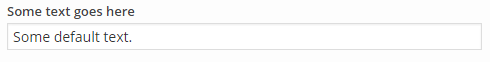
text
Renders a text input field.
Additional Options
- placeholder:
stringA string to display before any text has been input. - readonly:
boolIf true, this field will not be editable. - input_type:
stringThe input type to use for this field. Supports all standard HTML input types. For a list avaliable types, click here.
Example
Form options input:
$form_options = array(
    'some_text' => array(
        'type' => 'text',
        'label' => __( 'Some text goes here', 'siteorigin-docs' ),
        'default' => 'Some default text.'
    )
);
Result:
link
Renders an input field for entering any URL and a button for convenient selection of content from public posts (except attachments). It's recommended that you output the URL using sow_esc_url. That will convert post id selections by the user to the full URL.
You can filter search results using the siteorigin_widgets_search_posts_results filter, and you can change the SQL Order By using the siteorigin_widgets_search_posts_order_by filter. For more information, click here.
Additional Options
- placeholder:
stringA string to display before any text has been input. - readonly:
boolIf true, this field will not be editable. - post_types:
arrayArray of strings post types by which to search.
Example
Form options input:
$form_options = array(
    'some_url' => array(
        'type' => 'link',
        'label' => __( 'Some URL goes here', 'siteorigin-docs' ),
        'default' => 'http://www.example.com'
    )
);
Result:
color
Renders a color input field and color picker.
Additional options
- placeholder:
stringA string to display before any text has been input.
Example
Form options input:
$form_options = array(
    'some_color' => array(
        'type' => 'color',
        'label' => __( 'Choose a color', 'siteorigin-docs' ),
        'default' => '#bada55'
    )
);
Result:

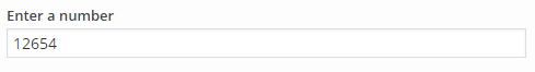
number
Renders a text input field for entering a number. This is the same as the text field, except that the input is cast as a float.
Additional Options
- placeholder:
stringA string to display before any text has been input. - readonly:
boolIf true, this field will not be editable. - abs:
boolWhether to optionally apply the PHP functionabswhen saving to ensure only positive numbers are possible. - min:
floatAn optional minimum value allowed. - max:
floatAn optional maximum value allowed. - unit:
stringAn optional unit of measurement shown to the user. This option will not be saved.
Example
Form options input:
$form_options = array(
    'some_number' => array(
        'type' => 'number',
        'label' => __( 'Enter a number', 'siteorigin-docs' ),
        'default' => '12654',
        'unit' => 'px',
    )
);
Result:
measurement
Renders a field for entering a unit of measurement. This is the same as the text field, except that the input includes unit of measurements.
Additional Options
- placeholder:
stringA string to display before any text has been input. - readonly:
boolIf true, this field will not be editable. - units:
arrayAn optional array of measurement units that will populate the drop down. Defaults to the list returned bysiteorigin_widgets_get_measurements_list(). - default_unit:
stringThe default unit of measurement if the unit of measurement isn't able to be detected or is no longer present in theunitsarray. Default to px.
Example
Form options input:
$form_options = array(
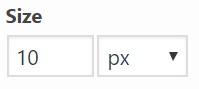
'example_size' => array(
'type' => 'measurement',
'label' => __( 'Size', 'siteorigin-docs' ),
'default' => '10px',
)
);Result:
multi measurement
Renders multiple fields for entering unit of measurement. This field type is typically used for things like margins, borders, and paddings.
Additional Options
- measurements:
arrayThe list of measurement options -- units:arrayThe selector units of measurement. If no units are set, default units are used -px,%,in,cm,mm,em,rem,pt,pc,ex,ch,vw,vh,vmin,vmax. - separator:
stringseparator for the measurements. Default is an empty space. - autofill:
boolWhether to automatically fill the rest of the inputs when the first value is entered. Default is false.
Example
Form options input:
$useable_units = array( 'px', '%' );
$form_options = array(
    'padding' => array(
        'type' => 'multi-measurement',
        'autofill' => true,
        'default' => '5% 0px 25px 0px',
        'measurements' => array(
            'top' => array(
                'label' => __( 'Padding Top', 'siteorigin-docs' ),
                'units' => $useable_units,
            ),
            'right' => array(
                'label' => __( 'Padding Right', 'siteorigin-docs' ),
                'units' => $useable_units,
            ),
            'bottom' => array(
                'label' => __( 'Padding Bottom', 'siteorigin-docs' ),
                'units' => $useable_units,
            ),
            'left' => array(
                'label' => __( 'Padding Left', 'siteorigin-docs' ),
                'units' => $useable_units,
            ),
        ),
    ),
);
Result:
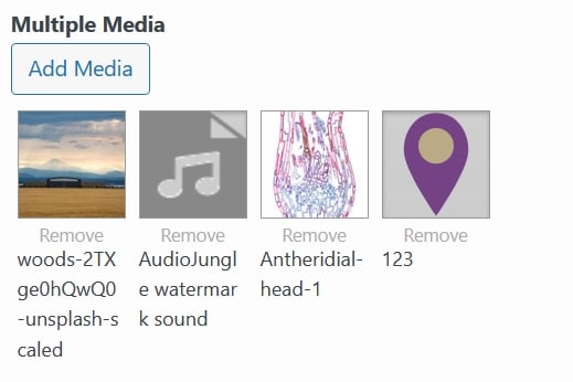
multiple media
Renders a media selector button that allows for multiple items to be selected. When clicked the button opens the WordPress Media Library dialog for the media types specified by the library option.
This field requires at least WordPress 3.5.
Additional Options
- choose:
stringA label for the title of the media selector dialog. - update:
stringA label for the confirmation button of the media selector dialog. - library:
stringSets the media library which to browse and from which media can be selected. Allowed MIME type values are'image','audio','video','file'and'application'. The default is'image'. - title:
booleanWhether to display the item title or not. Titles are displayed by default. - thumbnail_dimensions:
arrayThe dimensions of each thumbnail item. Only used when editing widgets. The default dimensions arearray( 64, 64 ). - repeater:
arrayAn optional array containing information about a repeater field. This will allow for the multiple media field to add items to the repeater. For usage instructions, please refer to this tutorial
Example
Form options input:
$form_options = array(
    'images' => array(
        'type' => 'multiple_media',
        'label' => __( 'Multiple Media', 'siteorigin-docs' ),
        'library' => 'image',
        'thumbnail_dimensions' => array( 64, 64 ),
        'title' => true,
    ),
);
Result:
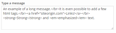
textarea
Renders a textarea field.
Additional Options
- rows:
intThe number of visible rows in the textarea. - placeholder:
stringA string to display before any text has been input. - readonly:
boolIf true, this field will not be editable.
Example
Form options input:
$form_options = array(
    'some_long_message' => array(
        'type' => 'textarea',
        'label' => __( 'Type a message', 'siteorigin-docs' ),
        'default' => 'An example of a long message.</br>It is even possible to add a few html tags.</br><a href="siteorigin.com" target="_blank"">Links!</a></br><strong>Strong</strong> and <em>emphasized</em> text.',
        'rows' => 10
    )
);
Result:
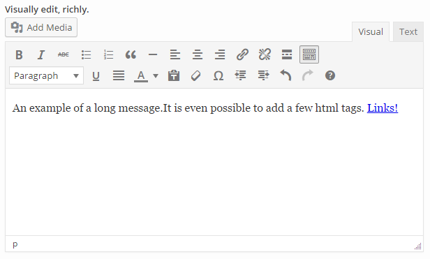
tinymce
Renders a TinyMCE editor field.
Additional Options
- rows:
intThe number of visible rows in the textarea. - default_editor:
stringWhether to display the TinyMCE visual editor or the Quicktags HTML editor initially. Allowed values are'tinymce'( can be abbreviated to'tmce'), and'html'. The default is'tinymce'. - media_buttons:
boolWhether to add the Add Media button. The default istrue. - editor_height:
intThe initial height of the editor. Setting this will cause the rows option to be ignored. - button_filters:
arrayAn array of filter callbacks to filter the buttons available on the TinyMCE visual editor and the Quicktags HTML editor. The TinyMCE editor can display up to four rows of buttons and the Quicktags editor displays a single row of buttons. Each row can be filtered by specifying a corresponding callback, as follows:- First row:
'mce_buttons' - Second row:
'mce_buttons_2' - Third row:
'mce_buttons_3' - Fourth row:
'mce_buttons_4' - Quicktags settings:
'quicktags_settings'
- First row:
Example
Form options input:
$form_options = array(
    'some_tinymce_editor' => array(
        'type' => 'tinymce',
        'label' => __( 'Visually edit, richly.', 'siteorigin-docs' ),
        'default' => 'An example of a long message.</br>It is even possible to add a few html tags.</br><a href="siteorigin.com" target="_blank"">Links!</a>',
        'rows' => 10,
        'default_editor' => 'html',
        'button_filters' => array(
            'mce_buttons' => array( $this, 'filter_mce_buttons' ),
            'mce_buttons_2' => array( $this, 'filter_mce_buttons_2' ),
            'mce_buttons_3' => array( $this, 'filter_mce_buttons_3' ),
            'mce_buttons_4' => array( $this, 'filter_mce_buttons_5' ),
            'quicktags_settings' => array( $this, 'filter_quicktags_settings' ),
        ),
    )
);
Result:
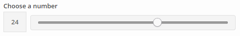
slider
Renders a number slider field to allow the choice of a number in a range.
Additional options
- min:
intThe minimum value of the allowed range. - max:
intThe maximum value of the allowed range. - step:
floatThe step size when moving in the range.
Example
Form options input:
$form_options = array(
    'some_number_in_a_range' => array(
        'type' => 'slider',
        'label' => __( 'Choose a number', 'siteorigin-docs' ),
        'default' => 24,
        'min' => 2,
        'max' => 37,
        'step' => 0.5,
        'integer' => true
    )
);
Result:
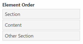
order
Renders a list of options that the user can reorder. For usage, please refer to this tutorial
Additional Options
- options:
arrayThe list of options which can be reordered - max:
intThe maximum value of the allowed range.
Example
Form options input:
$form_options = array(
    'ordering' => array(
        'type' => 'order',
        'label' => __( 'Element Order', 'siteorigin-docs' ),
        'options' => array(
            'section' => __( 'Section', 'siteorigin-docs' ),
            'divider' => __( 'Content', 'siteorigin-docs' ),
            'other section' => __( 'Other Section', 'siteorigin-docs' ),
        ),
        'default' => array( 'section', 'divider', 'other section' ),
    ),
);
Result:
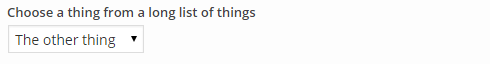
select
Renders a dropdown select field. This field is better for a long list of predefined values. For a short list the radio input field is a better choice.
Additional Options
- prompt:
stringIf present, it is included as a disabled (not selectable) value at the top of the list of options. If there is no default value, it is selected by default. You might even want to leave the label value blank when you use this. - options
arrayThe list of options which may be selected. - multiple
boolDetermines whether this is a single or multiple select field. - select2
boolIf bothselect2andmultipleare enabled, Select2 will be enabled for the field.
Example 1 - Default Value Without Prompt
Form options input:
$form_options = array(
    'some_selection' => array(
        'type' => 'select',
        'label' => __( 'Choose a thing from a long list of things', 'siteorigin-docs' ),
        'default' => 'the_other_thing',
        'options' => array(
            'this_thing' => __( 'This thing', 'siteorigin-docs' ),
            'that_thing' => __( 'That thing', 'siteorigin-docs' ),
            'the_other_thing' => __( 'The other thing', 'siteorigin-docs' ),
        )
    )
);
Result:
Example 2 - Prompt Without Default Value
Form options input:
$form_options = array(
    'another_selection' => array(
        'type' => 'select',
        'prompt' => __( 'Choose a thing from a long list of things', 'siteorigin-docs' ),
        'options' => array(
            'this_thing' => __( 'This thing', 'siteorigin-docs' ),
            'that_thing' => __( 'That thing', 'siteorigin-docs' ),
            'the_other_thing' => __( 'The other thing', 'siteorigin-docs' ),
        )
    )
);
Result:

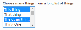
Example 3 - Multiple Select
Form options input:
$form_options = array(
    'another_selection' => array(
        'type' => 'select',
        'label' => __( 'Choose a thing from a long list of things', 'siteorigin-docs' ),
        'multiple' => true,
        'default' => 'the_other_thing',
        'options' => array(
            'this_thing' => __( 'This thing', 'siteorigin-docs' ),
            'that_thing' => __( 'That thing', 'siteorigin-docs' ),
            'the_other_thing' => __( 'The other thing', 'siteorigin-docs' ),
        )
    )
);
Result:
checkbox
Renders a checkbox field.
Example
Form options input:
$form_options = array(
    'some_boolean' => array(
        'type' => 'checkbox',
        'label' => __( 'Allow this thing?', 'siteorigin-docs' ),
        'default' => true
    )
);
Result:

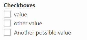
checkboxes
Renders a series of checkboxes.
Additional Options
- options
arrayThe list of options which may be selected.
Example
Form options input:
$form_options = array(
    'potential_options' => array(
        'type' => 'checkboxes',
        'label' => __( 'Allow this thing?', 'siteorigin-docs' ),
        'options' => array(
            'option' =>  __( 'value', 'siteorigin-docs' ),
            'other option' =>  __( 'other value', 'siteorigin-docs' ),
            'another additional option' => __( 'Another possible value', 'siteorigin-docs' )
        ),
    )
);
Result:
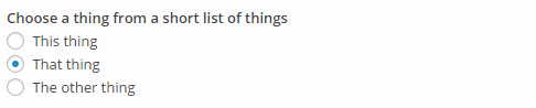
radio
Renders a radio input field. This field is better for a short list of predefined values. For a long list the dropdown select field is a better choice.
Additional options
- options
arrayThe list of options which may be selected.
Example
Form options input:
$form_options = array(
    'radio_selection' => array(
        'type' => 'radio',
        'label' => __( 'Choose a thing from a short list of things', 'siteorigin-docs' ),
        'default' => 'that_thing',
        'options' => array(
            'this_thing' => __( 'This thing', 'siteorigin-docs' ),
            'that_thing' => __( 'That thing', 'siteorigin-docs' ),
            'the_other_thing' => __( 'The other thing', 'siteorigin-docs' )
        )
    )
);
Result:
media
Renders a media selector button. When clicked the button opens the WordPress Media Library dialog for the media types specified by the library option.
This field requires at least WordPress 3.5.
Additional Options
- choose:
stringA label for the title of the media selector dialog. - update:
stringA label for the confirmation button of the media selector dialog. - library:
stringSets the media library which to browse and from which media can be selected. Allowed MIME type values are'image','audio','video','file'and'application'. The default is'image'. - fallback:
boolWhether or not to display a URL input field which allows for specification of a fallback URL to be used in case the selected media resource isn't available.
Example
Form options input:
$form_options = array(
    'some_media' => array(
        'type' => 'media',
        'label' => __( 'Choose a media thing', 'siteorigin-docs' ),
        'choose' => __( 'Choose image', 'siteorigin-docs' ),
        'update' => __( 'Set image', 'siteorigin-docs' ),
        'library' => 'image',
        'fallback' => true
    )
);
Result:
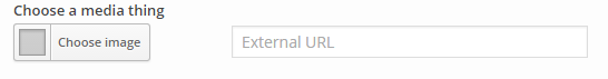
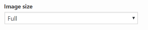
image size
Renders a dropdown with all of the available image sizes on the widget users website. This field is commonly used in conjunction with the Media field to allow the user more control over the image output. Please refer to the Image Sizes tutorial for usage instructions.
This field requires at least WordPress 2.9.
Additional Options
- custom_size:
boolWhether to allow custom image sizes. By default, Custom Sizes are disabled.
Example
$form_options = array(
    'size' => array(
        'type' => 'image-size',
        'label' => __( 'Image size', 'siteorigin-docs' ),
    )
);
Result:
Possible Image Size values:
Custom Image Size
The custom_size option allows the user to manually input an image size. The custom image size values are prefixed with the option name and then _width or _height. For example: option_name_width and option_name_height**.
For this image size to be used you'll need to detect the size form field value equals to custom_size and then pass an array with the field values. For example:
<?php
// Detect custom image size and override size.
if (
    $instance['size'] == 'custom_size' &&
    ! empty( $instance['size_width'] ) &&
    ! empty( $instance['size_height'] )
) {
    $instance['size'] = array(
        (int) $instance['size_width'],
        (int) $instance['size_width'],
    );
}

$src = siteorigin_widgets_get_attachment_image_src(
    $instance['image'], // Set elsewhere
    $instance['size']
);
posts
Renders a post selector field. This can be used to build custom queries with which to select posts from your database. The field displays a small red indicator which shows the number of posts currently being selected. By default, all posts are selected.
You can find more detail about the use of the post selector field here.
Additional Options
- show_count:
boolWhether to add query total results count to the posts section title in the editor. Defaults to true.
Example
Form options input:
$form_options = array(
    'some_posts' => array(
        'type' => 'posts',
        'show_count' => true,
        'label' => __( 'Some posts query', 'siteorigin-docs' ),
    )
);
Result:

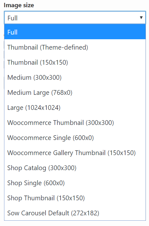
section
The section field type provides a convenient way to group and hide related form fields. This is useful when you have a large form which can appear overwhelming.
Additional Options
- hide:
boolWhether or not this section should start out collapsed or expanded. - fields:
arrayThe set of fields to be grouped together. This should contain any combination of other field types, even repeaters and sections.
Example
Form options input:
$form_options = array(
    'a_section' => array(
        'type' => 'section',
        'label' => __( 'A section containing related fields.' , 'siteorigin-docs' ),
        'hide' => true,
        'fields' => array(
            'grouped_text' => array(
                'type' => 'text',
                'label' => __( 'A grouped text field', 'siteorigin-docs' )
            ),
            'grouped_checkbox' => array(
                'type' => 'checkbox',
                'label' => __( 'A grouped checkbox', 'siteorigin-docs' )
            )
        )
    )
);
Result:
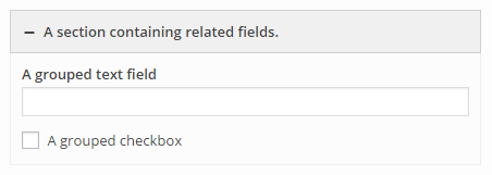
tabs
The tabs field integrates with the section field. By itself, this field doesn't function and must be paired with a section field as each tab corresponds to an assigned section. On mobile devices, the tabs will disappear in favor of the original sections.
This field requires Widgets Bundle version 1.50.1 or higher. If the user is using a version prior to that release, the sections will output as normal.
Options
- tabs:
arrayThis associative array contains the section id and label of the section to display as a tab. The section label doesn't have to be the same as the section.
add_filter( 'siteorigin_widgets_form_options_sow-editor', function( $form_options ) {
    if ( empty( $form_options ) ) {
        return $form_options;
    }
    $form_options['tabs'] = array(
        'type' => 'tabs',
        'tabs' => array(
            'example_section' => __( 'Example Section', 'siteorigin-docs' ),
            'another_example' => __( 'Second Example', 'siteorigin-docs' ),
        ),
    );
    $form_options['example_section'] = array(
        'type' => 'section',
        'label' => __( 'Example Section' , 'siteorigin-docs' ),
        'tab' => true,
        'hide' => true,
        'fields' => array(
            'test' => array(
                'type' => 'html',
                'markup' => __( 'First tab', 'siteorigin-docs' ),
            ),
        ),
    );
    $form_options['another_example'] = array(
        'type' => 'section',
        'label' => __( 'The Tab label defined above will be output instead of this' , 'siteorigin-docs' ),
        'tab' => true,
        'hide' => true,
        'fields' => array(
            'test' => array(
                'type' => 'html',
                'markup' => __( 'Second tab', 'siteorigin-docs' ),
            ),
        ),
    );
    return $form_options;
} );
Result: 
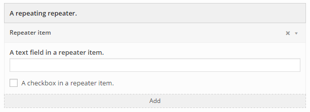
repeater
The repeater field type provides a convenient way to repeat a specified set of form fields.
Additional Options
- item_name:
stringA default label for each repeated item. - item_label:
arrayThis associative array describes how the repeater may retrieve the item labels from HTML elements as they are updated. The options are:- selector:
stringA JQuery selector which is used to find an element from which to retrieve the item label. - update_event:
stringThe javascript event on which to bind and update the item label. - value_method:
stringThe javascript function which should be used to retrieve the item label from an element.
- selector:
- fields:
arrayThe set of fields to be repeated together as one item. This should contain any combination of other field types, even repeaters and sections. - scroll_count:
intThe maximum number of repeated items to display before adding a scrollbar to the repeater. - readonly:
boolWhether or not items may be added to or removed from this repeater by user interaction.
Example
Form options input:
$form_options = array(
    'a_repeater' => array(
        'type' => 'repeater',
        'label' => __( 'A repeating repeater.' , 'siteorigin-docs' ),
        'item_name'  => __( 'Repeater item', 'siteorigin-docs' ),
        'item_label' => array(
            'selector'     => "[id*='repeat_text']",
            'update_event' => 'change',
            'value_method' => 'val'
        ),
        'fields' => array(
            'repeat_text' => array(
                'type' => 'text',
                'label' => __( 'A text field in a repeater item.', 'siteorigin-docs' )
            ),
            'repeat_checkbox' => array(
                'type' => 'checkbox',
                'label' => __( 'A checkbox in a repeater item.', 'siteorigin-docs' )
            )
        )
    )
);
Result:
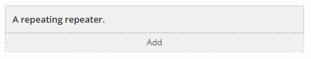
Repeater containing two items (the first item is collapsed and the second item is expanded):
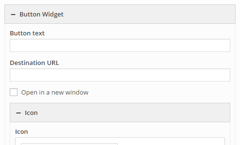
widget
Includes the entire form of an existing widget class. You can find more information about using child widgets here.
Additional Options
- class:
stringThe class name of the widget to be included. - hide:
boolWhether or not this widget's form section should start out collapsed or expanded.
Example
Form options input:
$form_options = array(
    'some_widget' => array(
        'type' => 'widget',
        'label' => __( 'Button Widget', 'siteorigin-docs' ),
        'class' => 'SiteOrigin_Widget_Button_Widget',
        'hide' => true
    )
);
Result:
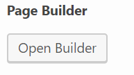
builder
An entire SiteOrigin Page Builder instance. For usage, please refer to this tutorial
This field requires SiteOrigin Page Builder to be installed and active.
Additional Options
- builder:
stringThe type of page builder instance - currently unused. Defaults tosow-builder-field
Example
Form options input:
$form_options = array(
    'page_builder' => array(
        'type' => 'builder',
        'label' => __( 'Page Builder', 'siteorigin-docs'),
    )
);
Result:
code
A textarea field with the Behave.js library set up for it.
Additional options
- element_id
stringthe id of the code textarea - element_name
stringthe name of the code textarea - rows:
intThe number of visible rows in the textarea. - placeholder:
stringA string to display before any text has been input. - readonly
boolIf true, this field will not be editable.
Example
Form options input:
$form_options = array(
    'code_editor' => array(
        'type' => 'code',
        'label' => __( 'Code Editor', 'siteorigin-docs' ),
    )
);
Result:
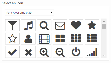
icon
Renders an icon selector field. This allows you to select an icon from a default set of icon families, namely Font Awesome, IcoMoon, Genericons, Typicons, and Elegant Themes' Line Icons. You can include your own icon families with the siteorigin_widgets_icon_families filter.
You can find more detail about using icons here.
Example
Form options input:
$form_options = array(
    'some_icon' => array(
        'type' => 'icon',
        'label' => __( 'Select an icon', 'siteorigin-docs' ),
    )
);
Result:
font
Renders a font selector field. This allows you to select a font from a default set of font families, namely the web safe fonts (Helvetica Neue, Lucida Grande, Georgia, and Courier New ) and a selection of font families from the Google Fonts library. By default this field will use the font specified by the active theme.
You can include your own font families with the siteorigin_widgets_font_families filter. You can find more detail about extending available fonts here.
Example
Form options input:
$form_options = array(
    'some_font' => array(
        'type' => 'font',
        'label' => __( 'Select a font', 'siteorigin-docs' ),
    )
);
Result:
Default selection: 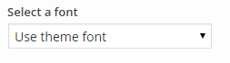
Selecting a font: 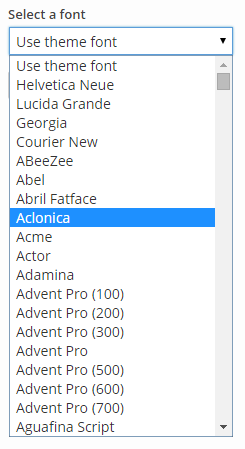
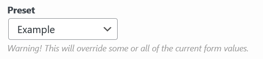
presets
The presets field allows you to create presets for your widget. You can find more information about using presets here.
Options
- options
arrayA multidimensional array containing your presets data. - default_preset
stringWhich preset to load automatically. This is optional, and if it is not set, an empty default option will be added to the presets select.
Example
Form options input:
$form_options = array(
    'presets' => array(
        'type' => 'presets',
        'label' => __( 'Theme', 'siteorigin-docs' ),
        'default_preset' => 'test-2',
        'options' => array(
            'test' => array( // Preset 1
                'label' => 'Test 1',
                'values' => array(
                    'test' => 'Test 1 example text',
                ),
            ),
            'test-2' => array(  // Preset 2
                'label' => 'Test 2',
                'values' => array(
                    'test' => 'Test 1 example text',
                    'color' => '#0f0',
                ),
            ),
        ),
    ),
);
Result:
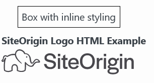
html
The HTML field allows you to directly output HTML. This is useful for conveying information that is better served being separate rather than in a field description, giving a brief for a section, etc.
This field requires Widgets Bundle version Widgets Bundle 1.44.0 or higher. If the user is using a version prior to that release, nothing will output.
Options
- markup
stringA string containing HTML to output.
Example
This example will add two HTML fields to the end of the SiteOrgin Editor widget. The first will display a box with some inline styling and the second will add the SiteOrigin logo.
add_filter( 'siteorigin_widgets_form_options_sow-editor', function( $form_options ) {
    if ( empty( $form_options ) ) {
        return $form_options;
    }
    // This go anywhere in the `$form_options` array.
    $form_options['html_button_example'] = array(
        'type' => 'html',
        'markup' => '<span style="border: 1px solid #000; padding: 5px; margin: 21px; display: inline-block;">' . __( 'Box with inline styling', 'siteorigin-docs' ) . '</span>',
    );
    $form_options['siteorigin_logo'] = array(
        'type' => 'html',
        'label' => __( 'SiteOrigin Logo HTML Example' , 'siteorigin-docs' ),
        'markup' => '<img src="https://siteorigin.com/wp-content/themes/siteorigin-theme/images/logo/logo.svg" width="175" height="33">',
    );
    return $form_options;
} );
Result:
Autocomplete
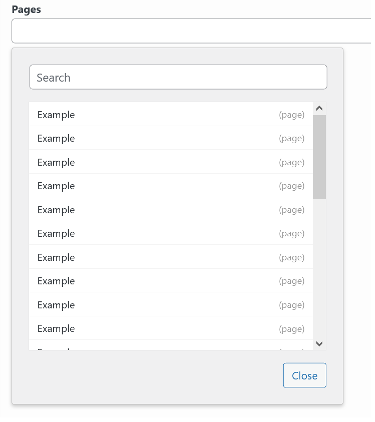
The Autocomplete field provides a list of posts or terms users that the user can select from. When an item is selected, the post/term id will be inserted. If multiple are selected each selection will be separated by a comma.
Options
- post_types
arrayAn array of post types to use in the autocomplete query. Only used for posts. Default is posts. - source
stringIndicates which database table will be used to retrieve autocomplete suggestions. Options arepostsandterms. Default is posts - multiple
stringWhether to allow multiple items to be selected. Default is true.
Example
$form_options = array(
    'example' => array(
        'type' => 'autocomplete',
        'label' => __( 'Pages', 'siteorigin-docs'),
        'post_types' => array(
            'page'
        ),
    ),
);
Result: