 Page Builder
  Widgets Bundle
  SiteOrigin CSS
  Installer
 Free WordPress Theme
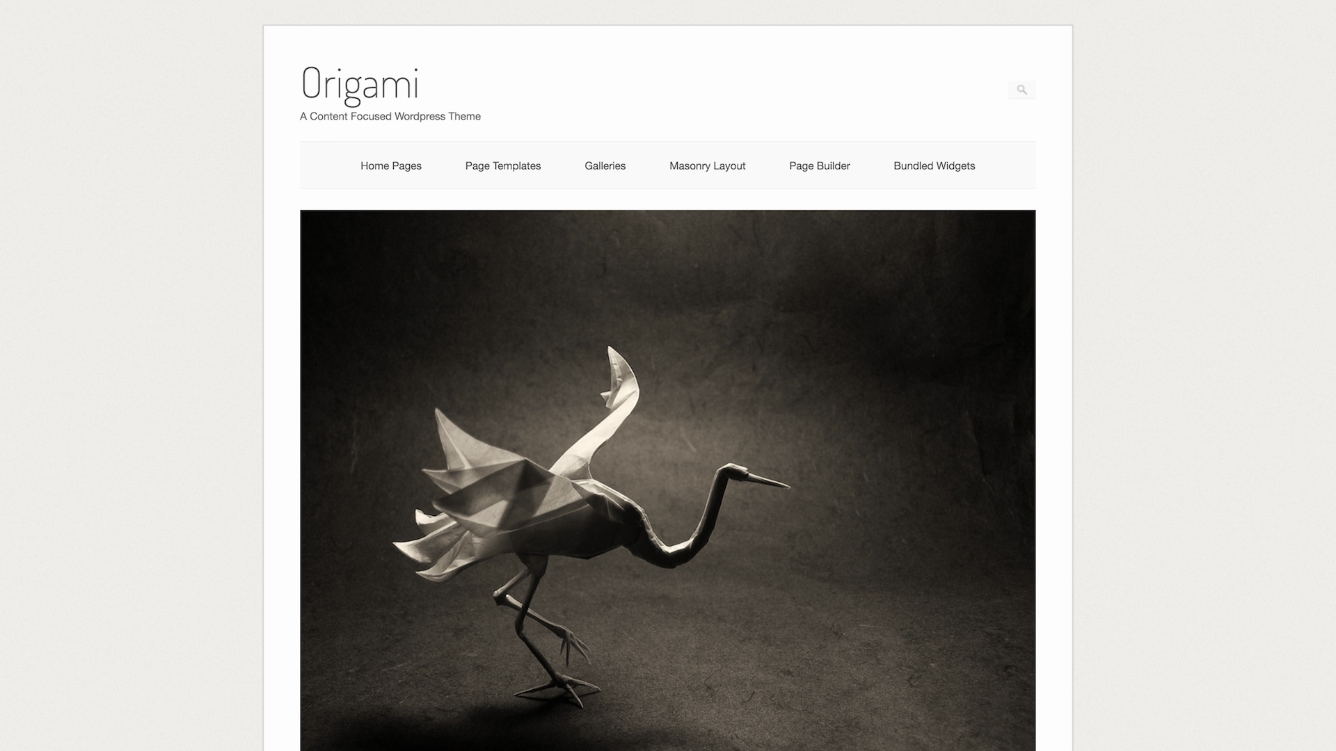
Origami
Simple Media Blogging
By SiteOrigin
media blogging minimal page builder responsive
yoursite.com
About Origami

Features
- Content focused design
- Classic, yet timeless design
The SiteOrigin Stack
Pair it with powerful free plugins
Extend Origami with SiteOrigin's free plugin suite. Page Builder for layouts, Widgets Bundle for content blocks, and SiteOrigin CSS for visual styling.
SiteOrigin Page Builder
Build responsive page layouts with an intuitive drag-and-drop interface. Works with any theme.
Learn more
SiteOrigin Widgets Bundle
28+ professional widgets for sliders, buttons, features, and more. Drop them anywhere.
SiteOrigin CSS
Customize any theme with a visual CSS editor. See your changes live, no code required.
Learn more Free forever, no license key
Start building with Origami
Download Origami and pair it with Page Builder, Widgets Bundle, and SiteOrigin CSS for a complete WordPress site-building toolkit.
WordPress compatible
Page Builder ready
GPL License