Page Builder Cell Vertical Alignment
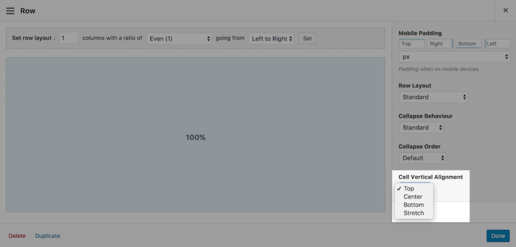
Page Builder 2.5 introduced an additional setting called, "Cell Vertical Alignment". A powerful feature that allows you to control the alignment of cells within each row. You can choose from one of four vertical alignment options. Let's take a look.
Page Builder Cells
Page Builder Cells are directly related to row columns. A single row with a single column will result in a single cell. In the example below, I created a single row with two columns resulting in two cells.

Adding content to a cell will increase the height of the cell. Cells with different content will have different heights.

Cell vertical alignment allows you to control how you want to align cells in each row. You can choose from one of four vertical alignment options:
Top
Cells align to the top of the row. As you add content to each cell, such as images and text, the height of the cell will increase in a downwards direction relative to the top of the row.

"Iceland"
Vertical Alignment - Top
↓
Center
Cells align to the centerline of the row. As you add content to each cell, the height of the cell will increase in an outwards direction from the rows centerline.

↑
"Yellowstone National Park"
Vertical Alignment - Center
↓
Bottom
Cells align to the bottom of the row. As you add content to each cell, the height of the cell will increase in an upwards direction relative to the bottom of the row.

↑
"Yellowstone National Park"
Vertical Alignment - Bottom
Stretch
All cell heights will stretch to equal the height of the tallest cell. As you add content to each cell, the content will fill the cell from the top down relative to the top of the row.

On my iPad Air with iOS 10 ‘Stretch’ looks exactly the same as ‘Top’.
I see the same problem on Chrome iPad & iPad Pro simulations.
Stretch would really be nice.
Any way to make this work?
Cell Vertical Alignment will “disable” itself when your columns collapse. This was done to prevent significantly stretched columns of blank spacing appearing on mobile devices (this spacing is most noticeable when there’s a significant mismatch in column sizing).
You can control when this happens by adjusting your mobile width. You can adjust this by navigating to WP Admin > Settings > Page Builder and open the Layout tab.
Hello and thanks you for this plugin.
I have the same problem than Erwin, on iPad, ‘Stretch’ doesn’t work.
If I desable ‘Use Legacy Layout Engine’ in ‘Page Builder’ back office, it’s work.
It is strange, because my iPad is up to date.
Is it an bug?
Best regards
Hi Shoki,
To clarify, what version of iOS are you using?
Can you please link me to your website so I can inspect the results?
Hi Alex and thank you for your answer.
The iOS is: 10.3.2
The problem is on this page: http://laurent-pineau-infographiste.kick-productions.fr/#home/competences-techniques
On Safari and Firefox, the reds lines separators are vertical aligned, but on iPad, there aren’t aligned.
Is it a bug? Or perhaps did I make a mistake in my code?
Best regards…
Hi Shoki,
Would it be possible for you to create a thread so I can more easily receive notifications and reply?
Regardless, on iPad your row has collapsed so it makes sense for the alignment to appear. If you would like for the row not to collapse, please open the row housing the Number Counter and text widget. Head over to the row styles sidebar. Open the Layout settings group and set the Collapse Behaviour to No Collapse.
Same on an iMac running Safari.
Thank you!
I am looking for an eternity for this trick
Glad we could finally release this Stefan, sorry it wasn’t sooner! All the best :)
Awesome! The flexbox superpowers? :)
Thanks for following along Primož. Flexbox powers!
This looks useful.
Hope it helps with a problem soon :) All the best.
Finally! An app that understands what designers look for!
Thanks Cess. Hopefully this will come in handy for you soon :) All the best.
Thanks for continuing to find ways to improve SOPB.
Thanks for the support Jim :)
Great!!!
Thanks Ted :)
This is awesome! Now I don’t have to use a bunch of CSS and the “spacer” to modify how it looks.
Hi Yosniel. Good to hear from you. The less CSS the better :)
An excellent addition, just was not enough in some cases. Now there will be an opportunity to try on their sites. Thank you!
Wish we had it sooner. Hopefully it’ll be useful moving forward. All the best :)
GREAT!!!
I was hoping for this feature.
Thanks again.
Bas
Thanks Bas :) Good to hear from you.
This is an excellent feature that I have been hoping for.
Thank You! Let me give it a try.
T
Thanks Tom. A long running request. Glad to finally have it out.
Love this functionality!
Super, glad you like it :)
Thank you, Alex and the SiteOrigin team. Still the best.
HG/mws
Andrew…
Thanks for your support, it’s most appreciated. Glad we could get this long awaited feature out. More to follow :)
Thank you!
I noticed the new setting but really did not understand what it did or why you’d use it.
Now I see how useful it is and what to do with it.
Hi Corrinda. Super :) Hopefully, it’ll come in handy in one of your future page layouts.
First collapse order, copy & pasting content and now vertical alignments! I’m looking forward to my next project.
Super :) Hope it all helps.
Great addition – The images to the left of the text alignment is confusing, they seem not to conform to the alignment of its companion text. This brings to mind another question which is kind of related. Does Siteorigin plan on enabling the ability of text to flow from one column to the next? Example: http://wpskyway.com/pagebuilder/ (page right) – dynamic column layout.
Regards,
Ron
Hi Ron,
The images on the left are the contents of the left column. In the examples, it’s allowing for the row to be much larger than the contents of the right cell which allows for the cell vertical alignment setting to work. In other words, if the left cell was empty, the Cell Vertical Alignment options wouldn’t do anything. Does that make sense?
That’s an interesting idea. I’m going to log this as a feature request.
After looking a the examples – I discovered what is confusing to me. All the text alignment examples to the right, show both, the text and the cell contain – as gray background tint. This illustrates the text alignment in relation to the cell, however this is not the case with the images.
Thank you Alex for your response.
Ron
wow,awesome!
I am about to use this plugin for my clinent wordpress blog site.
Thank you for your great product!
Hi kaborin,
Thank you for the kind words! :)
Best of luck with the new project mate.
This is an awesome feature. Aligning made easy. Yet to try it out but look forward to giving it a go. There has many times I could have used this in the past. Thank you.
Indeed! Sorry it took so long. Glad to have it out now. All the best.
I was looking for this for quite some time. Thanks for adding this in.
Thanks Rishi, really glad we finally have this out.
I am pleased to hear this and an happy for its actualization.
Thanks miracle, hope it helps :)
This is great. It solves the problem of using images of different sizes.
Thanks Bruce. Hopefully it makes your next layout a little easier to build. All the best.
I’ve tested it on this page http://1.ajaysgroup.com/young-people/ at the bottom, and it doesn’t appear to be working. It stays aligned to the top.
Hi James. It looks like you have it set to Stretch right now. Please, try changing it to Center, that should do the trick.
Thanks for checking. I’ve changed it to centre, and that works, but the stretch doesn’t seem to.
Basically, I would like the text box to be the same size as the image box, irrelevant of the amount of text in it.
Is that what stretch is supposed to do?
James’ definition is exactly what I was looking for in a stretch functionality.
“text box to be the same size as the image box, irrelevant of the amount of text in it”
This. is. Good. Thank. You
Awesome feature! I have been wishing for this. Thank you for seeing the need and solving the problem.
In my pages stretch isn’t doing anything different than top (version 2.5.12 on chrome). I have a number of rows with two cells each. The individual cells have a background color and it doesn’t stretch so the two cells match. At the moment I manual set the bottom padding of the cell that has less content to match the other cell. Would love for this to work.
Very nice!
1. What I want to do is add images one on top of the other, vertically, in a given cell. How do I do this?
2. Is there a way in a SiteOrigin theme (Puro) to pad the top and bottom of each image so that they don’t all squish together?
Good, but for me stretching doesn’t work, looks like top alignment. Crome, Firefox, IE.
Scrolling on one cell while the picture in the background of the row is fixed during scrolling is an interesting new feature. I suggest that you should build this in to PageBuilder.
It utilises something called “tiny-scrollmation” and you can see an excample of its use here: https://www.vg.no/annonsorinnhold/ving/artikler/tenerife/
This would be great, but Stretch isn’t working for me either. Just behaves like Top. This is on desktop view, Chrome 62.0.3202.94.
Not having much luck with this. Got a cell with a background image set and it doesn’t stretch vertically, it just covers the div where there is text. Any ideas?
Hi Chris, thanks for posting. Please, could you post your question on the forum: https://siteorigin.com/thread. We’ll do our best to assist there. Thanks.
Hi there,
Could someone help me. Trying to do a « shopmystyle » with page builder but why is it vertical? How can I like it horizontal? Thank
Hi Myriam, thanks for reaching out. Please, could you post your question on the forum: https://siteorigin.com/thread. We’ll do our best to assist there. Thanks.
Just what I was looking for. Thanks!!!
Super, glad that helped :) All the best with your site.
I’ve followed these instructions. Selected a 2 column row – applied the vertical stretch to each column, but still not lining up.
HI Lyndsey
If you open a support thread on the forum and let us know once that’s done, we’d be happy to lend a hand.
https://siteorigin.com/thread
Please, include a link to a page with the problem. Thanks :)
When I try to use the stretch feature, I can’t get it to make the columns equal. I am using Unwind theme and SiteOrigin Page Builder. Is this compatible for equal height columns? How can I get this to work?
Hi Rhonda
If you open a support thread on the forum and let us know once that’s done, we’d be happy to lend a hand.
https://siteorigin.com/thread
Please, include a link to a page with the problem. Thanks :)
Hi Rhonda, did you get a chance on the forum? Thanks :)
Great! This will be very useful for the design of my pages!
Hi Henry, super, glad to hear you’ll be able to make use of this feature. All the best :)
This is a fantastic feature. Really loving the flexibility of the sitebuilder plugin. Just wondering how to get the background to stretch but the content to align vertically in the centre.
Hi Zac :)
Can you perhaps open a support thread on our forum and let me know once that’s done? If possible, please include a link to the page concerned in your support thread so we can inspect the problem. Thanks.
https://siteorigin.com/thread/
Hello!
Did anyone find a solution of a problem with Vertical Alignment – Stretch, which doesn´t work? Windows 10, Chrome.
Hi Anna,
There are no known issues with Stretch Vertical Alignment. Can you please open a support thread on the forum and let us know once that’s done, we’d be happy to lend a hand.
https://siteorigin.com/thread
Please include a link to the page you’re working on so we can inspect the issue you’re experiencing.
Finally I’ve figured it out. My mistake was that I was trying to affect a widget instead of a cell it contains. Thank you for your attention!
Super :) Glad to hear you’ve made progress. Thanks for the update.
I have a two column page where the left side is bullet style instruction, and the right column is a video of the movements being described on the left. Is there a way where I can scroll the left column whist the right column stays still. This for PC use, maybe tablet too, I understand on a phone the columns won’t display the same, and that’s fine.
Hi Daniel
Thanks for reaching out.
You could try adding a plugin like https://wordpress.org/plugins/toast-stick-anything/ or https://wordpress.org/plugins/sticky-menu-or-anything-on-scroll/. I haven’t tried these but they come to mind for a situation like this.
Ok, I could not reproduce what I think you’ve done. I have a page with three rows, each with two columns. The right column are all videos and the left text. The first two row the text goes no further down than the video, but the third row the text goes about 5 times the length. Is this update supposed to address this type of page at all or am I spitting in the wind.
Hi Daniel, sorry we missed your comment. If you still need a hand, please, open a support thread at https://siteorigin.com/thread/ and we’ll assist from there. Thanks.
I am using Site Origin, but the rows I use divided into 2 or 3 parts don’t arrange themselves horizontally and appear vertically, is there any reason or am I doing something wrong?
Hi Arturo. You can perhaps try temporarily switching to another theme to see if the issue is related to your theme. For extended assistance, you could open a support thread at https://siteorigin.com/thread. Thanks.
Hi,
the bottom alignment (after update) doesn’t work anymore.
Site: https://www.ideanole.it/noleggio-lavaggio-e-sanificazione-abiti-da-lavoro-workwear-l21/
the first big image with workwear…
Did I make some mistake?
Thank you
Hi Gianluca
Thanks for reaching out.
CSS is being added for the cell as follows
height: 659px;. Try editing the row, click on the cell, open the Attributes section, have you inserted a declaration for height in the CSS Declarations field? If so, that’s causing the problem. If you have any follow-up questions perhaps post over on the forum at https://siteorigin.com/thread and we’ll lend a hand there.I’m noticing using the Stretch vertical alignment option, while enabling all columns in a row to maintain the same height, also forces the contents to align to the top. I’m creating a landing page and need to have a 2 column row have all columns maintain the same height across the row, but at the same time, have an image in 1 of the columns also be centred vertically. Is there currently any way to get both settings in place?
Hi Jason. Thanks for reaching out. There isn’t a settings-based solution for this layout type at the moment. We’ll take a further look today or at the weekend and get back to you with an update. Thanks again. Andrew
Hi Jason
Try adding the following to the Attributes > CSS Declarations field of the cell you’d like to vertically center text in:
display: flex
align-items: center
The cell Layout > Vertical Alignment setting should be set to the Use row setting option.
Thanks, I’ll try that out when I resume work on that page.
Sounds like a plan! Works without issue in local testing.
Cheers
Andrew